What is inventory forecasting? How does it help?
Problem: Retailers struggle to predict demand accurately, especially when external factors like weather dramatically impact sales. Traditional forecasting methods may ignore these contextual signals, leading to stockouts during high-demand periods or excess inventory during low-demand periods. Our approach: Incorporate weather data as context, and demonstrate conditional forecasting to discover which items sell together. Outcome: Our models achieve significantly lower error rates by incorporating weather data, and further analysis reveals which products move together, which can enable strategic decisions like complementary product placement and targeted promotions.Prerequisites
First, install the required libraries:1. Load and Prepare Data
We’ll use a real-world dataset from a Chicago store that tracks sales for multiple products along with daily weather conditions. This rich dataset allows us to compare simple time-series forecasting against forecasts that incorporate weather data.2. Visualize Historical Sales Patterns
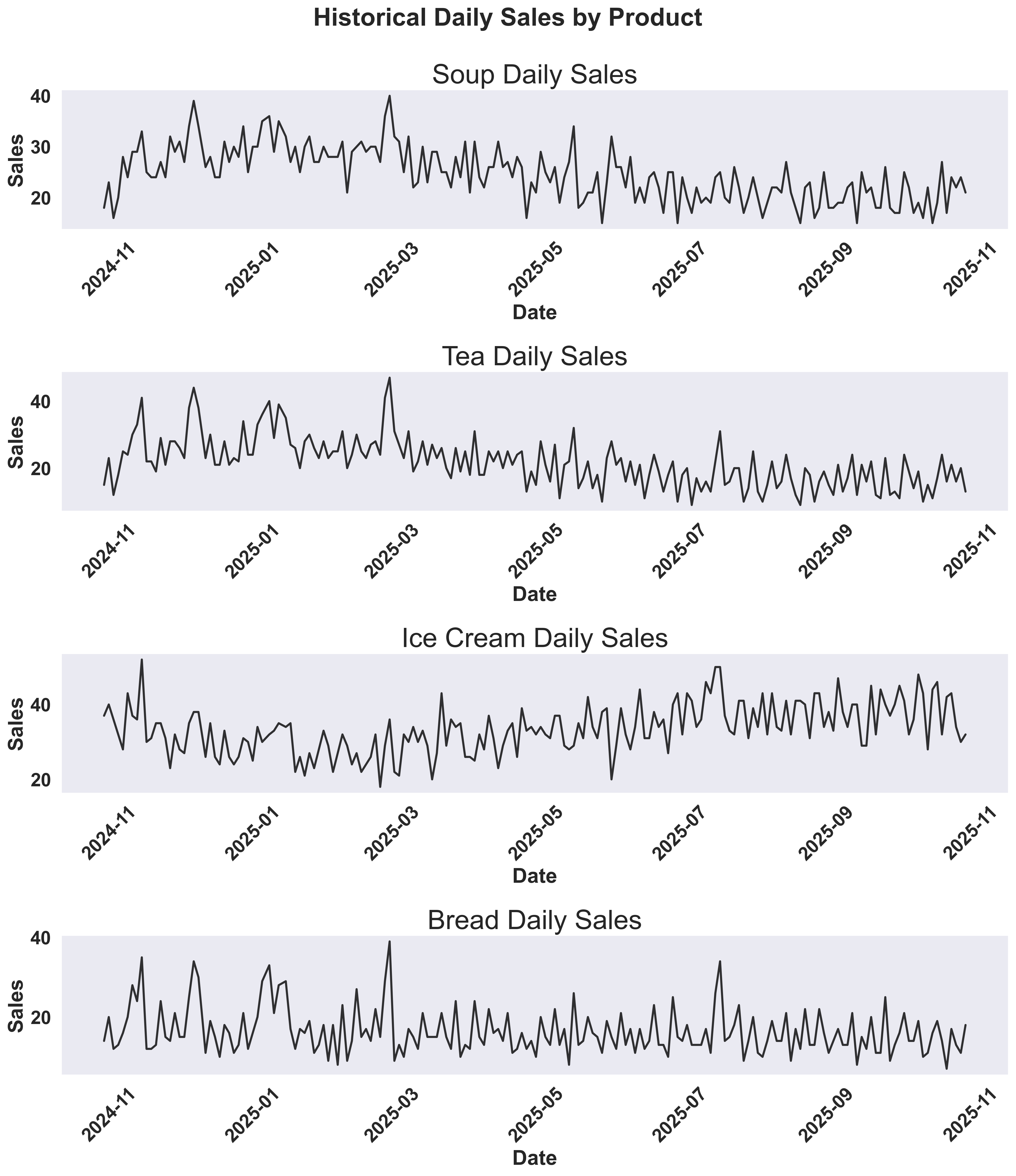
Before running forecasts, let’s visualize the historical sales data to understand patterns and seasonality for each product. We’ll create time series plots showing how sales vary over time.Show plotting code for historical sales
Show plotting code for historical sales
These visualizations help you understand:
- Sales trends: Are there seasonal patterns or trends over time?
- Weather impact: How does temperature correlate with sales?
- Product differences: Do different products show different sensitivities to temperature?
Historical Sales Overview
Historical Sales and Temperature
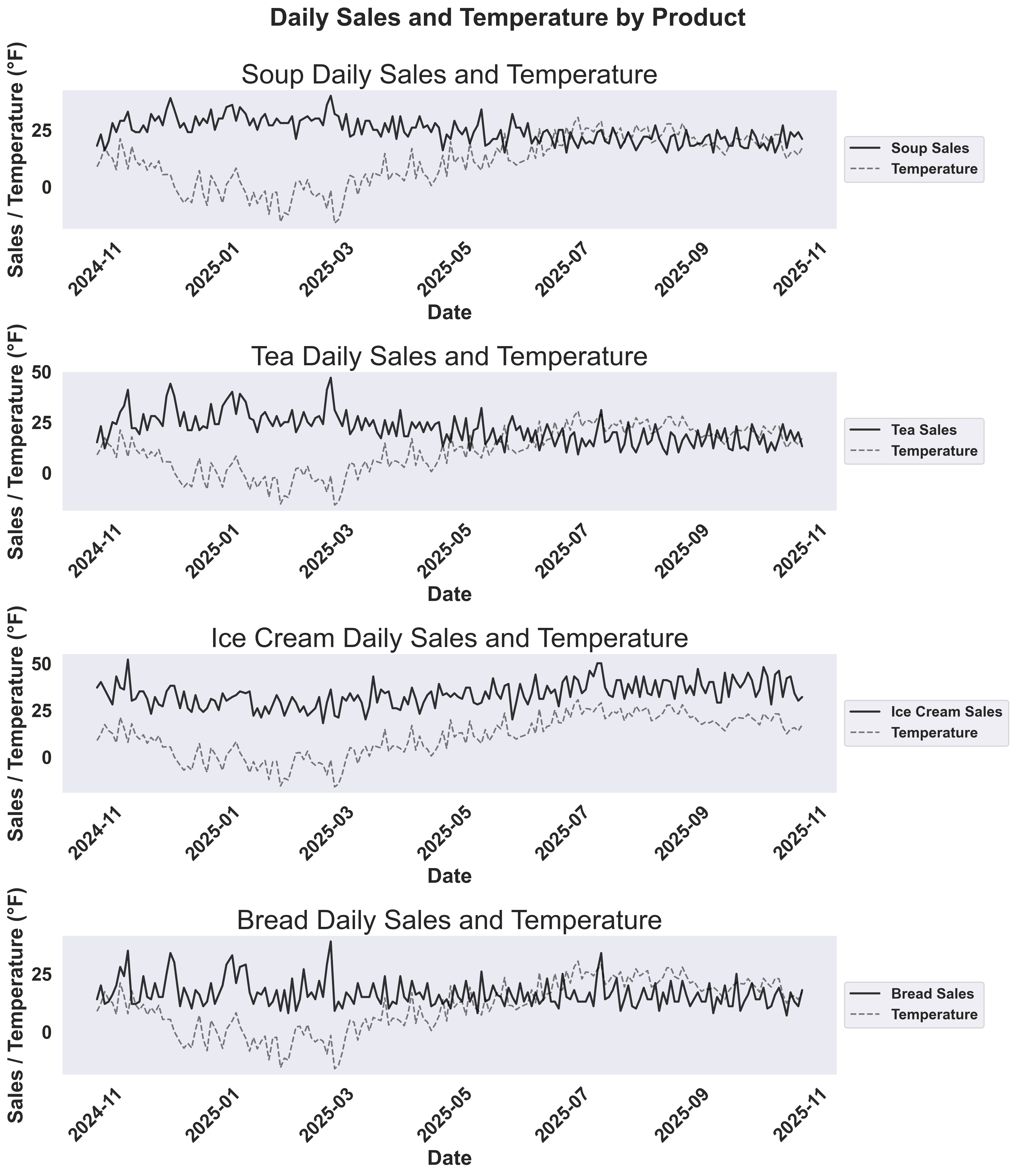
- Solid colored lines: Sales for each product
- Dashed red line: Temperature overlay to show how weather affects demand
3. Split Data and Run Forecasts
We’ll split the data and forecast the last 20% of the data to compare univariate vs multivariate forecasting approaches.4. Visualize Forecast Results
Create visualizations to compare the forecasting approaches:Show plotting code for forecast comparison
Show plotting code for forecast comparison
Example Output: Soup Forecast Comparison

- Time series plot: The multivariate forecast closely tracks actual sales through various weather conditions, while univariate struggles with sudden changes. The red vertical line marks the train/test split.
- MAPE values in legend: The legend shows the quantitative improvement - multivariate forecasting achieves significantly lower error rates (MAPE values are displayed directly in the legend labels).
Note that there seem to be peaks of sales before the weather dips! You can experiment with adding new features like (num_days_before_temp_dip)
Example Output: Tea Forecast Comparison
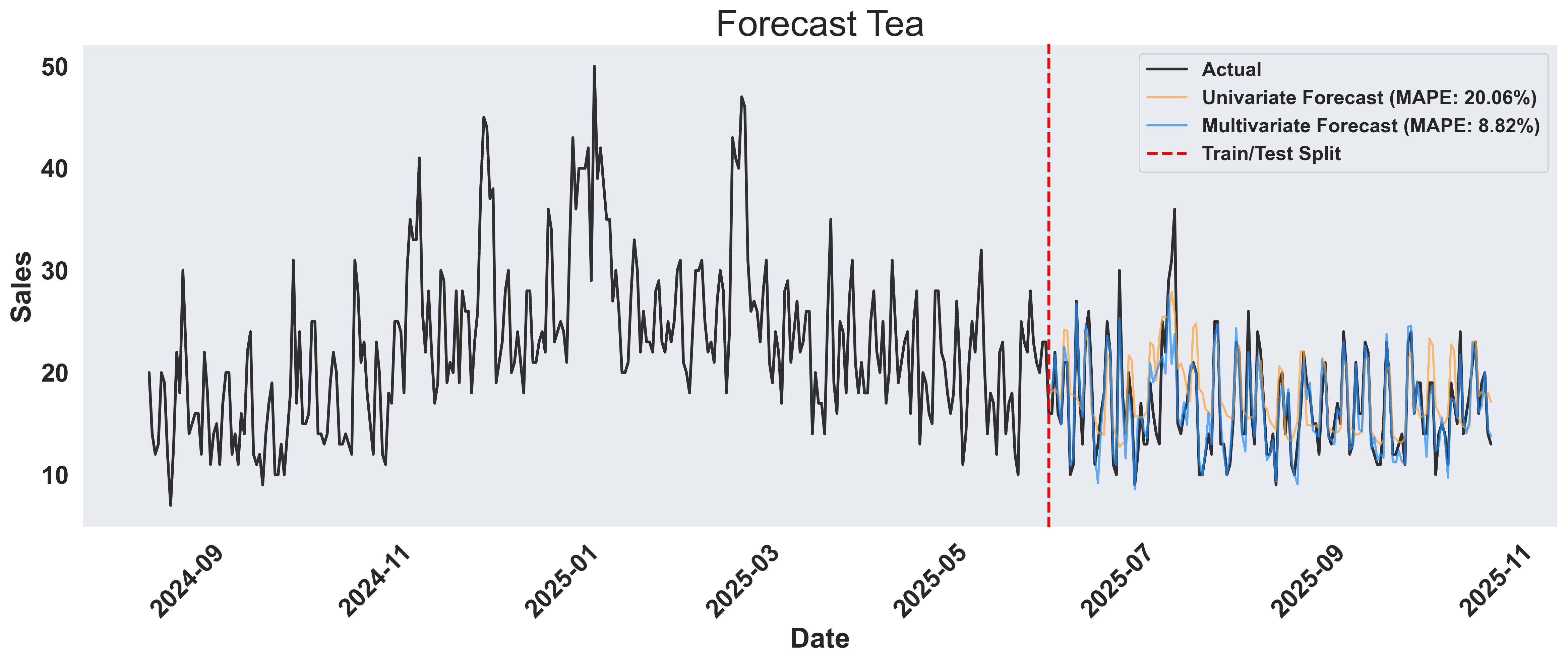
Key Insight: The multivariate approach doesn’t just forecast better - it reveals why demand changes. By incorporating weather and temporal features, you gain actionable insights: stock more hot beverages before cold fronts, and optimize inventory based on weather forecasts rather than just historical patterns.
5. Easily Find Products that Sell Together
Beyond weather, products in a store often influence each other’s sales. For instance, if coffee sales spike, tea sales might also increase, or soup and bread might move together. We can discover these relationships by using one product’s sales data to help forecast another product’s sales. Knowing this, store owners can introduce promotions or package deals to increase revenue.What is Cross-Item Analysis
The key insight: if knowing Product A’s sales helps predict Product B’s sales more accurately, then these products are correlated. We measure this by comparing forecast accuracy (MAPE) - lower MAPE means stronger correlation.What is “Leaking” in Cross-Item Analysis?
In this context, “leaking” refers to conditioning our forecast on another product’s sales data. Think of it as asking: “If I know how much tea was sold today, how does that change my forecast for soup sales?” Example: When we “leak” tea sales data into our soup forecast, we’re essentially asking:- Without tea data: “Based on historical soup sales and weather, what will soup sales look like?”
- With tea data: “Given that tea sales were X units today, and considering historical soup sales and weather, what will soup sales look like?”
How It Works
- For each target product (e.g., soup), we forecast its sales using three approaches:
- Univariate: Time series only
- Multivariate: Time series + weather
- Cross-item: Time series + weather + another product’s sales
- We test each product as the “leaked” feature to see which one helps most
- Lower MAPE = stronger correlation between the products
Visualizing Cross-Item Relationships
Create comprehensive visualizations showing the progressive improvement from univariate to cross-item forecasting:Show plotting code for cross-item analysis
Show plotting code for cross-item analysis
Example Output: Cross-Item Analysis for Soup
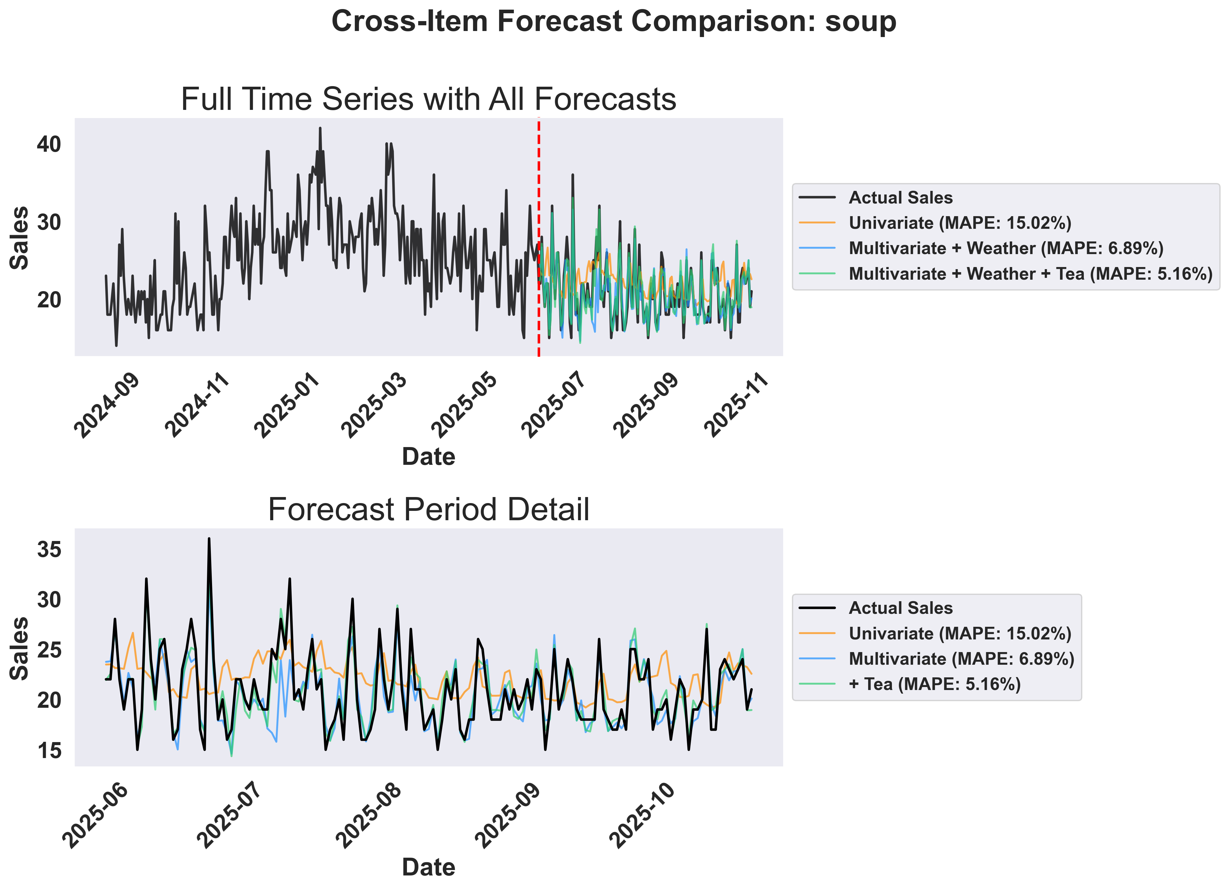
- Top panel: Shows the full timeline with historical data and all three forecast approaches. The vertical line marks the train/test split.
- Bottom panel: Zoomed view of the forecast period showing how each approach performs. Notice the progressive improvement from univariate to multivariate to cross-item forecasting.
Visualizing Cross-Item Prediction Accuracy
Create a comprehensive 2x2 grid showing which items are most helpful for predicting each target item:Show plotting code for cross-item MAPE comparison
Show plotting code for cross-item MAPE comparison
Example Output: Cross-Item MAPE Comparison
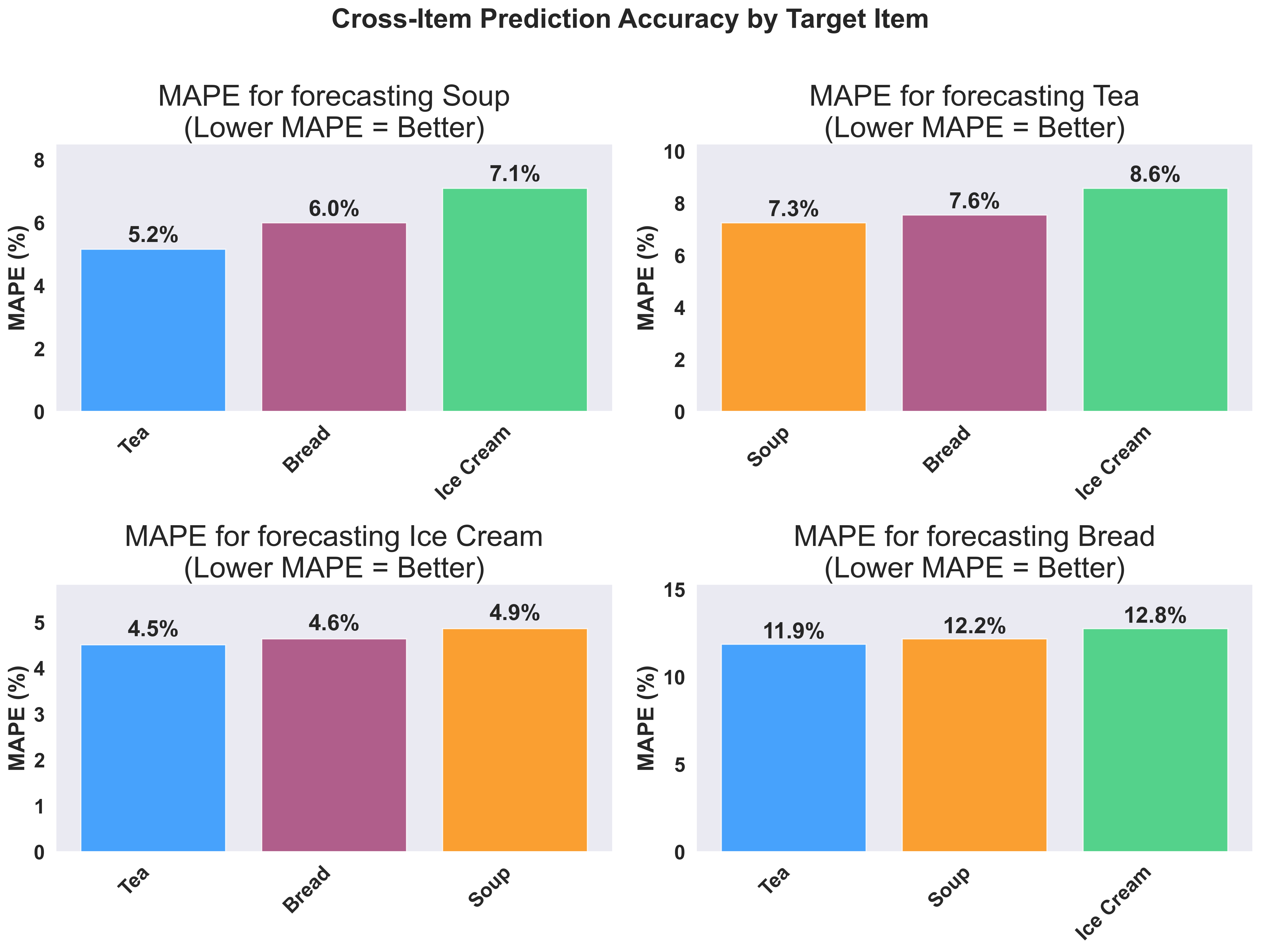
- Hot beverages show strong correlations - Tea and Soup are highly correlated
Business Applications:
- Inventory Optimization: If tea and soup are highly correlated, use tea sales trends to improve soup inventory forecasts
- Shelf Placement: Position correlated products near each other to increase cross-sales
- Demand Forecasting: When you see unusual tea sales, prepare for corresponding soup demand changes