> ## Documentation Index
> Fetch the complete documentation index at: https://docs.synthefy.com/llms.txt
> Use this file to discover all available pages before exploring further.
# Pricing Simulation
> Learn how to run pricing simulations using Synthefy's AI-powered conditional forecasting to optimize a pricing strategy and maximize revenue.
## What is pricing simulation? How does it help?
**Problem**: Businesses struggle to find optimal pricing that maximizes revenue. Traditional methods rely on gut feeling, often leading to suboptimal pricing that either leaves money on the table or drives away customers.
**Our approach**: We show how businesses can use Synthefy's AI-powered forecasting to simulate different price points and automatically identify the optimal pricing strategy.
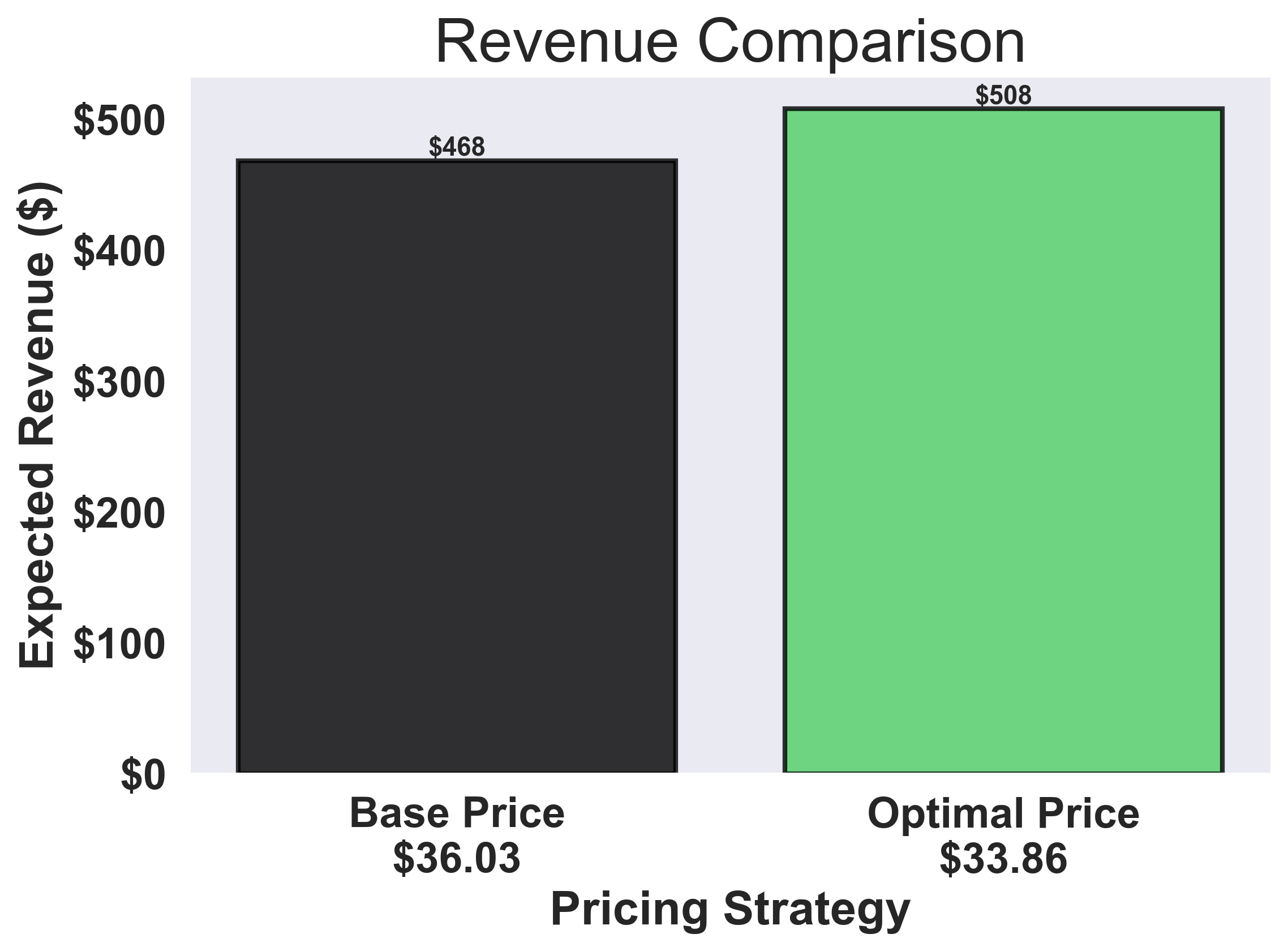
**Outcome**: In this example, our models show a potential revenue increase of 9% by finding the optimal price point that balances demand and profitability.
### 1. Load Historical Sales Data
This dataset comes from a Fortune 500 company that sells a popular health product in a pharmacy. We'll use their real sales and pricing history to uncover how data can drive smarter, more profitable pricing decisions.
```python theme={null}
import asyncio
import matplotlib.cm as cm
import matplotlib.pyplot as plt
import numpy as np
import pandas as pd
import seaborn as sns
import swarm_visualizer
from swarm_visualizer.utility import set_axis_infos
from swarm_visualizer.utility.general_utils import set_plot_properties
from synthefy.api_client import SynthefyAsyncAPIClient
# Set swarm-visualizer properties for consistent styling
set_plot_properties(usetex=False)
# Load the historical sales data
history_df = pd.read_csv(
"https://drive.google.com/uc?export=download&id=1FtLW17XE1NHcV1bF8mLW_2WHVKzrHts_"
)
future_df = pd.read_csv(
"https://drive.google.com/uc?export=download&id=1l2zG7GNTcdDm_HzKhhwii3GTI0Z99a9h"
)
```
**Data Format**: Your CSV should have columns like `date`, `unit_price`, and `sales`. The `future_df` represents the time periods you want to forecast for (without the `sales` column filled in yet).
## 2: Visualize Historical Data
Before running simulations, it's important to understand your historical data. Let's create visualizations to see how price and sales have changed over time, and whether there's a correlation.
```python theme={null}
def plot_historical_analysis(history_df):
"""
Create two plots to analyze historical price and sales data using swarm-visualizer.
Plot 1: Time series showing both unit price and sales over time (dual-axis)
Plot 2: Correlation plot between unit price and sales
Args:
history_df: DataFrame with 'date', 'unit_price', and 'sales' columns
"""
# Create figure with 2 rows and 1 column (vertical layout)
fig, (ax1, ax2) = plt.subplots(2, 1, figsize=(14, 10))
# --- Plot 1: Historical Time Series Plot using swarm-visualizer ---
# Prepare data for swarm-visualizer
normalized_dict = {
"Unit Price": {
"x": history_df["date"],
"y": history_df["unit_price"],
"lw": 2.5,
"linestyle": "--",
"color": "black", # Black dashed
"alpha": 0.8,
"zorder": 2,
},
"Sales": {
"x": history_df["date"],
"y": history_df["sales"],
"lw": 2.5,
"linestyle": "-",
"color": "black", # Black solid
"alpha": 0.8,
"zorder": 2,
},
}
# Use swarm-visualizer plot_overlaid_lineplot
swarm_visualizer.plot_overlaid_lineplot(
ax=ax1,
normalized_dict=normalized_dict,
title_str="Historical Unit Price and Sales Over Time",
ylabel="Unit Price / Sales",
xlabel="Date",
legend_present=True,
)
# Move legend to the right side outside the plot
ax1.legend(loc="center left", bbox_to_anchor=(1, 0.5))
# Use swarm-visualizer set_axis_infos for consistent styling
set_axis_infos(
ax=ax1,
xlabel="Date",
ylabel="Unit Price / Sales",
title_str="Historical Unit Price and Sales Over Time",
grid=True,
)
# Format x-axis labels - reduce label frequency and font size
ax1.set_xticks(ax1.get_xticks()[::2])
plt.setp(ax1.get_xticklabels(), rotation=45, ha="right", fontsize=12)
# --- Plot 2: Correlation Plot ---
corr_val = (
history_df[["unit_price", "sales"]].corr().loc["unit_price", "sales"]
)
sns.regplot(
x="unit_price",
y="sales",
data=history_df,
marker="o",
color="black", # Black points
line_kws={"color": "#E63946", "lw": 2, "label": f"Corr={corr_val:.2f}"},
ax=ax2,
scatter_kws={"alpha": 1.0},
ci=None,
)
ax2.set_xlabel("Unit Price ($)", fontsize=12)
ax2.set_ylabel("Sales", fontsize=12)
ax2.set_title(
"Correlation Between Unit Price and Sales",
fontsize=13,
weight="semibold",
)
ax2.legend()
ax2.grid(True, linestyle="--", alpha=0.4)
plt.tight_layout()
plt.savefig("pricing_data_visualization.png", dpi=300, bbox_inches="tight")
plt.show()
# Visualize the historical data
plot_historical_analysis(history_df)
```
The **time series plot** shows trends over time, while the **correlation plot** reveals if there's a linear relationship between price and demand. A negative correlation suggests demand decreases as price increases (price sensitivity).
### Example Output: Historical Data Analysis
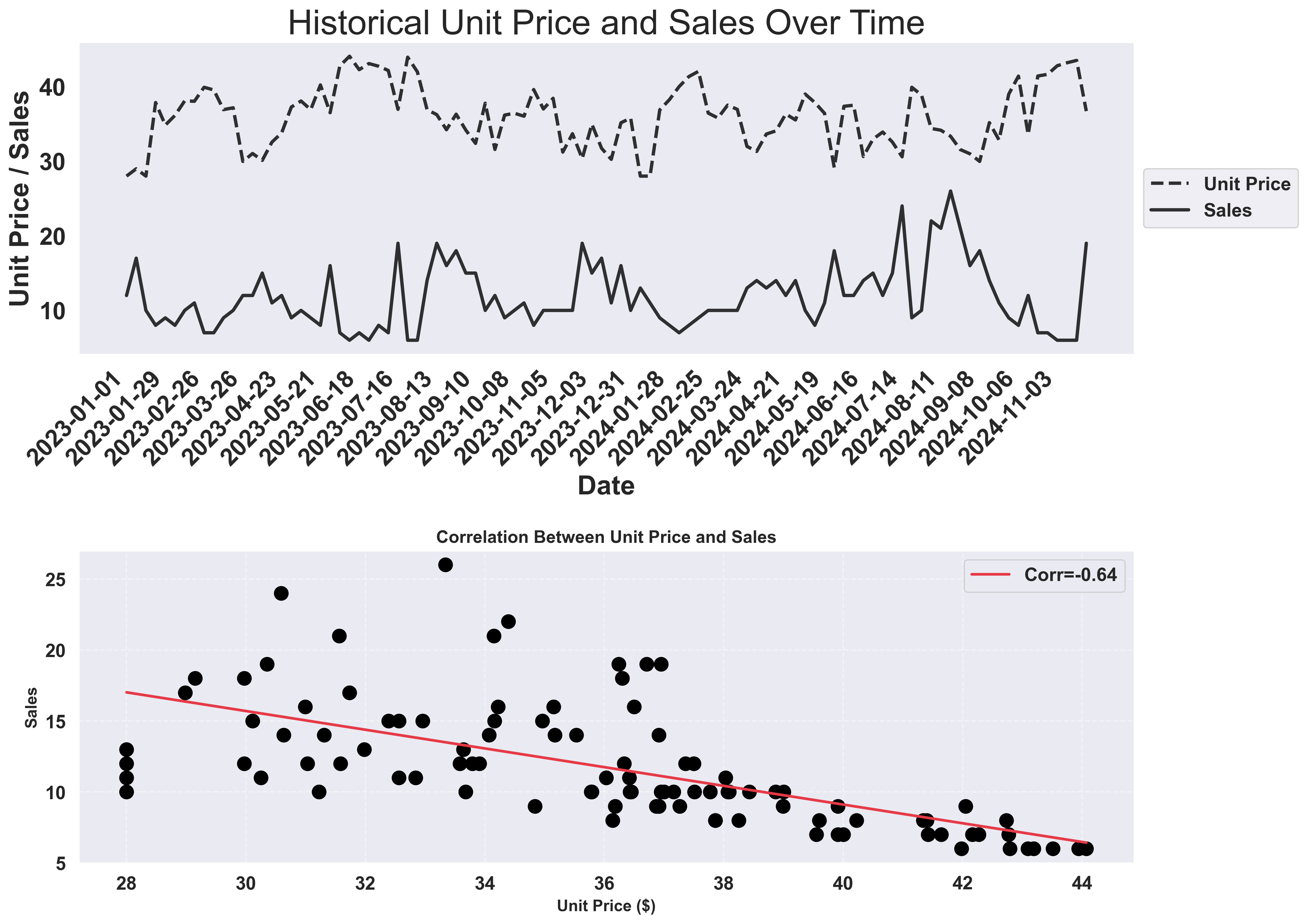 The visualizations above show:
* **Top panels**: How unit price and sales volume have varied over 2 years of weekly data
* **Bottom panel**: A clear negative correlation (-0.64) between price and sales, confirming price sensitivity
## Step 3: Set Up Pricing Simulation
Now, let's define the range of prices we want to test. We'll create a range of 11 price points ranging from 85% to 115% of your historical average price. We'll call this the "base" price, and use it as a basline for comparison.
```python theme={null}
# Calculate base price from historical data
base_price = history_df["unit_price"].mean()
# Create price range (11 price points from 85% to 115% of base price)
price_simulation_range = np.linspace(base_price * 0.85, base_price * 1.15, 11)
print(f"Testing prices from ${price_simulation_range[0]:.2f} to ${price_simulation_range[-1]:.2f}")
```
**Adjust the range**: You can modify the `0.85` and `1.15` multipliers to test a wider or narrower price range. For example, use `0.7` and `1.3` to test 70% to 130% of the base price.
## Step 4: Prepare Data for Forecasting
For each price point, we need to create a separate forecast scenario. We'll duplicate the future DataFrame and modify the `unit_price` column for each scenario.
```python theme={null}
# Data preparation for pricing simulation
target_dfs = []
for price in price_simulation_range:
modified_future = future_df.copy()
modified_future["unit_price"] = price
target_dfs.append(modified_future)
```
## Step 5: Run AI Forecasts
```python theme={null}
async def get_forecasts():
async with SynthefyAsyncAPIClient() as api_client:
results = await api_client.forecast_dfs(
history_dfs=[history_df] * len(price_simulation_range),
target_dfs=target_dfs,
target_col="sales",
timestamp_col="date",
metadata_cols=["unit_price"],
leak_cols=["unit_price"],
model="Migas-1.0",
)
return results
# Run the async forecast function
results = asyncio.run(get_forecasts())
print(f"✓ Received {len(results)} forecast results")
```
**Key parameters**:
* `metadata_cols=["unit_price"]`: Features the model can use
* `leak_cols=["unit_price"]`: Features that are known in advance (price is controllable)
## Step 6: Create Time Series Forecast Visualization
First, let's create a comprehensive time series visualization that shows all forecast scenarios overlaid on the historical data.
```python theme={null}
def plot_forecast_time_series(
history_df,
future_df,
results,
price_simulation_range,
base_price,
optimal_price,
):
"""
Plot historical data and all forecasts for different prices using swarm-visualizer.
This function creates a comprehensive visualization showing:
- Historical sales data (black line)
- Multiple forecast scenarios for different prices (orange gradient)
- Highlighted optimal and base price forecasts
- Forecast region background highlighting
Args:
history_df: DataFrame with historical sales data
future_df: DataFrame with future dates for forecasting
results: List of forecast results for each price point
price_simulation_range: Array of price points tested
base_price: Current/average price from historical data
optimal_price: Price that maximizes revenue
"""
# Create figure with consistent sizing following hotel demand pattern
fig, ax = plt.subplots(figsize=(20, 6))
# Get future dates
future_dates = future_df["date"].tolist()
# Prepare data for swarm-visualizer - show only last 50% of history
history_cutoff = len(history_df) // 2
history_subset = history_df.iloc[history_cutoff:]
# Prepare normalized dictionary for swarm-visualizer
normalized_dict = {
"Historical Sales": {
"x": history_subset["date"],
"y": history_subset["sales"],
"lw": 3,
"linestyle": "-",
"color": "black",
"alpha": 0.8,
"zorder": 5,
}
}
# Create orange gradient colors for all price points
orange_colors = cm.Oranges(
np.linspace(0.3, 0.9, len(price_simulation_range))
)
# Plot ALL forecasts - every single price point!
for i, (price, result) in enumerate(zip(price_simulation_range, results)):
forecast_values = result["sales"].tolist()
# Combine historical data with forecast for this price
historical_dates = history_subset["date"].tolist()
historical_sales = history_subset["sales"].tolist()
# Combine historical + forecast dates and values
combined_dates = historical_dates + future_dates
combined_sales = historical_sales + forecast_values
# Determine styling based on price type - all using orange gradient
color = orange_colors[i] # Each price gets its own orange shade
if abs(price - optimal_price) < 0.01:
label = f"Optimal Price (${price:.2f})"
linewidth = 4
alpha = 1.0
elif abs(price - base_price) < 0.01:
label = f"Base Price (${price:.2f})"
linewidth = 4
alpha = 1.0
else:
label = f"${price:.2f}"
linewidth = 2.0
alpha = 0.8
normalized_dict[label] = {
"x": combined_dates,
"y": combined_sales,
"lw": linewidth,
"linestyle": "-",
"color": color,
"alpha": alpha,
"zorder": 4,
}
# Use swarm-visualizer plot_overlaid_lineplot
swarm_visualizer.plot_overlaid_lineplot(
ax=ax,
normalized_dict=normalized_dict,
title_str="Pricing Simulation: Complete Time Series with Forecasts by Price",
ylabel="Sales",
xlabel="Date",
legend_present=True,
)
# Move legend to the right side outside the plot (following inventory_forecasting_demo.py pattern)
ax.legend(loc="center left", bbox_to_anchor=(1, 0.5))
# Add vertical line to separate historical from forecast (following hotel_demand.py pattern)
last_historical_date = history_subset["date"].iloc[-1]
ax.axvline(
x=last_historical_date,
color="red",
linestyle="--",
linewidth=2,
alpha=0.7,
label="Train/Test Split",
zorder=1,
)
# Use swarm-visualizer set_axis_infos for consistent styling
set_axis_infos(
ax=ax,
xlabel="Date",
ylabel="Sales",
title_str="Pricing Simulation: Forecasts for Different Prices",
grid=True,
)
# Format x-axis labels following hotel demand pattern - reduce label frequency
# Only show every other tick to reduce clutter
ax.set_xticks(ax.get_xticks()[::2])
plt.xticks(rotation=45, ha="right")
plt.tight_layout()
plt.savefig("forecast_time_series.png", dpi=300, bbox_inches="tight")
plt.show()
# Create time series visualization showing all forecasts
print("📊 Creating time series visualization of all forecasts...")
plot_forecast_time_series(
history_df,
future_df,
results,
price_simulation_range,
base_price,
optimal_price,
)
```
### Example Output: Time Series Forecast Visualization
The visualizations above show:
* **Top panels**: How unit price and sales volume have varied over 2 years of weekly data
* **Bottom panel**: A clear negative correlation (-0.64) between price and sales, confirming price sensitivity
## Step 3: Set Up Pricing Simulation
Now, let's define the range of prices we want to test. We'll create a range of 11 price points ranging from 85% to 115% of your historical average price. We'll call this the "base" price, and use it as a basline for comparison.
```python theme={null}
# Calculate base price from historical data
base_price = history_df["unit_price"].mean()
# Create price range (11 price points from 85% to 115% of base price)
price_simulation_range = np.linspace(base_price * 0.85, base_price * 1.15, 11)
print(f"Testing prices from ${price_simulation_range[0]:.2f} to ${price_simulation_range[-1]:.2f}")
```
**Adjust the range**: You can modify the `0.85` and `1.15` multipliers to test a wider or narrower price range. For example, use `0.7` and `1.3` to test 70% to 130% of the base price.
## Step 4: Prepare Data for Forecasting
For each price point, we need to create a separate forecast scenario. We'll duplicate the future DataFrame and modify the `unit_price` column for each scenario.
```python theme={null}
# Data preparation for pricing simulation
target_dfs = []
for price in price_simulation_range:
modified_future = future_df.copy()
modified_future["unit_price"] = price
target_dfs.append(modified_future)
```
## Step 5: Run AI Forecasts
```python theme={null}
async def get_forecasts():
async with SynthefyAsyncAPIClient() as api_client:
results = await api_client.forecast_dfs(
history_dfs=[history_df] * len(price_simulation_range),
target_dfs=target_dfs,
target_col="sales",
timestamp_col="date",
metadata_cols=["unit_price"],
leak_cols=["unit_price"],
model="Migas-1.0",
)
return results
# Run the async forecast function
results = asyncio.run(get_forecasts())
print(f"✓ Received {len(results)} forecast results")
```
**Key parameters**:
* `metadata_cols=["unit_price"]`: Features the model can use
* `leak_cols=["unit_price"]`: Features that are known in advance (price is controllable)
## Step 6: Create Time Series Forecast Visualization
First, let's create a comprehensive time series visualization that shows all forecast scenarios overlaid on the historical data.
```python theme={null}
def plot_forecast_time_series(
history_df,
future_df,
results,
price_simulation_range,
base_price,
optimal_price,
):
"""
Plot historical data and all forecasts for different prices using swarm-visualizer.
This function creates a comprehensive visualization showing:
- Historical sales data (black line)
- Multiple forecast scenarios for different prices (orange gradient)
- Highlighted optimal and base price forecasts
- Forecast region background highlighting
Args:
history_df: DataFrame with historical sales data
future_df: DataFrame with future dates for forecasting
results: List of forecast results for each price point
price_simulation_range: Array of price points tested
base_price: Current/average price from historical data
optimal_price: Price that maximizes revenue
"""
# Create figure with consistent sizing following hotel demand pattern
fig, ax = plt.subplots(figsize=(20, 6))
# Get future dates
future_dates = future_df["date"].tolist()
# Prepare data for swarm-visualizer - show only last 50% of history
history_cutoff = len(history_df) // 2
history_subset = history_df.iloc[history_cutoff:]
# Prepare normalized dictionary for swarm-visualizer
normalized_dict = {
"Historical Sales": {
"x": history_subset["date"],
"y": history_subset["sales"],
"lw": 3,
"linestyle": "-",
"color": "black",
"alpha": 0.8,
"zorder": 5,
}
}
# Create orange gradient colors for all price points
orange_colors = cm.Oranges(
np.linspace(0.3, 0.9, len(price_simulation_range))
)
# Plot ALL forecasts - every single price point!
for i, (price, result) in enumerate(zip(price_simulation_range, results)):
forecast_values = result["sales"].tolist()
# Combine historical data with forecast for this price
historical_dates = history_subset["date"].tolist()
historical_sales = history_subset["sales"].tolist()
# Combine historical + forecast dates and values
combined_dates = historical_dates + future_dates
combined_sales = historical_sales + forecast_values
# Determine styling based on price type - all using orange gradient
color = orange_colors[i] # Each price gets its own orange shade
if abs(price - optimal_price) < 0.01:
label = f"Optimal Price (${price:.2f})"
linewidth = 4
alpha = 1.0
elif abs(price - base_price) < 0.01:
label = f"Base Price (${price:.2f})"
linewidth = 4
alpha = 1.0
else:
label = f"${price:.2f}"
linewidth = 2.0
alpha = 0.8
normalized_dict[label] = {
"x": combined_dates,
"y": combined_sales,
"lw": linewidth,
"linestyle": "-",
"color": color,
"alpha": alpha,
"zorder": 4,
}
# Use swarm-visualizer plot_overlaid_lineplot
swarm_visualizer.plot_overlaid_lineplot(
ax=ax,
normalized_dict=normalized_dict,
title_str="Pricing Simulation: Complete Time Series with Forecasts by Price",
ylabel="Sales",
xlabel="Date",
legend_present=True,
)
# Move legend to the right side outside the plot (following inventory_forecasting_demo.py pattern)
ax.legend(loc="center left", bbox_to_anchor=(1, 0.5))
# Add vertical line to separate historical from forecast (following hotel_demand.py pattern)
last_historical_date = history_subset["date"].iloc[-1]
ax.axvline(
x=last_historical_date,
color="red",
linestyle="--",
linewidth=2,
alpha=0.7,
label="Train/Test Split",
zorder=1,
)
# Use swarm-visualizer set_axis_infos for consistent styling
set_axis_infos(
ax=ax,
xlabel="Date",
ylabel="Sales",
title_str="Pricing Simulation: Forecasts for Different Prices",
grid=True,
)
# Format x-axis labels following hotel demand pattern - reduce label frequency
# Only show every other tick to reduce clutter
ax.set_xticks(ax.get_xticks()[::2])
plt.xticks(rotation=45, ha="right")
plt.tight_layout()
plt.savefig("forecast_time_series.png", dpi=300, bbox_inches="tight")
plt.show()
# Create time series visualization showing all forecasts
print("📊 Creating time series visualization of all forecasts...")
plot_forecast_time_series(
history_df,
future_df,
results,
price_simulation_range,
base_price,
optimal_price,
)
```
### Example Output: Time Series Forecast Visualization
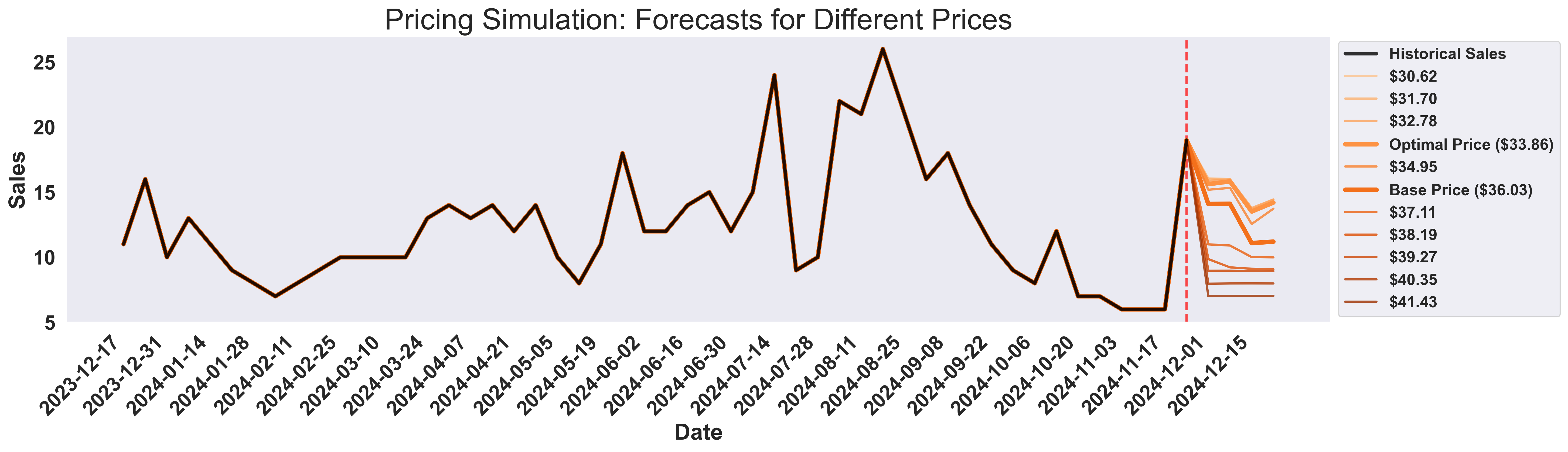 This comprehensive visualization shows:
* **Black line**: Historical sales data (last 50% for focus)
* **Orange gradient lines**: All forecast scenarios for different prices
* **Light blue background**: Highlights the forecast region
* **Optimal & Base prices**: Thicker lines for key scenarios
## Step 7: Analyze Results
Extract the forecasts and calculate revenue for each price point. Then identify the optimal price that maximizes revenue.
```python theme={null}
# Extract forecasts (mean sales for each price point)
forecasts = [int(round(result["sales"].mean())) for result in results]
# Calculate revenue for each price point
revenues = [price * forecast for price, forecast in zip(price_simulation_range, forecasts)]
# Find optimal price point
optimal_idx = np.argmax(revenues)
optimal_price = price_simulation_range[optimal_idx]
optimal_transactions = forecasts[optimal_idx]
optimal_revenue = revenues[optimal_idx]
# Find base price index (closest to current average price)
base_idx = np.argmin(np.abs(price_simulation_range - base_price))
base_transactions = forecasts[base_idx]
base_revenue = revenues[base_idx]
```
## Step 8: Visualize Pricing Insights
Finally, let's create comprehensive visualizations to understand the price-demand relationship and identify the optimal pricing strategy.
```python theme={null}
# Create 3-plot visualization
fig, (ax1, ax2, ax3) = plt.subplots(1, 3, figsize=(18, 5))
fig.suptitle(
"Pricing Simulation Analysis", fontsize=18, fontweight="bold", y=0.95
)
# Plot 1: Price vs Sales (Partial Dependence Plot)
fig1, ax1 = plt.subplots(figsize=(10, 6))
# Prepare data for swarm-visualizer
normalized_dict = {
"Forecasted Sales": {
"x": price_simulation_range,
"y": forecasts,
"lw": 2.5,
"linestyle": "--",
"color": "#fea333", # Orange
"alpha": 0.9,
"zorder": 3,
},
"Base Price": {
"x": [base_price, base_price],
"y": [min(forecasts), max(forecasts)],
"lw": 2,
"linestyle": "--",
"color": "black",
"alpha": 0.8,
"zorder": 2,
},
}
# Use swarm-visualizer plot_overlaid_lineplot
swarm_visualizer.plot_overlaid_lineplot(
ax=ax1,
normalized_dict=normalized_dict,
title_str="Partial Dependence Plot (Price vs Avg Forecasted Sales)",
ylabel="Avg Forecasted Sales",
xlabel="Sales Price ($)",
legend_present=True,
)
# Use swarm-visualizer set_axis_infos for consistent styling
set_axis_infos(
ax=ax1,
xlabel="Sales Price ($)",
ylabel="Avg Forecasted Sales",
title_str="Partial Dependence Plot (Price vs Avg Forecasted Sales)",
grid=True,
)
plt.tight_layout()
plt.savefig("price_vs_sales.png", dpi=300, bbox_inches="tight")
plt.show()
# Plot 2: Price vs Revenue
fig2, ax2 = plt.subplots(figsize=(10, 6))
# Prepare data for swarm-visualizer
normalized_dict = {
"Expected Revenue": {
"x": price_simulation_range,
"y": revenues,
"lw": 2.5,
"linestyle": "--",
"color": "#fea333", # Orange
"alpha": 0.9,
"zorder": 3,
},
"Base Price": {
"x": [base_price, base_price],
"y": [min(revenues), max(revenues)],
"lw": 2,
"linestyle": "--",
"color": "black",
"alpha": 0.8,
"zorder": 2,
},
"Optimal Price": {
"x": [optimal_price, optimal_price],
"y": [min(revenues), max(revenues)],
"lw": 2,
"linestyle": "--",
"color": "#2ECC71",
"alpha": 0.8,
"zorder": 2,
},
"Optimal Point": {
"x": [optimal_price],
"y": [optimal_revenue],
"lw": 0,
"linestyle": "",
"color": "#2ECC71",
"alpha": 1.0,
"zorder": 5,
"marker": "o",
"markersize": 6,
},
}
# Use swarm-visualizer plot_overlaid_lineplot
swarm_visualizer.plot_overlaid_lineplot(
ax=ax2,
normalized_dict=normalized_dict,
title_str="Price vs Revenue Optimization",
ylabel="Expected Revenue ($)",
xlabel="Sales Price ($)",
legend_present=True,
)
# Use swarm-visualizer set_axis_infos for consistent styling
set_axis_infos(
ax=ax2,
xlabel="Sales Price ($)",
ylabel="Expected Revenue ($)",
title_str="Price vs Revenue Optimization",
grid=True,
)
# Format y-axis for revenue
ax2.yaxis.set_major_formatter(plt.FuncFormatter(lambda x, p: f"${x:,.0f}"))
plt.tight_layout()
plt.savefig("price_vs_revenue.png", dpi=300, bbox_inches="tight")
plt.show()
# Plot 3: Revenue comparison bar chart
fig3, ax3 = plt.subplots(figsize=(8, 6))
# Create bar chart with consistent styling
bar_colors = ["black", "#51CF66"]
bars = ax3.bar(
[
"Base Price\n" + f"${base_price:.2f}",
"Optimal Price\n" + f"${optimal_price:.2f}",
],
[base_revenue, optimal_revenue],
color=bar_colors,
alpha=0.8,
edgecolor="black",
linewidth=2,
)
# Use swarm-visualizer set_axis_infos for consistent styling
set_axis_infos(
ax=ax3,
xlabel="Pricing Strategy",
ylabel="Expected Revenue ($)",
title_str="Revenue Comparison",
grid=True,
)
# Add value labels on bars
for bar in bars:
height = bar.get_height()
ax3.text(
bar.get_x() + bar.get_width() / 2.0,
height,
f"${height:,.0f}",
ha="center",
va="bottom",
fontsize=11,
fontweight="bold",
)
# Format y-axis for revenue
ax3.yaxis.set_major_formatter(plt.FuncFormatter(lambda x, p: f"${x:,.0f}"))
plt.tight_layout()
plt.savefig("revenue_comparison.png", dpi=300, bbox_inches="tight")
plt.show()
```
### Example Output: Pricing Simulation Results
#### Plot 1: Price vs Sales Analysis
This comprehensive visualization shows:
* **Black line**: Historical sales data (last 50% for focus)
* **Orange gradient lines**: All forecast scenarios for different prices
* **Light blue background**: Highlights the forecast region
* **Optimal & Base prices**: Thicker lines for key scenarios
## Step 7: Analyze Results
Extract the forecasts and calculate revenue for each price point. Then identify the optimal price that maximizes revenue.
```python theme={null}
# Extract forecasts (mean sales for each price point)
forecasts = [int(round(result["sales"].mean())) for result in results]
# Calculate revenue for each price point
revenues = [price * forecast for price, forecast in zip(price_simulation_range, forecasts)]
# Find optimal price point
optimal_idx = np.argmax(revenues)
optimal_price = price_simulation_range[optimal_idx]
optimal_transactions = forecasts[optimal_idx]
optimal_revenue = revenues[optimal_idx]
# Find base price index (closest to current average price)
base_idx = np.argmin(np.abs(price_simulation_range - base_price))
base_transactions = forecasts[base_idx]
base_revenue = revenues[base_idx]
```
## Step 8: Visualize Pricing Insights
Finally, let's create comprehensive visualizations to understand the price-demand relationship and identify the optimal pricing strategy.
```python theme={null}
# Create 3-plot visualization
fig, (ax1, ax2, ax3) = plt.subplots(1, 3, figsize=(18, 5))
fig.suptitle(
"Pricing Simulation Analysis", fontsize=18, fontweight="bold", y=0.95
)
# Plot 1: Price vs Sales (Partial Dependence Plot)
fig1, ax1 = plt.subplots(figsize=(10, 6))
# Prepare data for swarm-visualizer
normalized_dict = {
"Forecasted Sales": {
"x": price_simulation_range,
"y": forecasts,
"lw": 2.5,
"linestyle": "--",
"color": "#fea333", # Orange
"alpha": 0.9,
"zorder": 3,
},
"Base Price": {
"x": [base_price, base_price],
"y": [min(forecasts), max(forecasts)],
"lw": 2,
"linestyle": "--",
"color": "black",
"alpha": 0.8,
"zorder": 2,
},
}
# Use swarm-visualizer plot_overlaid_lineplot
swarm_visualizer.plot_overlaid_lineplot(
ax=ax1,
normalized_dict=normalized_dict,
title_str="Partial Dependence Plot (Price vs Avg Forecasted Sales)",
ylabel="Avg Forecasted Sales",
xlabel="Sales Price ($)",
legend_present=True,
)
# Use swarm-visualizer set_axis_infos for consistent styling
set_axis_infos(
ax=ax1,
xlabel="Sales Price ($)",
ylabel="Avg Forecasted Sales",
title_str="Partial Dependence Plot (Price vs Avg Forecasted Sales)",
grid=True,
)
plt.tight_layout()
plt.savefig("price_vs_sales.png", dpi=300, bbox_inches="tight")
plt.show()
# Plot 2: Price vs Revenue
fig2, ax2 = plt.subplots(figsize=(10, 6))
# Prepare data for swarm-visualizer
normalized_dict = {
"Expected Revenue": {
"x": price_simulation_range,
"y": revenues,
"lw": 2.5,
"linestyle": "--",
"color": "#fea333", # Orange
"alpha": 0.9,
"zorder": 3,
},
"Base Price": {
"x": [base_price, base_price],
"y": [min(revenues), max(revenues)],
"lw": 2,
"linestyle": "--",
"color": "black",
"alpha": 0.8,
"zorder": 2,
},
"Optimal Price": {
"x": [optimal_price, optimal_price],
"y": [min(revenues), max(revenues)],
"lw": 2,
"linestyle": "--",
"color": "#2ECC71",
"alpha": 0.8,
"zorder": 2,
},
"Optimal Point": {
"x": [optimal_price],
"y": [optimal_revenue],
"lw": 0,
"linestyle": "",
"color": "#2ECC71",
"alpha": 1.0,
"zorder": 5,
"marker": "o",
"markersize": 6,
},
}
# Use swarm-visualizer plot_overlaid_lineplot
swarm_visualizer.plot_overlaid_lineplot(
ax=ax2,
normalized_dict=normalized_dict,
title_str="Price vs Revenue Optimization",
ylabel="Expected Revenue ($)",
xlabel="Sales Price ($)",
legend_present=True,
)
# Use swarm-visualizer set_axis_infos for consistent styling
set_axis_infos(
ax=ax2,
xlabel="Sales Price ($)",
ylabel="Expected Revenue ($)",
title_str="Price vs Revenue Optimization",
grid=True,
)
# Format y-axis for revenue
ax2.yaxis.set_major_formatter(plt.FuncFormatter(lambda x, p: f"${x:,.0f}"))
plt.tight_layout()
plt.savefig("price_vs_revenue.png", dpi=300, bbox_inches="tight")
plt.show()
# Plot 3: Revenue comparison bar chart
fig3, ax3 = plt.subplots(figsize=(8, 6))
# Create bar chart with consistent styling
bar_colors = ["black", "#51CF66"]
bars = ax3.bar(
[
"Base Price\n" + f"${base_price:.2f}",
"Optimal Price\n" + f"${optimal_price:.2f}",
],
[base_revenue, optimal_revenue],
color=bar_colors,
alpha=0.8,
edgecolor="black",
linewidth=2,
)
# Use swarm-visualizer set_axis_infos for consistent styling
set_axis_infos(
ax=ax3,
xlabel="Pricing Strategy",
ylabel="Expected Revenue ($)",
title_str="Revenue Comparison",
grid=True,
)
# Add value labels on bars
for bar in bars:
height = bar.get_height()
ax3.text(
bar.get_x() + bar.get_width() / 2.0,
height,
f"${height:,.0f}",
ha="center",
va="bottom",
fontsize=11,
fontweight="bold",
)
# Format y-axis for revenue
ax3.yaxis.set_major_formatter(plt.FuncFormatter(lambda x, p: f"${x:,.0f}"))
plt.tight_layout()
plt.savefig("revenue_comparison.png", dpi=300, bbox_inches="tight")
plt.show()
```
### Example Output: Pricing Simulation Results
#### Plot 1: Price vs Sales Analysis
 #### Plot 2: Price vs Revenue Optimization
 #### Plot 3: Revenue Comparison
 Now you can answer critical business questions:
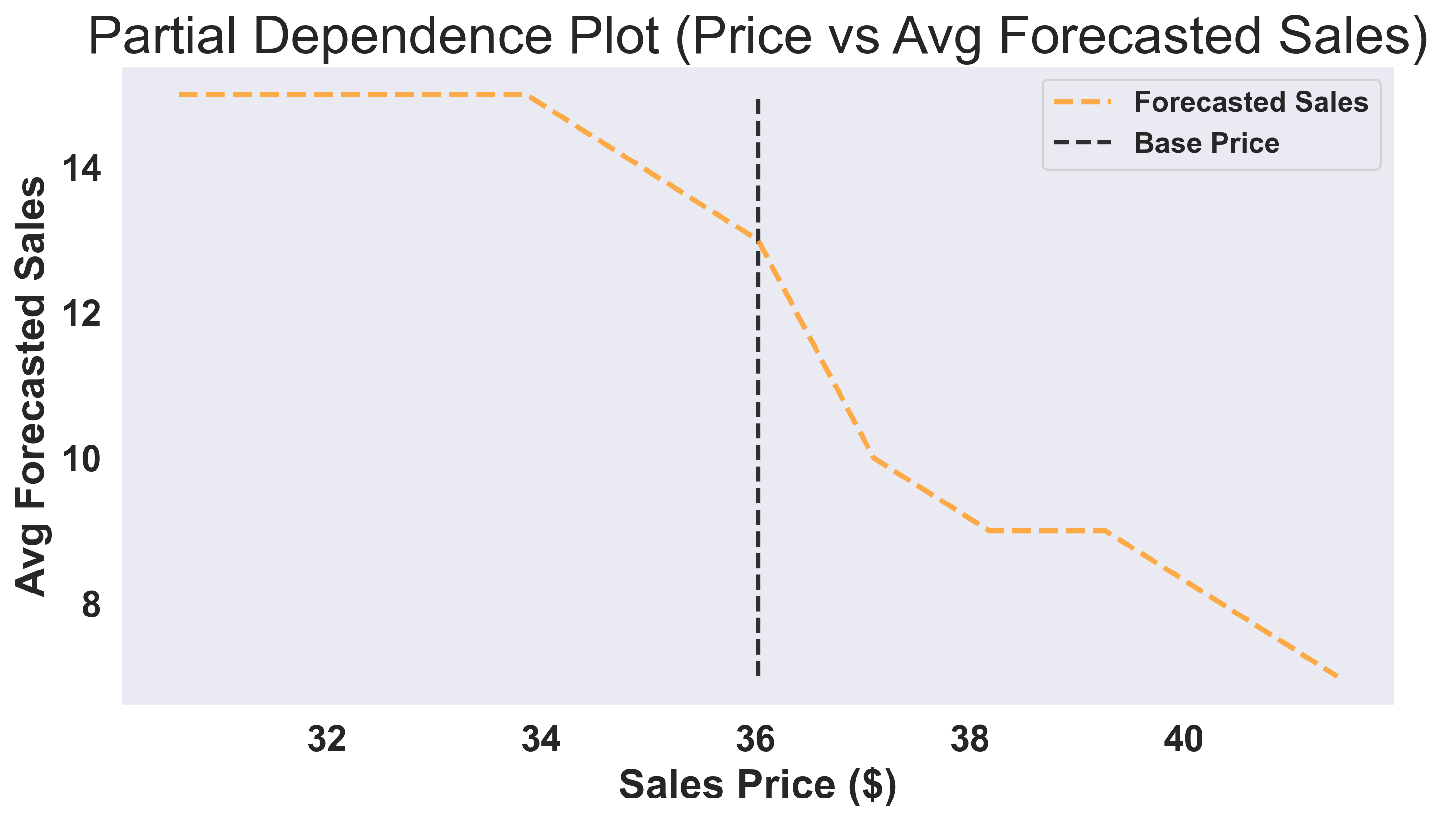
1. **How price-sensitive are my customers?** → Look at **Plot 1** (steeper slope = more sensitivity)
2. **What's my optimal price?** → Look at **Plot 2** (green marker)
3. **How much revenue am I leaving on the table?** → Look at **Plot 3** (red vs green bars)
## Complete Code
Here's the full working example you can run:
```python theme={null}
import asyncio
import matplotlib.cm as cm
import matplotlib.pyplot as plt
import numpy as np
import pandas as pd
import seaborn as sns
import swarm_visualizer
from swarm_visualizer.utility import set_axis_infos
from swarm_visualizer.utility.general_utils import set_plot_properties
from synthefy.api_client import SynthefyAsyncAPIClient
# Set swarm-visualizer properties for consistent styling
set_plot_properties(usetex=False)
# Step 1: Load Your Historical Sales Data
history_df = pd.read_csv(
"https://drive.google.com/uc?export=download&id=1FtLW17XE1NHcV1bF8mLW_2WHVKzrHts_"
)
future_df = pd.read_csv(
"https://drive.google.com/uc?export=download&id=1l2zG7GNTcdDm_HzKhhwii3GTI0Z99a9h"
)
def plot_historical_analysis(history_df):
"""
Create two plots to analyze historical price and sales data using swarm-visualizer.
Plot 1: Time series showing both unit price and sales over time (dual-axis)
Plot 2: Correlation plot between unit price and sales
Args:
history_df: DataFrame with 'date', 'unit_price', and 'sales' columns
"""
# Create figure with 2 rows and 1 column (vertical layout)
fig, (ax1, ax2) = plt.subplots(2, 1, figsize=(14, 10))
# --- Plot 1: Historical Time Series Plot using swarm-visualizer ---
# Prepare data for swarm-visualizer
normalized_dict = {
"Unit Price": {
"x": history_df["date"],
"y": history_df["unit_price"],
"lw": 2.5,
"linestyle": "--",
"color": "black", # Black dashed
"alpha": 0.8,
"zorder": 2,
},
"Sales": {
"x": history_df["date"],
"y": history_df["sales"],
"lw": 2.5,
"linestyle": "-",
"color": "black", # Black solid
"alpha": 0.8,
"zorder": 2,
},
}
# Use swarm-visualizer plot_overlaid_lineplot
swarm_visualizer.plot_overlaid_lineplot(
ax=ax1,
normalized_dict=normalized_dict,
title_str="Historical Unit Price and Sales Over Time",
ylabel="Unit Price / Sales",
xlabel="Date",
legend_present=True,
)
# Move legend to the right side outside the plot
ax1.legend(loc="center left", bbox_to_anchor=(1, 0.5))
# Use swarm-visualizer set_axis_infos for consistent styling
set_axis_infos(
ax=ax1,
xlabel="Date",
ylabel="Unit Price / Sales",
title_str="Historical Unit Price and Sales Over Time",
grid=True,
)
# Format x-axis labels - reduce label frequency and font size
ax1.set_xticks(ax1.get_xticks()[::2])
plt.setp(ax1.get_xticklabels(), rotation=45, ha="right", fontsize=12)
# --- Plot 2: Correlation Plot ---
corr_val = (
history_df[["unit_price", "sales"]].corr().loc["unit_price", "sales"]
)
sns.regplot(
x="unit_price",
y="sales",
data=history_df,
marker="o",
color="black", # Black points
line_kws={"color": "#E63946", "lw": 2, "label": f"Corr={corr_val:.2f}"},
ax=ax2,
scatter_kws={"alpha": 1.0},
ci=None,
)
ax2.set_xlabel("Unit Price ($)", fontsize=12)
ax2.set_ylabel("Sales", fontsize=12)
ax2.set_title(
"Correlation Between Unit Price and Sales",
fontsize=13,
weight="semibold",
)
ax2.legend()
ax2.grid(True, linestyle="--", alpha=0.4)
plt.tight_layout()
plt.savefig("pricing_data_visualization.png", dpi=300, bbox_inches="tight")
plt.show()
# Step 2: Visualize Historical Data
plot_historical_analysis(history_df)
# Step 3: Set Up Price Grid
base_price = history_df["unit_price"].mean()
price_simulation_range = np.linspace(base_price * 0.85, base_price * 1.15, 11)
print(f"Testing prices from ${price_simulation_range[0]:.2f} to ${price_simulation_range[-1]:.2f}")
# Step 4: Prepare Data for Forecasting
target_dfs = []
for price in price_simulation_range:
modified_future = future_df.copy()
modified_future["unit_price"] = price
target_dfs.append(modified_future)
# Step 5: Run AI Forecasts
async def get_forecasts():
async with SynthefyAsyncAPIClient() as api_client:
results = await api_client.forecast_dfs(
history_dfs=[history_df] * len(price_simulation_range),
target_dfs=target_dfs,
target_col="sales",
timestamp_col="date",
metadata_cols=["unit_price"],
leak_cols=["unit_price"],
model="Migas-1.0",
)
return results
results = asyncio.run(get_forecasts())
print(f"✓ Received {len(results)} forecast results")
# Step 6: Analyze Results
forecasts = [int(round(result["sales"].mean())) for result in results]
revenues = [price * forecast for price, forecast in zip(price_simulation_range, forecasts)]
optimal_idx = np.argmax(revenues)
optimal_price = price_simulation_range[optimal_idx]
optimal_revenue = revenues[optimal_idx]
base_idx = np.argmin(np.abs(price_simulation_range - base_price))
base_revenue = revenues[base_idx]
# Step 6: Create Time Series Forecast Visualization
def plot_forecast_time_series(
history_df,
future_df,
results,
price_simulation_range,
base_price,
optimal_price,
):
"""Plot historical data and all forecasts for different prices using swarm-visualizer."""
fig, ax = plt.subplots(figsize=(20, 6))
# Get future dates
future_dates = future_df["date"].tolist()
# Prepare data for swarm-visualizer - show only last 50% of history
history_cutoff = len(history_df) // 2
history_subset = history_df.iloc[history_cutoff:]
normalized_dict = {
"Historical Sales": {
"x": history_subset["date"],
"y": history_subset["sales"],
"lw": 3,
"linestyle": "-",
"color": "black",
"alpha": 0.8,
"zorder": 5,
}
}
# Plot ALL forecasts - every single price point!
# Orange gradient color scheme for all forecasts
# Create orange gradient colors for all price points
orange_colors = cm.Oranges(
np.linspace(0.3, 0.9, len(price_simulation_range))
)
for i, (price, result) in enumerate(zip(price_simulation_range, results)):
forecast_values = result["sales"].tolist()
# Combine historical data with forecast for this price
# Historical data (same for all prices) - only last 50%
historical_dates = history_subset["date"].tolist()
historical_sales = history_subset["sales"].tolist()
# Combine historical + forecast dates and values
combined_dates = historical_dates + future_dates
combined_sales = historical_sales + forecast_values
# Determine styling based on price type - all using orange gradient
color = orange_colors[i] # Each price gets its own orange shade
if abs(price - optimal_price) < 0.01:
label = f"Optimal Price (${price:.2f})"
linewidth = 4
alpha = 1.0
elif abs(price - base_price) < 0.01:
label = f"Base Price (${price:.2f})"
linewidth = 4
alpha = 1.0
else:
label = f"${price:.2f}"
linewidth = 2.0
alpha = 0.8
normalized_dict[label] = {
"x": combined_dates,
"y": combined_sales,
"lw": linewidth,
"linestyle": "-",
"color": color,
"alpha": alpha,
"zorder": 4,
}
# Use swarm-visualizer plot_overlaid_lineplot
swarm_visualizer.plot_overlaid_lineplot(
ax=ax,
normalized_dict=normalized_dict,
title_str="Pricing Simulation: Complete Time Series with Forecasts by Price",
ylabel="Sales",
xlabel="Date",
legend_present=True,
)
# Add light blue background for the forecast region
last_historical_date = history_subset["date"].iloc[-1]
last_forecast_date = future_df["date"].iloc[-1]
# Add light blue background for the forecast region
ax.axvspan(
xmin=last_historical_date,
xmax=last_forecast_date,
ymin=0,
ymax=1,
color="lightblue",
alpha=0.2,
zorder=1,
label="Forecast Region",
)
# Add light blue vertical line to separate historical from forecast
ax.axvline(
x=last_historical_date,
color="lightblue",
linestyle="-",
alpha=0.8,
linewidth=3,
zorder=3,
)
ax.text(
last_historical_date,
ax.get_ylim()[1] * 0.95,
"Forecasts",
ha="left",
va="top",
fontsize=12,
color="black",
weight="bold",
zorder=6,
)
# Use swarm-visualizer set_axis_infos for consistent styling
set_axis_infos(
ax=ax,
xlabel="Date",
ylabel="Sales",
title_str="Simulation: Forecasts for Different Prices",
grid=True,
)
# Rotate x-axis labels to prevent overlap and improve readability
plt.setp(ax.get_xticklabels(), rotation=45, ha="right", fontsize=10)
plt.savefig("forecast_time_series.png", dpi=300, bbox_inches="tight")
plt.show()
# Create time series visualization showing all forecasts
print("📊 Creating time series visualization of all forecasts...")
plot_forecast_time_series(
history_df,
future_df,
results,
price_simulation_range,
base_price,
optimal_price,
)
# Step 7: Analyze Results
forecasts = [int(round(result["sales"].mean())) for result in results]
revenues = [price * forecast for price, forecast in zip(price_simulation_range, forecasts)]
optimal_idx = np.argmax(revenues)
optimal_price = price_simulation_range[optimal_idx]
optimal_revenue = revenues[optimal_idx]
base_idx = np.argmin(np.abs(price_simulation_range - base_price))
base_revenue = revenues[base_idx]
# Step 8: Visualize Pricing Insights - Create separate plots for each analysis
# Plot 1: Price vs Sales (Partial Dependence Plot)
print("📊 Creating Price vs Sales plot...")
fig1, ax1 = plt.subplots(figsize=(10, 6))
# Prepare data for swarm-visualizer
normalized_dict = {
"Forecasted Sales": {
"x": price_simulation_range,
"y": forecasts,
"lw": 2.5,
"linestyle": "--",
"color": "#fea333", # Orange
"alpha": 0.9,
"zorder": 3,
},
"Base Price": {
"x": [base_price, base_price],
"y": [min(forecasts), max(forecasts)],
"lw": 2,
"linestyle": "--",
"color": "black",
"alpha": 0.8,
"zorder": 2,
},
}
# Use swarm-visualizer plot_overlaid_lineplot
swarm_visualizer.plot_overlaid_lineplot(
ax=ax1,
normalized_dict=normalized_dict,
title_str="Partial Dependence Plot (Price vs Avg Forecasted Sales)",
ylabel="Avg Forecasted Sales",
xlabel="Sales Price ($)",
legend_present=True,
)
# Use swarm-visualizer set_axis_infos for consistent styling
set_axis_infos(
ax=ax1,
xlabel="Sales Price ($)",
ylabel="Avg Forecasted Sales",
title_str="Partial Dependence Plot (Price vs Avg Forecasted Sales)",
grid=True,
)
plt.tight_layout()
plt.savefig("price_vs_sales.png", dpi=300, bbox_inches="tight")
plt.show()
# Plot 2: Price vs Revenue
print("📊 Creating Price vs Revenue plot...")
fig2, ax2 = plt.subplots(figsize=(10, 6))
# Prepare data for swarm-visualizer
normalized_dict = {
"Expected Revenue": {
"x": price_simulation_range,
"y": revenues,
"lw": 2.5,
"linestyle": "--",
"color": "#fea333", # Orange
"alpha": 0.9,
"zorder": 3,
},
"Base Price": {
"x": [base_price, base_price],
"y": [min(revenues), max(revenues)],
"lw": 2,
"linestyle": "--",
"color": "black",
"alpha": 0.8,
"zorder": 2,
},
"Optimal Price": {
"x": [optimal_price, optimal_price],
"y": [min(revenues), max(revenues)],
"lw": 2,
"linestyle": "--",
"color": "#2ECC71",
"alpha": 0.8,
"zorder": 2,
},
}
# Use swarm-visualizer plot_overlaid_lineplot
swarm_visualizer.plot_overlaid_lineplot(
ax=ax2,
normalized_dict=normalized_dict,
title_str="Price vs Revenue Optimization",
ylabel="Expected Revenue ($)",
xlabel="Sales Price ($)",
legend_present=True,
)
# Use swarm-visualizer set_axis_infos for consistent styling
set_axis_infos(
ax=ax2,
xlabel="Sales Price ($)",
ylabel="Expected Revenue ($)",
title_str="Price vs Revenue Optimization",
grid=True,
)
# Format y-axis for revenue
ax2.yaxis.set_major_formatter(plt.FuncFormatter(lambda x, p: f"${x:,.0f}"))
plt.tight_layout()
plt.savefig("price_vs_revenue.png", dpi=300, bbox_inches="tight")
plt.show()
# Plot 3: Revenue comparison bar chart
print("📊 Creating Revenue Comparison plot...")
fig3, ax3 = plt.subplots(figsize=(8, 6))
# Create bar chart with consistent styling
bar_colors = ["black", "#51CF66"]
bars = ax3.bar(
[
"Base Price\n" + f"${base_price:.2f}",
"Optimal Price\n" + f"${optimal_price:.2f}",
],
[base_revenue, optimal_revenue],
color=bar_colors,
alpha=0.8,
edgecolor="black",
linewidth=2,
)
# Use swarm-visualizer set_axis_infos for consistent styling
set_axis_infos(
ax=ax3,
xlabel="Pricing Strategy",
ylabel="Expected Revenue ($)",
title_str="Revenue Comparison",
grid=True,
)
# Add value labels on bars
for bar in bars:
height = bar.get_height()
ax3.text(
bar.get_x() + bar.get_width() / 2.0,
height,
f"${height:,.0f}",
ha="center",
va="bottom",
fontsize=11,
fontweight="bold",
)
# Format y-axis for revenue
ax3.yaxis.set_major_formatter(plt.FuncFormatter(lambda x, p: f"${x:,.0f}"))
plt.tight_layout()
plt.savefig("revenue_comparison.png", dpi=300, bbox_inches="tight")
plt.show()
```
## Next Steps
1. **Prepare your own data** with historical prices and transactions
2. **Run the simulation** with different price ranges
3. **Analyze the results** to find your optimal price point
**Pro tip**: Run pricing simulations regularly (monthly or quarterly) as market conditions change. Your optimal price today might not be optimal tomorrow!
Now you can answer critical business questions:
1. **How price-sensitive are my customers?** → Look at **Plot 1** (steeper slope = more sensitivity)
2. **What's my optimal price?** → Look at **Plot 2** (green marker)
3. **How much revenue am I leaving on the table?** → Look at **Plot 3** (red vs green bars)
## Complete Code
Here's the full working example you can run:
```python theme={null}
import asyncio
import matplotlib.cm as cm
import matplotlib.pyplot as plt
import numpy as np
import pandas as pd
import seaborn as sns
import swarm_visualizer
from swarm_visualizer.utility import set_axis_infos
from swarm_visualizer.utility.general_utils import set_plot_properties
from synthefy.api_client import SynthefyAsyncAPIClient
# Set swarm-visualizer properties for consistent styling
set_plot_properties(usetex=False)
# Step 1: Load Your Historical Sales Data
history_df = pd.read_csv(
"https://drive.google.com/uc?export=download&id=1FtLW17XE1NHcV1bF8mLW_2WHVKzrHts_"
)
future_df = pd.read_csv(
"https://drive.google.com/uc?export=download&id=1l2zG7GNTcdDm_HzKhhwii3GTI0Z99a9h"
)
def plot_historical_analysis(history_df):
"""
Create two plots to analyze historical price and sales data using swarm-visualizer.
Plot 1: Time series showing both unit price and sales over time (dual-axis)
Plot 2: Correlation plot between unit price and sales
Args:
history_df: DataFrame with 'date', 'unit_price', and 'sales' columns
"""
# Create figure with 2 rows and 1 column (vertical layout)
fig, (ax1, ax2) = plt.subplots(2, 1, figsize=(14, 10))
# --- Plot 1: Historical Time Series Plot using swarm-visualizer ---
# Prepare data for swarm-visualizer
normalized_dict = {
"Unit Price": {
"x": history_df["date"],
"y": history_df["unit_price"],
"lw": 2.5,
"linestyle": "--",
"color": "black", # Black dashed
"alpha": 0.8,
"zorder": 2,
},
"Sales": {
"x": history_df["date"],
"y": history_df["sales"],
"lw": 2.5,
"linestyle": "-",
"color": "black", # Black solid
"alpha": 0.8,
"zorder": 2,
},
}
# Use swarm-visualizer plot_overlaid_lineplot
swarm_visualizer.plot_overlaid_lineplot(
ax=ax1,
normalized_dict=normalized_dict,
title_str="Historical Unit Price and Sales Over Time",
ylabel="Unit Price / Sales",
xlabel="Date",
legend_present=True,
)
# Move legend to the right side outside the plot
ax1.legend(loc="center left", bbox_to_anchor=(1, 0.5))
# Use swarm-visualizer set_axis_infos for consistent styling
set_axis_infos(
ax=ax1,
xlabel="Date",
ylabel="Unit Price / Sales",
title_str="Historical Unit Price and Sales Over Time",
grid=True,
)
# Format x-axis labels - reduce label frequency and font size
ax1.set_xticks(ax1.get_xticks()[::2])
plt.setp(ax1.get_xticklabels(), rotation=45, ha="right", fontsize=12)
# --- Plot 2: Correlation Plot ---
corr_val = (
history_df[["unit_price", "sales"]].corr().loc["unit_price", "sales"]
)
sns.regplot(
x="unit_price",
y="sales",
data=history_df,
marker="o",
color="black", # Black points
line_kws={"color": "#E63946", "lw": 2, "label": f"Corr={corr_val:.2f}"},
ax=ax2,
scatter_kws={"alpha": 1.0},
ci=None,
)
ax2.set_xlabel("Unit Price ($)", fontsize=12)
ax2.set_ylabel("Sales", fontsize=12)
ax2.set_title(
"Correlation Between Unit Price and Sales",
fontsize=13,
weight="semibold",
)
ax2.legend()
ax2.grid(True, linestyle="--", alpha=0.4)
plt.tight_layout()
plt.savefig("pricing_data_visualization.png", dpi=300, bbox_inches="tight")
plt.show()
# Step 2: Visualize Historical Data
plot_historical_analysis(history_df)
# Step 3: Set Up Price Grid
base_price = history_df["unit_price"].mean()
price_simulation_range = np.linspace(base_price * 0.85, base_price * 1.15, 11)
print(f"Testing prices from ${price_simulation_range[0]:.2f} to ${price_simulation_range[-1]:.2f}")
# Step 4: Prepare Data for Forecasting
target_dfs = []
for price in price_simulation_range:
modified_future = future_df.copy()
modified_future["unit_price"] = price
target_dfs.append(modified_future)
# Step 5: Run AI Forecasts
async def get_forecasts():
async with SynthefyAsyncAPIClient() as api_client:
results = await api_client.forecast_dfs(
history_dfs=[history_df] * len(price_simulation_range),
target_dfs=target_dfs,
target_col="sales",
timestamp_col="date",
metadata_cols=["unit_price"],
leak_cols=["unit_price"],
model="Migas-1.0",
)
return results
results = asyncio.run(get_forecasts())
print(f"✓ Received {len(results)} forecast results")
# Step 6: Analyze Results
forecasts = [int(round(result["sales"].mean())) for result in results]
revenues = [price * forecast for price, forecast in zip(price_simulation_range, forecasts)]
optimal_idx = np.argmax(revenues)
optimal_price = price_simulation_range[optimal_idx]
optimal_revenue = revenues[optimal_idx]
base_idx = np.argmin(np.abs(price_simulation_range - base_price))
base_revenue = revenues[base_idx]
# Step 6: Create Time Series Forecast Visualization
def plot_forecast_time_series(
history_df,
future_df,
results,
price_simulation_range,
base_price,
optimal_price,
):
"""Plot historical data and all forecasts for different prices using swarm-visualizer."""
fig, ax = plt.subplots(figsize=(20, 6))
# Get future dates
future_dates = future_df["date"].tolist()
# Prepare data for swarm-visualizer - show only last 50% of history
history_cutoff = len(history_df) // 2
history_subset = history_df.iloc[history_cutoff:]
normalized_dict = {
"Historical Sales": {
"x": history_subset["date"],
"y": history_subset["sales"],
"lw": 3,
"linestyle": "-",
"color": "black",
"alpha": 0.8,
"zorder": 5,
}
}
# Plot ALL forecasts - every single price point!
# Orange gradient color scheme for all forecasts
# Create orange gradient colors for all price points
orange_colors = cm.Oranges(
np.linspace(0.3, 0.9, len(price_simulation_range))
)
for i, (price, result) in enumerate(zip(price_simulation_range, results)):
forecast_values = result["sales"].tolist()
# Combine historical data with forecast for this price
# Historical data (same for all prices) - only last 50%
historical_dates = history_subset["date"].tolist()
historical_sales = history_subset["sales"].tolist()
# Combine historical + forecast dates and values
combined_dates = historical_dates + future_dates
combined_sales = historical_sales + forecast_values
# Determine styling based on price type - all using orange gradient
color = orange_colors[i] # Each price gets its own orange shade
if abs(price - optimal_price) < 0.01:
label = f"Optimal Price (${price:.2f})"
linewidth = 4
alpha = 1.0
elif abs(price - base_price) < 0.01:
label = f"Base Price (${price:.2f})"
linewidth = 4
alpha = 1.0
else:
label = f"${price:.2f}"
linewidth = 2.0
alpha = 0.8
normalized_dict[label] = {
"x": combined_dates,
"y": combined_sales,
"lw": linewidth,
"linestyle": "-",
"color": color,
"alpha": alpha,
"zorder": 4,
}
# Use swarm-visualizer plot_overlaid_lineplot
swarm_visualizer.plot_overlaid_lineplot(
ax=ax,
normalized_dict=normalized_dict,
title_str="Pricing Simulation: Complete Time Series with Forecasts by Price",
ylabel="Sales",
xlabel="Date",
legend_present=True,
)
# Add light blue background for the forecast region
last_historical_date = history_subset["date"].iloc[-1]
last_forecast_date = future_df["date"].iloc[-1]
# Add light blue background for the forecast region
ax.axvspan(
xmin=last_historical_date,
xmax=last_forecast_date,
ymin=0,
ymax=1,
color="lightblue",
alpha=0.2,
zorder=1,
label="Forecast Region",
)
# Add light blue vertical line to separate historical from forecast
ax.axvline(
x=last_historical_date,
color="lightblue",
linestyle="-",
alpha=0.8,
linewidth=3,
zorder=3,
)
ax.text(
last_historical_date,
ax.get_ylim()[1] * 0.95,
"Forecasts",
ha="left",
va="top",
fontsize=12,
color="black",
weight="bold",
zorder=6,
)
# Use swarm-visualizer set_axis_infos for consistent styling
set_axis_infos(
ax=ax,
xlabel="Date",
ylabel="Sales",
title_str="Simulation: Forecasts for Different Prices",
grid=True,
)
# Rotate x-axis labels to prevent overlap and improve readability
plt.setp(ax.get_xticklabels(), rotation=45, ha="right", fontsize=10)
plt.savefig("forecast_time_series.png", dpi=300, bbox_inches="tight")
plt.show()
# Create time series visualization showing all forecasts
print("📊 Creating time series visualization of all forecasts...")
plot_forecast_time_series(
history_df,
future_df,
results,
price_simulation_range,
base_price,
optimal_price,
)
# Step 7: Analyze Results
forecasts = [int(round(result["sales"].mean())) for result in results]
revenues = [price * forecast for price, forecast in zip(price_simulation_range, forecasts)]
optimal_idx = np.argmax(revenues)
optimal_price = price_simulation_range[optimal_idx]
optimal_revenue = revenues[optimal_idx]
base_idx = np.argmin(np.abs(price_simulation_range - base_price))
base_revenue = revenues[base_idx]
# Step 8: Visualize Pricing Insights - Create separate plots for each analysis
# Plot 1: Price vs Sales (Partial Dependence Plot)
print("📊 Creating Price vs Sales plot...")
fig1, ax1 = plt.subplots(figsize=(10, 6))
# Prepare data for swarm-visualizer
normalized_dict = {
"Forecasted Sales": {
"x": price_simulation_range,
"y": forecasts,
"lw": 2.5,
"linestyle": "--",
"color": "#fea333", # Orange
"alpha": 0.9,
"zorder": 3,
},
"Base Price": {
"x": [base_price, base_price],
"y": [min(forecasts), max(forecasts)],
"lw": 2,
"linestyle": "--",
"color": "black",
"alpha": 0.8,
"zorder": 2,
},
}
# Use swarm-visualizer plot_overlaid_lineplot
swarm_visualizer.plot_overlaid_lineplot(
ax=ax1,
normalized_dict=normalized_dict,
title_str="Partial Dependence Plot (Price vs Avg Forecasted Sales)",
ylabel="Avg Forecasted Sales",
xlabel="Sales Price ($)",
legend_present=True,
)
# Use swarm-visualizer set_axis_infos for consistent styling
set_axis_infos(
ax=ax1,
xlabel="Sales Price ($)",
ylabel="Avg Forecasted Sales",
title_str="Partial Dependence Plot (Price vs Avg Forecasted Sales)",
grid=True,
)
plt.tight_layout()
plt.savefig("price_vs_sales.png", dpi=300, bbox_inches="tight")
plt.show()
# Plot 2: Price vs Revenue
print("📊 Creating Price vs Revenue plot...")
fig2, ax2 = plt.subplots(figsize=(10, 6))
# Prepare data for swarm-visualizer
normalized_dict = {
"Expected Revenue": {
"x": price_simulation_range,
"y": revenues,
"lw": 2.5,
"linestyle": "--",
"color": "#fea333", # Orange
"alpha": 0.9,
"zorder": 3,
},
"Base Price": {
"x": [base_price, base_price],
"y": [min(revenues), max(revenues)],
"lw": 2,
"linestyle": "--",
"color": "black",
"alpha": 0.8,
"zorder": 2,
},
"Optimal Price": {
"x": [optimal_price, optimal_price],
"y": [min(revenues), max(revenues)],
"lw": 2,
"linestyle": "--",
"color": "#2ECC71",
"alpha": 0.8,
"zorder": 2,
},
}
# Use swarm-visualizer plot_overlaid_lineplot
swarm_visualizer.plot_overlaid_lineplot(
ax=ax2,
normalized_dict=normalized_dict,
title_str="Price vs Revenue Optimization",
ylabel="Expected Revenue ($)",
xlabel="Sales Price ($)",
legend_present=True,
)
# Use swarm-visualizer set_axis_infos for consistent styling
set_axis_infos(
ax=ax2,
xlabel="Sales Price ($)",
ylabel="Expected Revenue ($)",
title_str="Price vs Revenue Optimization",
grid=True,
)
# Format y-axis for revenue
ax2.yaxis.set_major_formatter(plt.FuncFormatter(lambda x, p: f"${x:,.0f}"))
plt.tight_layout()
plt.savefig("price_vs_revenue.png", dpi=300, bbox_inches="tight")
plt.show()
# Plot 3: Revenue comparison bar chart
print("📊 Creating Revenue Comparison plot...")
fig3, ax3 = plt.subplots(figsize=(8, 6))
# Create bar chart with consistent styling
bar_colors = ["black", "#51CF66"]
bars = ax3.bar(
[
"Base Price\n" + f"${base_price:.2f}",
"Optimal Price\n" + f"${optimal_price:.2f}",
],
[base_revenue, optimal_revenue],
color=bar_colors,
alpha=0.8,
edgecolor="black",
linewidth=2,
)
# Use swarm-visualizer set_axis_infos for consistent styling
set_axis_infos(
ax=ax3,
xlabel="Pricing Strategy",
ylabel="Expected Revenue ($)",
title_str="Revenue Comparison",
grid=True,
)
# Add value labels on bars
for bar in bars:
height = bar.get_height()
ax3.text(
bar.get_x() + bar.get_width() / 2.0,
height,
f"${height:,.0f}",
ha="center",
va="bottom",
fontsize=11,
fontweight="bold",
)
# Format y-axis for revenue
ax3.yaxis.set_major_formatter(plt.FuncFormatter(lambda x, p: f"${x:,.0f}"))
plt.tight_layout()
plt.savefig("revenue_comparison.png", dpi=300, bbox_inches="tight")
plt.show()
```
## Next Steps
1. **Prepare your own data** with historical prices and transactions
2. **Run the simulation** with different price ranges
3. **Analyze the results** to find your optimal price point
**Pro tip**: Run pricing simulations regularly (monthly or quarterly) as market conditions change. Your optimal price today might not be optimal tomorrow!