> ## Documentation Index
> Fetch the complete documentation index at: https://docs.synthefy.com/llms.txt
> Use this file to discover all available pages before exploring further.
# Inventory Forecasting
> Learn how to improve inventory forecasting accuracy by incorporating weather data and how to do conditional forecasting to discover which items move together.
## What is inventory forecasting? How does it help?
**Problem**: Retailers struggle to predict demand accurately, especially when external factors like weather dramatically impact sales. Traditional forecasting methods may ignore these contextual signals, leading to stockouts during high-demand periods or excess inventory during low-demand periods.
**Our approach**: Incorporate weather data as context, and demonstrate conditional forecasting to discover which items sell together.
**Outcome**: Our models achieve significantly lower error rates by incorporating weather data, and further analysis reveals which products move together, which can enable strategic decisions like complementary product placement and targeted promotions.
## Prerequisites
First, install the required libraries:
```bash theme={null}
pip install synthefy matplotlib numpy pandas swarm-visualizer
```
### 1. Load and Prepare Data
We'll use a real-world dataset from a Chicago store that tracks sales for multiple products along with daily weather conditions. This rich dataset allows us to compare simple time-series forecasting against forecasts that incorporate weather data.
```python theme={null}
import os
from typing import Dict, Any
import matplotlib.pyplot as plt
import numpy as np
import pandas as pd
import swarm_visualizer
from swarm_visualizer.utility import set_axis_infos
from synthefy import SynthefyAPIClient
# Configuration
TIMESTAMP_COL = "date"
GROUP_COL = "item_name"
TARGET_COL = "sales"
METADATA_COLS = [
"temperature",
"humidity",
"wind_speed",
"cloud_cover",
"precipitation",
]
# Initialize API client
API_CLIENT = SynthefyAPIClient(api_key="YOUR_API_KEY")
# Load the Chicago store sales dataset
data_df = pd.read_csv(
"https://drive.google.com/uc?export=download&id=1YcAFpFzcZgX0elekB_vdWrzTzEMbGzuD"
)
# Convert date column to datetime
data_df[TIMESTAMP_COL] = pd.to_datetime(data_df[TIMESTAMP_COL])
# Sort by date
data_df = data_df.sort_values(TIMESTAMP_COL).reset_index(drop=True)
# ============================================================================
# HELPER FUNCTIONS
# ============================================================================
def format_item_name(item_name: str) -> str:
"""Format item name professionally by replacing underscores with spaces and applying title case."""
return item_name.replace("_", " ").title()
```
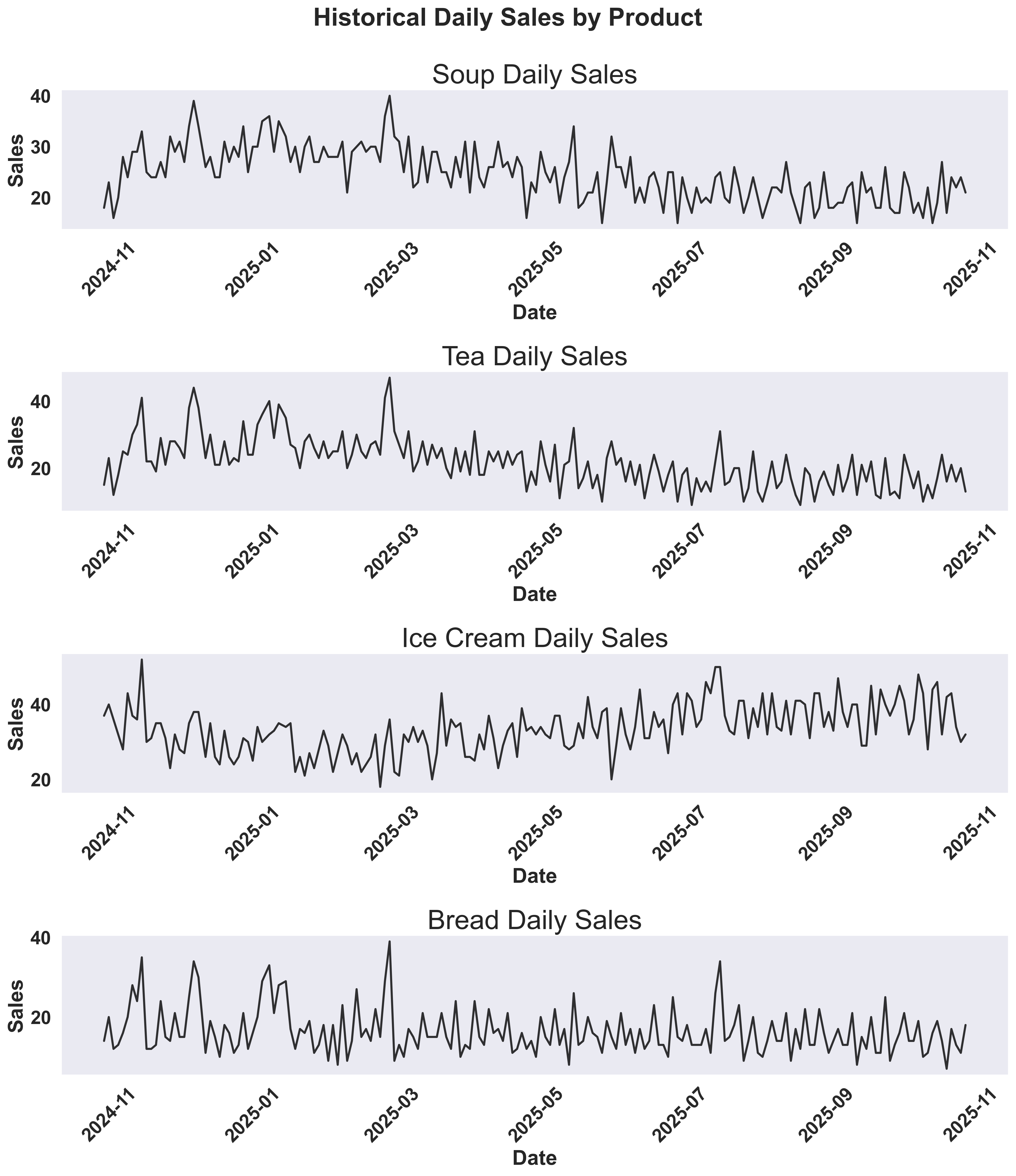
### 2. Visualize Historical Sales Patterns
Before running forecasts, let's visualize the historical sales data to understand patterns and seasonality for each product. We'll create time series plots showing how sales vary over time.
```python theme={null}
def plot_historical_sales(data_df: pd.DataFrame) -> None:
"""Create separate subplots for each item's sales over time using swarm-visualizer."""
items = data_df[GROUP_COL].unique()
# Create subplots - 4x1 vertical layout for 4 items
fig, axes = plt.subplots(4, 1, figsize=(14, 16))
axes = axes.flatten() # Flatten to 1D array for easier indexing
# Plot each item in its own subplot
for idx, item in enumerate(items):
if idx >= 4: # Only plot first 4 items
break
ax = axes[idx]
# Filter data for this item
item_data = data_df[data_df[GROUP_COL] == item].sort_values(TIMESTAMP_COL)
# Plot only last 50% of history
history_cutoff = len(item_data) // 2
item_data_subset = item_data.iloc[history_cutoff:]
# Prepare data for swarm-visualizer
normalized_dict = {
f"{format_item_name(item)} Sales": {
"x": item_data_subset[TIMESTAMP_COL][::2],
"y": item_data_subset[TARGET_COL][::2],
"lw": 2.5,
"linestyle": "-",
"color": "black",
"alpha": 0.8,
}
}
# Use swarm-visualizer plot_overlaid_lineplot
swarm_visualizer.plot_overlaid_lineplot(
ax=ax,
normalized_dict=normalized_dict,
title_str=f"{format_item_name(item)} Daily Sales",
ylabel="Sales",
xlabel="Date",
legend_present=False,
)
# Use swarm-visualizer set_axis_infos for consistent styling
set_axis_infos(
ax=ax,
xlabel="Date",
ylabel="Sales",
title_str=f"{format_item_name(item)} Daily Sales",
grid=True,
)
plt.setp(ax.get_xticklabels(), rotation=45, ha="right")
# Hide unused subplots if there are fewer than 4 items
for idx in range(len(items), 4):
axes[idx].set_visible(False)
# Overall title
fig.suptitle(
"Historical Daily Sales by Product",
fontsize=24,
fontweight="bold",
y=0.99,
)
plt.tight_layout()
# Create directory if it doesn't exist
os.makedirs("inventory_forecasting_plots", exist_ok=True)
filepath = os.path.abspath(
"inventory_forecasting_plots/historical_sales_overview.png"
)
plt.savefig(filepath, dpi=300, bbox_inches="tight")
plt.close()
print(f"✓ Saved: {filepath}")
def plot_sales_with_weather(data_df: pd.DataFrame) -> None:
"""Create separate subplots for each item's sales with temperature overlay using swarm-visualizer."""
items = data_df[GROUP_COL].unique()
# Create subplots - 4x1 vertical layout for 4 items
fig, axes = plt.subplots(4, 1, figsize=(14, 16))
axes = axes.flatten() # Flatten to 1D array for easier indexing
# Get overall temperature (from unique timestamps) - last 50% only
weather_data = data_df.drop_duplicates(TIMESTAMP_COL).sort_values(TIMESTAMP_COL)
weather_cutoff = len(weather_data) // 2
weather_data = weather_data.iloc[weather_cutoff:]
# Plot each item in its own subplot with temperature
for idx, item in enumerate(items):
if idx >= 4: # Only plot first 4 items
break
ax = axes[idx]
# Filter data for this item
item_data = data_df[data_df[GROUP_COL] == item].sort_values(TIMESTAMP_COL)
# Plot only last 50% of history
history_cutoff = len(item_data) // 2
item_data_subset = item_data.iloc[history_cutoff:]
# Prepare data for swarm-visualizer with both sales and temperature
normalized_dict = {
f"{format_item_name(item)} Sales": {
"x": item_data_subset[TIMESTAMP_COL][::2],
"y": item_data_subset[TARGET_COL][::2],
"lw": 2.5,
"linestyle": "-",
"color": "black",
"alpha": 0.8,
},
"Temperature": {
"x": weather_data[TIMESTAMP_COL][::2],
"y": weather_data["temperature"][::2],
"lw": 2,
"linestyle": "--",
"color": "black",
"alpha": 0.5,
}
}
# Use swarm-visualizer plot_overlaid_lineplot
swarm_visualizer.plot_overlaid_lineplot(
ax=ax,
normalized_dict=normalized_dict,
title_str=f"{format_item_name(item)} Daily Sales and Temperature",
ylabel="Sales / Temperature (°F)",
xlabel="Date",
legend_present=True,
)
# Move legend to the right side
ax.legend(loc="center left", bbox_to_anchor=(1, 0.5))
# Use swarm-visualizer set_axis_infos for consistent styling
set_axis_infos(
ax=ax,
xlabel="Date",
ylabel="Sales / Temperature (°F)",
title_str=f"{format_item_name(item)} Daily Sales and Temperature",
grid=True,
)
plt.setp(ax.get_xticklabels(), rotation=45, ha="right")
# Hide unused subplots if there are fewer than 4 items
for idx in range(len(items), 4):
axes[idx].set_visible(False)
# Overall title
fig.suptitle(
"Daily Sales and Temperature by Product",
fontsize=24,
fontweight="bold",
y=0.99,
)
plt.tight_layout()
# Create directory if it doesn't exist
os.makedirs("inventory_forecasting_plots", exist_ok=True)
filepath = os.path.abspath(
"inventory_forecasting_plots/sales_and_weather.png"
)
plt.savefig(filepath, dpi=300, bbox_inches="tight")
plt.close()
print(f"✓ Saved: {filepath}")
# Generate the visualizations
plot_historical_sales(data_df)
plot_sales_with_weather(data_df)
```
These visualizations help you understand:
* **Sales trends**: Are there seasonal patterns or trends over time?
* **Weather impact**: How does temperature correlate with sales?
* **Product differences**: Do different products show different sensitivities to temperature?
### Historical Sales Overview
 ### Historical Sales and Temperature
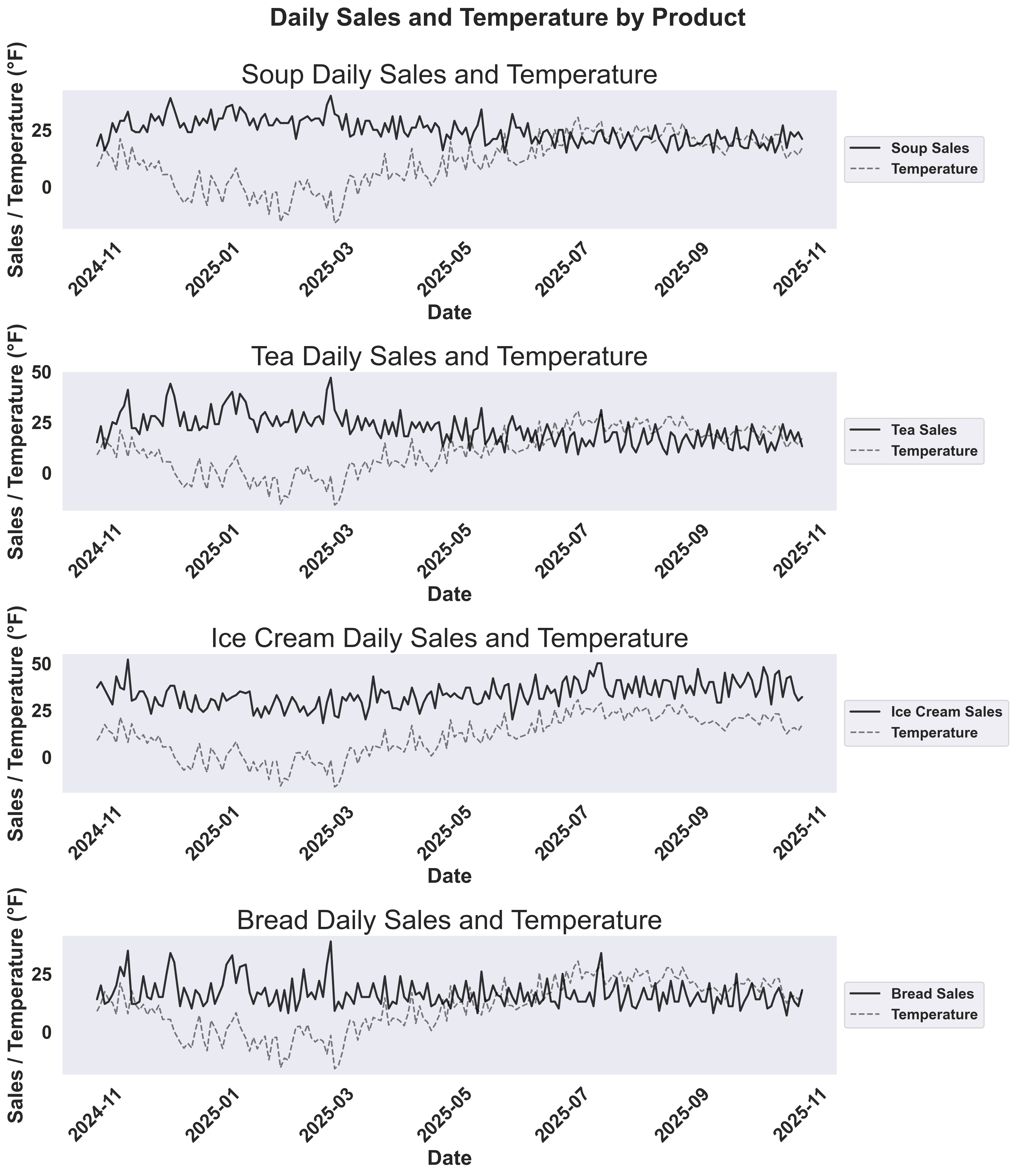 This dual-axis plot reveals the relationship between sales and temperature:
* **Solid colored lines**: Sales for each product
* **Dashed red line**: Temperature overlay to show how weather affects demand
### 3. Split Data and Run Forecasts
We'll split the data and forecast the last 20% of the data to compare univariate vs multivariate forecasting approaches.
```python theme={null}
def forecast_item(data_df: pd.DataFrame, item_name: str, history_ratio: float = 0.8) -> Dict[str, Any]:
"""Compare univariate vs multivariate forecasting for a single item."""
# Split data
item_data = data_df[data_df[GROUP_COL] == item_name].sort_values(TIMESTAMP_COL)
split_idx = int(len(item_data) * history_ratio)
history_df = item_data.iloc[:split_idx].copy()
target_df = item_data.iloc[split_idx:].copy()
# Univariate forecast (time series only)
univariate_forecast = API_CLIENT.forecast_dfs(
history_dfs=[history_df],
target_dfs=[target_df],
target_col=TARGET_COL,
timestamp_col=TIMESTAMP_COL,
metadata_cols=[],
leak_cols=[],
model="Migas-1.0",
)
# Multivariate forecast (time series + weather)
multivariate_forecast = API_CLIENT.forecast_dfs(
history_dfs=[history_df],
target_dfs=[target_df],
target_col=TARGET_COL,
timestamp_col=TIMESTAMP_COL,
metadata_cols=METADATA_COLS,
leak_cols=METADATA_COLS,
model="Migas-1.0",
)
return {
'item_name': item_name,
'history_df': history_df,
'target_df': target_df,
'univariate_predictions': univariate_forecast[0][TARGET_COL].values,
'multivariate_predictions': multivariate_forecast[0][TARGET_COL].values,
}
# Run forecasts for Soup and Tea
soup_results = forecast_item(data_df, 'soup')
tea_results = forecast_item(data_df, 'tea')
```
### 4. Visualize Forecast Results
Create visualizations to compare the forecasting approaches:
```python theme={null}
def plot_forecast_comparison(results: Dict[str, Any]) -> None:
"""Create time series plot with forecasts and MAPE values in legend labels."""
item_name: str = results['item_name']
history_df: pd.DataFrame = results['history_df']
target_df: pd.DataFrame = results['target_df']
univariate_preds: np.ndarray = results['univariate_predictions']
multivariate_preds: np.ndarray = results['multivariate_predictions']
# Calculate MAPE
actual = target_df[TARGET_COL].values
univariate_mape = np.mean(np.abs((actual - univariate_preds) / actual)) * 100
multivariate_mape = np.mean(np.abs((actual - multivariate_preds) / actual)) * 100
colors = {
"univariate": "#fea333", # Orange
"multivariate": "#1E90FF", # Blue
"groundtruth": "black",
"cross_item": "#2ECC71", # Green
}
# Create time series plot with forecasts
fig, ax = plt.subplots(1, 1, figsize=(16, 7))
# Plot only last 50% of history
history_cutoff = len(history_df) // 2
history_subset = history_df.iloc[history_cutoff:]
# Prepare data for swarm-visualizer
# Combine historical and test data for actual values
actual_x = pd.concat([history_subset[TIMESTAMP_COL], target_df[TIMESTAMP_COL]])
actual_y = pd.concat([history_subset[TARGET_COL], target_df[TARGET_COL]])
normalized_dict = {
"Actual": {
"x": actual_x,
"y": actual_y,
"lw": 2,
"linestyle": "-",
"color": colors["groundtruth"],
"alpha": 0.8,
"zorder": 1,
},
f"Univariate Forecast (MAPE: {univariate_mape:.2f}%)": {
"x": target_df[TIMESTAMP_COL],
"y": univariate_preds,
"lw": 1.5,
"linestyle": "-",
"color": colors["univariate"],
"alpha": 0.7,
"zorder": 2,
},
f"Multivariate Forecast (MAPE: {multivariate_mape:.2f}%)": {
"x": target_df[TIMESTAMP_COL],
"y": multivariate_preds,
"lw": 1.5,
"linestyle": "-",
"color": colors["multivariate"],
"alpha": 0.7,
"zorder": 3,
}
}
# Use swarm-visualizer plot_overlaid_lineplot
swarm_visualizer.plot_overlaid_lineplot(
ax=ax,
normalized_dict=normalized_dict,
title_str=f"Forecast {format_item_name(item_name)}",
ylabel="Sales",
xlabel="Date",
legend_present=True,
)
# Add vertical line at split
split_date = target_df[TIMESTAMP_COL].iloc[0]
ax.axvline(
x=split_date,
color="red",
linestyle="--",
linewidth=2,
alpha=0.7,
label="Train/Test Split",
zorder=1,
)
# Move legend inside the plot area with default font size
ax.legend(loc="upper right", frameon=True)
# Use swarm-visualizer set_axis_infos for consistent styling
set_axis_infos(
ax=ax,
xlabel="Date",
ylabel="Sales",
title_str=f"Forecast {format_item_name(item_name)}",
grid=True,
)
plt.setp(ax.get_xticklabels(), rotation=45, ha="right")
plt.tight_layout()
plt.savefig(f'forecast_time_series_{item_name.lower()}.png', dpi=300, bbox_inches='tight')
plt.close()
# Create forecast comparison plots
plot_forecast_comparison(soup_results)
plot_forecast_comparison(tea_results)
```
### Example Output: Soup Forecast Comparison
This dual-axis plot reveals the relationship between sales and temperature:
* **Solid colored lines**: Sales for each product
* **Dashed red line**: Temperature overlay to show how weather affects demand
### 3. Split Data and Run Forecasts
We'll split the data and forecast the last 20% of the data to compare univariate vs multivariate forecasting approaches.
```python theme={null}
def forecast_item(data_df: pd.DataFrame, item_name: str, history_ratio: float = 0.8) -> Dict[str, Any]:
"""Compare univariate vs multivariate forecasting for a single item."""
# Split data
item_data = data_df[data_df[GROUP_COL] == item_name].sort_values(TIMESTAMP_COL)
split_idx = int(len(item_data) * history_ratio)
history_df = item_data.iloc[:split_idx].copy()
target_df = item_data.iloc[split_idx:].copy()
# Univariate forecast (time series only)
univariate_forecast = API_CLIENT.forecast_dfs(
history_dfs=[history_df],
target_dfs=[target_df],
target_col=TARGET_COL,
timestamp_col=TIMESTAMP_COL,
metadata_cols=[],
leak_cols=[],
model="Migas-1.0",
)
# Multivariate forecast (time series + weather)
multivariate_forecast = API_CLIENT.forecast_dfs(
history_dfs=[history_df],
target_dfs=[target_df],
target_col=TARGET_COL,
timestamp_col=TIMESTAMP_COL,
metadata_cols=METADATA_COLS,
leak_cols=METADATA_COLS,
model="Migas-1.0",
)
return {
'item_name': item_name,
'history_df': history_df,
'target_df': target_df,
'univariate_predictions': univariate_forecast[0][TARGET_COL].values,
'multivariate_predictions': multivariate_forecast[0][TARGET_COL].values,
}
# Run forecasts for Soup and Tea
soup_results = forecast_item(data_df, 'soup')
tea_results = forecast_item(data_df, 'tea')
```
### 4. Visualize Forecast Results
Create visualizations to compare the forecasting approaches:
```python theme={null}
def plot_forecast_comparison(results: Dict[str, Any]) -> None:
"""Create time series plot with forecasts and MAPE values in legend labels."""
item_name: str = results['item_name']
history_df: pd.DataFrame = results['history_df']
target_df: pd.DataFrame = results['target_df']
univariate_preds: np.ndarray = results['univariate_predictions']
multivariate_preds: np.ndarray = results['multivariate_predictions']
# Calculate MAPE
actual = target_df[TARGET_COL].values
univariate_mape = np.mean(np.abs((actual - univariate_preds) / actual)) * 100
multivariate_mape = np.mean(np.abs((actual - multivariate_preds) / actual)) * 100
colors = {
"univariate": "#fea333", # Orange
"multivariate": "#1E90FF", # Blue
"groundtruth": "black",
"cross_item": "#2ECC71", # Green
}
# Create time series plot with forecasts
fig, ax = plt.subplots(1, 1, figsize=(16, 7))
# Plot only last 50% of history
history_cutoff = len(history_df) // 2
history_subset = history_df.iloc[history_cutoff:]
# Prepare data for swarm-visualizer
# Combine historical and test data for actual values
actual_x = pd.concat([history_subset[TIMESTAMP_COL], target_df[TIMESTAMP_COL]])
actual_y = pd.concat([history_subset[TARGET_COL], target_df[TARGET_COL]])
normalized_dict = {
"Actual": {
"x": actual_x,
"y": actual_y,
"lw": 2,
"linestyle": "-",
"color": colors["groundtruth"],
"alpha": 0.8,
"zorder": 1,
},
f"Univariate Forecast (MAPE: {univariate_mape:.2f}%)": {
"x": target_df[TIMESTAMP_COL],
"y": univariate_preds,
"lw": 1.5,
"linestyle": "-",
"color": colors["univariate"],
"alpha": 0.7,
"zorder": 2,
},
f"Multivariate Forecast (MAPE: {multivariate_mape:.2f}%)": {
"x": target_df[TIMESTAMP_COL],
"y": multivariate_preds,
"lw": 1.5,
"linestyle": "-",
"color": colors["multivariate"],
"alpha": 0.7,
"zorder": 3,
}
}
# Use swarm-visualizer plot_overlaid_lineplot
swarm_visualizer.plot_overlaid_lineplot(
ax=ax,
normalized_dict=normalized_dict,
title_str=f"Forecast {format_item_name(item_name)}",
ylabel="Sales",
xlabel="Date",
legend_present=True,
)
# Add vertical line at split
split_date = target_df[TIMESTAMP_COL].iloc[0]
ax.axvline(
x=split_date,
color="red",
linestyle="--",
linewidth=2,
alpha=0.7,
label="Train/Test Split",
zorder=1,
)
# Move legend inside the plot area with default font size
ax.legend(loc="upper right", frameon=True)
# Use swarm-visualizer set_axis_infos for consistent styling
set_axis_infos(
ax=ax,
xlabel="Date",
ylabel="Sales",
title_str=f"Forecast {format_item_name(item_name)}",
grid=True,
)
plt.setp(ax.get_xticklabels(), rotation=45, ha="right")
plt.tight_layout()
plt.savefig(f'forecast_time_series_{item_name.lower()}.png', dpi=300, bbox_inches='tight')
plt.close()
# Create forecast comparison plots
plot_forecast_comparison(soup_results)
plot_forecast_comparison(tea_results)
```
### Example Output: Soup Forecast Comparison
 **Analysis:**
The multivariate forecast (blue) dramatically outperforms the univariate approach (orange) by capturing weather-related demand fluctuations:
* **Time series plot**: The multivariate forecast closely tracks actual sales through various weather conditions, while univariate struggles with sudden changes. The red vertical line marks the train/test split.
* **MAPE values in legend**: The legend shows the quantitative improvement - multivariate forecasting achieves significantly lower error rates (MAPE values are displayed directly in the legend labels).
The weather-aware model identifies patterns like increased soup sales during cold, rainy days - insights impossible with time-series-only forecasting.
Note that there seem to be peaks of sales before the weather dips! You can experiment with adding new features like (num\_days\_before\_temp\_dip)
### Example Output: Tea Forecast Comparison
**Analysis:**
The multivariate forecast (blue) dramatically outperforms the univariate approach (orange) by capturing weather-related demand fluctuations:
* **Time series plot**: The multivariate forecast closely tracks actual sales through various weather conditions, while univariate struggles with sudden changes. The red vertical line marks the train/test split.
* **MAPE values in legend**: The legend shows the quantitative improvement - multivariate forecasting achieves significantly lower error rates (MAPE values are displayed directly in the legend labels).
The weather-aware model identifies patterns like increased soup sales during cold, rainy days - insights impossible with time-series-only forecasting.
Note that there seem to be peaks of sales before the weather dips! You can experiment with adding new features like (num\_days\_before\_temp\_dip)
### Example Output: Tea Forecast Comparison
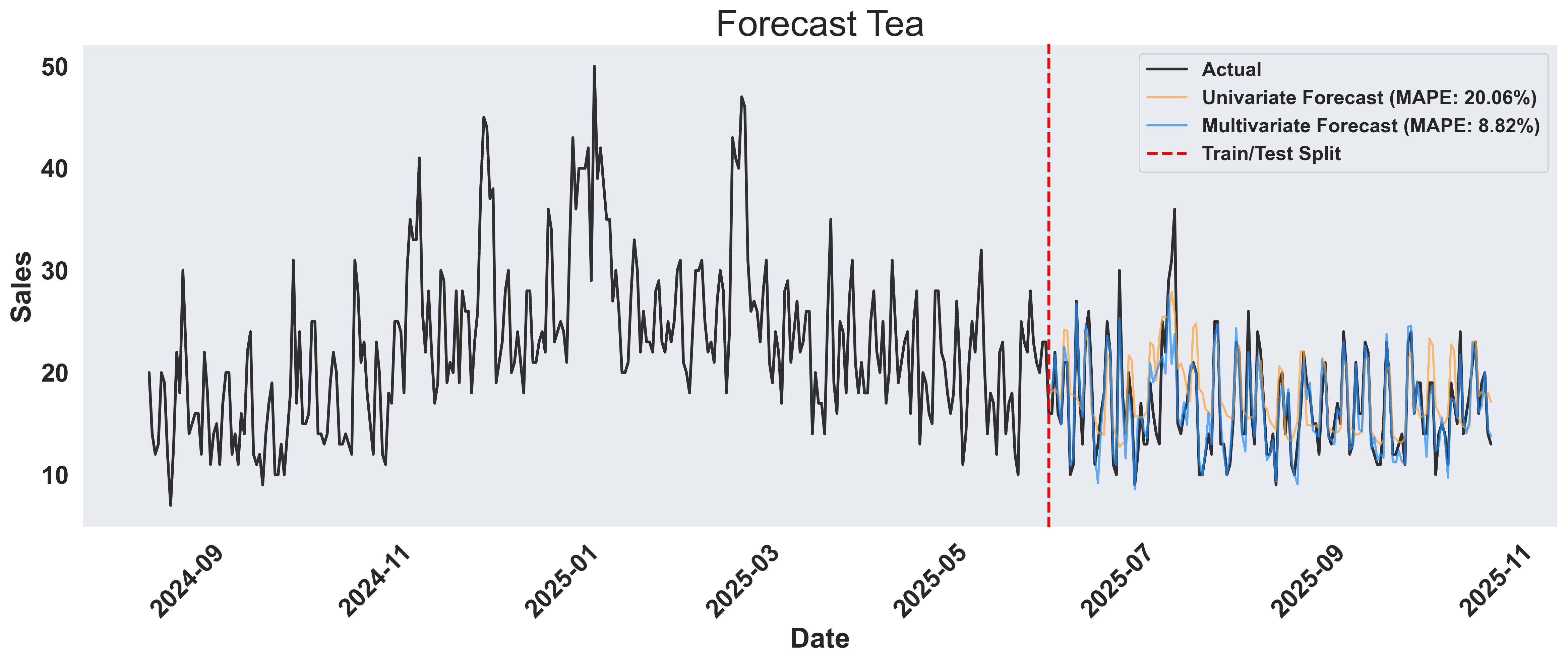 **Key Insight**: The multivariate approach doesn't just forecast better - it reveals **why** demand changes. By incorporating weather and temporal features, you gain actionable insights: stock more hot beverages before cold fronts, and optimize inventory based on weather forecasts rather than just historical patterns.
### 5. Easily Find Products that Sell Together
Beyond weather, products in a store often influence each other's sales. For instance, if coffee sales spike, tea sales might also increase, or soup and bread might move together. We can discover these relationships by using one product's sales data to help forecast another product's sales. Knowing this, store owners can introduce promotions or package deals to increase revenue.
### What is Cross-Item Analysis
The key insight: if knowing Product A's sales helps predict Product B's sales more accurately, then these products are correlated. We measure this by comparing forecast accuracy (MAPE) - lower MAPE means stronger correlation.
### What is "Leaking" in Cross-Item Analysis?
In this context, "leaking" refers to **conditioning** our forecast on another product's sales data. Think of it as asking: "If I know how much tea was sold today, how does that change my forecast for soup sales?"
**Example**: When we "leak" tea sales data into our soup forecast, we're essentially asking:
* **Without tea data**: "Based on historical soup sales and weather, what will soup sales look like?"
* **With tea data**: "Given that tea sales were X units today, and considering historical soup sales and weather, what will soup sales look like?"
```python theme={null}
def calculate_mape(y_true, y_pred, epsilon=1e-10):
"""Calculate Mean Absolute Percentage Error."""
y_true = np.array(y_true)
y_pred = np.array(y_pred)
mask = np.abs(y_true) > epsilon
if not np.any(mask):
return np.inf
mape = float(np.mean(np.abs((y_true[mask] - y_pred[mask]) / y_true[mask])) * 100)
return mape
def analyze_cross_item_correlations(data_df: pd.DataFrame, history_ratio: float = 0.8):
"""Analyze how well each item's sales can predict other items' sales."""
item_ids = data_df[GROUP_COL].unique()
cross_item_results = {}
for target_item in item_ids:
print(f"\n[Target: {target_item}]")
item_results = {}
for leaked_item in item_ids:
if target_item == leaked_item:
continue
# Get data for both items
target_data = data_df[data_df[GROUP_COL] == target_item].sort_values(TIMESTAMP_COL)
leaked_data = data_df[data_df[GROUP_COL] == leaked_item].sort_values(TIMESTAMP_COL)
# Split target item's data
split_idx = int(len(target_data) * history_ratio)
split_timestamp = target_data.iloc[split_idx][TIMESTAMP_COL]
hist_target = target_data[target_data[TIMESTAMP_COL] < split_timestamp]
future_target = target_data[target_data[TIMESTAMP_COL] >= split_timestamp]
# Align leaked item's data with target item's timestamps
hist_leaked = leaked_data[leaked_data[TIMESTAMP_COL] < split_timestamp]
future_leaked = leaked_data[leaked_data[TIMESTAMP_COL] >= split_timestamp]
# Create leaked column
leaked_col_name = f"{TARGET_COL}_leaked"
hist_leaked_vals = hist_leaked[[TIMESTAMP_COL, TARGET_COL]].rename(
columns={TARGET_COL: leaked_col_name}
)
future_leaked_vals = future_leaked[[TIMESTAMP_COL, TARGET_COL]].rename(
columns={TARGET_COL: leaked_col_name}
)
# Merge
hist_with_leak = hist_target.merge(hist_leaked_vals, on=TIMESTAMP_COL, how='inner')
future_with_leak = future_target.merge(future_leaked_vals, on=TIMESTAMP_COL, how='inner')
# Forecast with leaked item data + weather
forecast_dfs = API_CLIENT.forecast_dfs(
history_dfs=[hist_with_leak],
target_dfs=[future_with_leak],
target_col=TARGET_COL,
timestamp_col=TIMESTAMP_COL,
metadata_cols=METADATA_COLS + [leaked_col_name],
leak_cols=METADATA_COLS + [leaked_col_name],
model="Migas-1.0",
)
predictions = forecast_dfs[0][TARGET_COL].values
ground_truth = future_with_leak[TARGET_COL].values
mape = calculate_mape(ground_truth, predictions)
item_results[leaked_item] = float(mape)
print(f" {leaked_item:15s} -> MAPE: {mape:6.2f}%")
cross_item_results[target_item] = item_results
return cross_item_results
# Run cross-item correlation analysis
cross_item_results = analyze_cross_item_correlations(data_df)
```
### How It Works
1. **For each target product** (e.g., soup), we forecast its sales using three approaches:
* Univariate: Time series only
* Multivariate: Time series + weather
* Cross-item: Time series + weather + another product's sales
2. **We test each product** as the "leaked" feature to see which one helps most
3. **Lower MAPE = stronger correlation** between the products
### Visualizing Cross-Item Relationships
Create comprehensive visualizations showing the progressive improvement from univariate to cross-item forecasting:
```python theme={null}
def plot_cross_item_analysis(data_df: pd.DataFrame, cross_item_results: Dict[str, Dict[str, float]],
forecast_results: Dict[str, Dict[str, Any]] = None):
"""
Create visualization comparing 3 forecasting approaches:
1. Univariate (time series only)
2. Multivariate (time series + weather)
3. Multivariate + best cross-item leak
"""
history_ratio = 0.8
for target_item, results in cross_item_results.items():
# Find best correlated item
valid_results = {k: v for k, v in results.items() if not np.isnan(v) and v != np.inf}
if not valid_results:
continue
best_item = min(valid_results.items(), key=lambda x: x[1])[0]
# Get target item data
target_data = data_df[data_df[GROUP_COL] == target_item].sort_values(TIMESTAMP_COL)
split_idx = int(len(target_data) * history_ratio)
split_timestamp = target_data.iloc[split_idx][TIMESTAMP_COL]
hist_target = target_data[target_data[TIMESTAMP_COL] < split_timestamp]
future_target = target_data[target_data[TIMESTAMP_COL] >= split_timestamp]
# Check if we can reuse existing results (from soup/tea forecasts)
if forecast_results and target_item in forecast_results:
print(f"Reusing existing forecast results for {target_item}...")
univariate_preds = forecast_results[target_item]['univariate_predictions']
multivariate_preds = forecast_results[target_item]['multivariate_predictions']
else:
# Compute fresh forecasts
univariate_forecast = API_CLIENT.forecast_dfs(
history_dfs=[hist_target], target_dfs=[future_target],
target_col=TARGET_COL, timestamp_col=TIMESTAMP_COL,
metadata_cols=[], leak_cols=[], model="Migas-1.0")
univariate_preds = univariate_forecast[0][TARGET_COL].values
multivariate_forecast = API_CLIENT.forecast_dfs(
history_dfs=[hist_target], target_dfs=[future_target],
target_col=TARGET_COL, timestamp_col=TIMESTAMP_COL,
metadata_cols=METADATA_COLS, leak_cols=METADATA_COLS, model="Migas-1.0")
multivariate_preds = multivariate_forecast[0][TARGET_COL].values
# Compute MAPEs
univariate_mape = calculate_mape(future_target[TARGET_COL].values, univariate_preds)
multivariate_mape = calculate_mape(future_target[TARGET_COL].values, multivariate_preds)
# Get cross-item forecast (already computed in analyze_cross_item_correlations)
cross_item_mape = results[best_item]
# Create figure with 2 subplots
fig, axes = plt.subplots(2, 1, figsize=(14, 10))
fig.suptitle(f'Cross-Item Forecast Comparison: {target_item}',
fontsize=24, fontweight='bold', y=0.995)
# Subplot 1: Full time series with all forecasts
ax1 = axes[0]
# Plot only last 50% of history
history_cutoff = len(hist_target) // 2
hist_target_subset = hist_target.iloc[history_cutoff:]
colors = {
"univariate": "#fea333", # Orange
"multivariate": "#1E90FF", # Blue
"groundtruth": "black",
"cross_item": "#2ECC71", # Green
}
# Prepare data for swarm-visualizer
# Combine historical and test data for actual values
actual_x = pd.concat([hist_target_subset[TIMESTAMP_COL], future_target[TIMESTAMP_COL]])
actual_y = pd.concat([hist_target_subset[TARGET_COL], future_target[TARGET_COL]])
cross_item_dict = {
"Actual Sales": {
"x": actual_x,
"y": actual_y,
"lw": 2,
"linestyle": "-",
"color": colors["groundtruth"],
"alpha": 0.8,
"zorder": 1,
},
f"Univariate (MAPE: {univariate_mape:.2f}%)": {
"x": future_target[TIMESTAMP_COL],
"y": univariate_preds,
"lw": 1.5,
"linestyle": "-",
"color": colors["univariate"],
"alpha": 0.7,
"zorder": 2,
},
f"Multivariate + Weather (MAPE: {multivariate_mape:.2f}%)": {
"x": future_target[TIMESTAMP_COL],
"y": multivariate_preds,
"lw": 1.5,
"linestyle": "-",
"color": colors["multivariate"],
"alpha": 0.7,
"zorder": 3,
},
f"Multivariate + Weather + {format_item_name(best_item)} (MAPE: {cross_item_mape:.2f}%)": {
"x": future_with_leak[TIMESTAMP_COL],
"y": cross_item_preds,
"lw": 1.5,
"linestyle": "-",
"color": colors["cross_item"],
"alpha": 0.7,
"zorder": 4,
}
}
# Use swarm-visualizer plot_overlaid_lineplot
swarm_visualizer.plot_overlaid_lineplot(
ax=ax1,
normalized_dict=cross_item_dict,
title_str="Full Time Series with All Forecasts",
ylabel="Sales",
xlabel="Date",
legend_present=True,
)
# Move legend to the right side
ax1.legend(loc="center left", bbox_to_anchor=(1, 0.5))
# Add vertical line at split
ax1.axvline(
x=split_timestamp,
color="red",
linestyle="--",
linewidth=2,
alpha=0.7,
label="Train/Test Split",
zorder=1,
)
# Use swarm-visualizer set_axis_infos for consistent styling
set_axis_infos(
ax=ax1,
xlabel="Date",
ylabel="Sales",
title_str="Full Time Series with All Forecasts",
grid=True,
)
plt.setp(ax1.get_xticklabels(), rotation=45, ha='right')
# Subplot 2: Zoom in on forecast period
ax2 = axes[1]
# Prepare data for swarm-visualizer for forecast period detail
forecast_detail_dict = {
"Actual Sales": {
"x": future_target[TIMESTAMP_COL],
"y": future_target[TARGET_COL],
"lw": 2,
"linestyle": "-",
"color": colors["groundtruth"],
"alpha": 1.0,
"zorder": 3,
},
f"Univariate (MAPE: {univariate_mape:.2f}%)": {
"x": future_target[TIMESTAMP_COL],
"y": univariate_preds,
"lw": 1.5,
"linestyle": "-",
"color": colors["univariate"],
"alpha": 0.7,
"zorder": 2,
},
f"Multivariate (MAPE: {multivariate_mape:.2f}%)": {
"x": future_target[TIMESTAMP_COL],
"y": multivariate_preds,
"lw": 1.5,
"linestyle": "-",
"color": colors["multivariate"],
"alpha": 0.7,
"zorder": 2,
},
f"+ {format_item_name(best_item)} (MAPE: {cross_item_mape:.2f}%)": {
"x": future_with_leak[TIMESTAMP_COL],
"y": cross_item_preds,
"lw": 1.5,
"linestyle": "-",
"color": colors["cross_item"],
"alpha": 0.7,
"zorder": 2,
}
}
# Use swarm-visualizer plot_overlaid_lineplot
swarm_visualizer.plot_overlaid_lineplot(
ax=ax2,
normalized_dict=forecast_detail_dict,
title_str="Forecast Period Detail",
ylabel="Sales",
xlabel="Date",
legend_present=True,
)
# Move legend to the right side
ax2.legend(loc="center left", bbox_to_anchor=(1, 0.5))
# Use swarm-visualizer set_axis_infos for consistent styling
set_axis_infos(
ax=ax2,
xlabel="Date",
ylabel="Sales",
title_str="Forecast Period Detail",
grid=True,
)
plt.setp(ax2.get_xticklabels(), rotation=45, ha='right')
plt.tight_layout()
plt.savefig(f'cross_item_analysis_{target_item.lower()}.png', dpi=300, bbox_inches='tight')
plt.show()
plt.close()
# Create cross-item analysis plots (reusing soup/tea results)
forecast_results_dict = {'soup': soup_results, 'tea': tea_results}
plot_cross_item_analysis(data_df, cross_item_results, forecast_results_dict)
```
### Example Output: Cross-Item Analysis for Soup
**Key Insight**: The multivariate approach doesn't just forecast better - it reveals **why** demand changes. By incorporating weather and temporal features, you gain actionable insights: stock more hot beverages before cold fronts, and optimize inventory based on weather forecasts rather than just historical patterns.
### 5. Easily Find Products that Sell Together
Beyond weather, products in a store often influence each other's sales. For instance, if coffee sales spike, tea sales might also increase, or soup and bread might move together. We can discover these relationships by using one product's sales data to help forecast another product's sales. Knowing this, store owners can introduce promotions or package deals to increase revenue.
### What is Cross-Item Analysis
The key insight: if knowing Product A's sales helps predict Product B's sales more accurately, then these products are correlated. We measure this by comparing forecast accuracy (MAPE) - lower MAPE means stronger correlation.
### What is "Leaking" in Cross-Item Analysis?
In this context, "leaking" refers to **conditioning** our forecast on another product's sales data. Think of it as asking: "If I know how much tea was sold today, how does that change my forecast for soup sales?"
**Example**: When we "leak" tea sales data into our soup forecast, we're essentially asking:
* **Without tea data**: "Based on historical soup sales and weather, what will soup sales look like?"
* **With tea data**: "Given that tea sales were X units today, and considering historical soup sales and weather, what will soup sales look like?"
```python theme={null}
def calculate_mape(y_true, y_pred, epsilon=1e-10):
"""Calculate Mean Absolute Percentage Error."""
y_true = np.array(y_true)
y_pred = np.array(y_pred)
mask = np.abs(y_true) > epsilon
if not np.any(mask):
return np.inf
mape = float(np.mean(np.abs((y_true[mask] - y_pred[mask]) / y_true[mask])) * 100)
return mape
def analyze_cross_item_correlations(data_df: pd.DataFrame, history_ratio: float = 0.8):
"""Analyze how well each item's sales can predict other items' sales."""
item_ids = data_df[GROUP_COL].unique()
cross_item_results = {}
for target_item in item_ids:
print(f"\n[Target: {target_item}]")
item_results = {}
for leaked_item in item_ids:
if target_item == leaked_item:
continue
# Get data for both items
target_data = data_df[data_df[GROUP_COL] == target_item].sort_values(TIMESTAMP_COL)
leaked_data = data_df[data_df[GROUP_COL] == leaked_item].sort_values(TIMESTAMP_COL)
# Split target item's data
split_idx = int(len(target_data) * history_ratio)
split_timestamp = target_data.iloc[split_idx][TIMESTAMP_COL]
hist_target = target_data[target_data[TIMESTAMP_COL] < split_timestamp]
future_target = target_data[target_data[TIMESTAMP_COL] >= split_timestamp]
# Align leaked item's data with target item's timestamps
hist_leaked = leaked_data[leaked_data[TIMESTAMP_COL] < split_timestamp]
future_leaked = leaked_data[leaked_data[TIMESTAMP_COL] >= split_timestamp]
# Create leaked column
leaked_col_name = f"{TARGET_COL}_leaked"
hist_leaked_vals = hist_leaked[[TIMESTAMP_COL, TARGET_COL]].rename(
columns={TARGET_COL: leaked_col_name}
)
future_leaked_vals = future_leaked[[TIMESTAMP_COL, TARGET_COL]].rename(
columns={TARGET_COL: leaked_col_name}
)
# Merge
hist_with_leak = hist_target.merge(hist_leaked_vals, on=TIMESTAMP_COL, how='inner')
future_with_leak = future_target.merge(future_leaked_vals, on=TIMESTAMP_COL, how='inner')
# Forecast with leaked item data + weather
forecast_dfs = API_CLIENT.forecast_dfs(
history_dfs=[hist_with_leak],
target_dfs=[future_with_leak],
target_col=TARGET_COL,
timestamp_col=TIMESTAMP_COL,
metadata_cols=METADATA_COLS + [leaked_col_name],
leak_cols=METADATA_COLS + [leaked_col_name],
model="Migas-1.0",
)
predictions = forecast_dfs[0][TARGET_COL].values
ground_truth = future_with_leak[TARGET_COL].values
mape = calculate_mape(ground_truth, predictions)
item_results[leaked_item] = float(mape)
print(f" {leaked_item:15s} -> MAPE: {mape:6.2f}%")
cross_item_results[target_item] = item_results
return cross_item_results
# Run cross-item correlation analysis
cross_item_results = analyze_cross_item_correlations(data_df)
```
### How It Works
1. **For each target product** (e.g., soup), we forecast its sales using three approaches:
* Univariate: Time series only
* Multivariate: Time series + weather
* Cross-item: Time series + weather + another product's sales
2. **We test each product** as the "leaked" feature to see which one helps most
3. **Lower MAPE = stronger correlation** between the products
### Visualizing Cross-Item Relationships
Create comprehensive visualizations showing the progressive improvement from univariate to cross-item forecasting:
```python theme={null}
def plot_cross_item_analysis(data_df: pd.DataFrame, cross_item_results: Dict[str, Dict[str, float]],
forecast_results: Dict[str, Dict[str, Any]] = None):
"""
Create visualization comparing 3 forecasting approaches:
1. Univariate (time series only)
2. Multivariate (time series + weather)
3. Multivariate + best cross-item leak
"""
history_ratio = 0.8
for target_item, results in cross_item_results.items():
# Find best correlated item
valid_results = {k: v for k, v in results.items() if not np.isnan(v) and v != np.inf}
if not valid_results:
continue
best_item = min(valid_results.items(), key=lambda x: x[1])[0]
# Get target item data
target_data = data_df[data_df[GROUP_COL] == target_item].sort_values(TIMESTAMP_COL)
split_idx = int(len(target_data) * history_ratio)
split_timestamp = target_data.iloc[split_idx][TIMESTAMP_COL]
hist_target = target_data[target_data[TIMESTAMP_COL] < split_timestamp]
future_target = target_data[target_data[TIMESTAMP_COL] >= split_timestamp]
# Check if we can reuse existing results (from soup/tea forecasts)
if forecast_results and target_item in forecast_results:
print(f"Reusing existing forecast results for {target_item}...")
univariate_preds = forecast_results[target_item]['univariate_predictions']
multivariate_preds = forecast_results[target_item]['multivariate_predictions']
else:
# Compute fresh forecasts
univariate_forecast = API_CLIENT.forecast_dfs(
history_dfs=[hist_target], target_dfs=[future_target],
target_col=TARGET_COL, timestamp_col=TIMESTAMP_COL,
metadata_cols=[], leak_cols=[], model="Migas-1.0")
univariate_preds = univariate_forecast[0][TARGET_COL].values
multivariate_forecast = API_CLIENT.forecast_dfs(
history_dfs=[hist_target], target_dfs=[future_target],
target_col=TARGET_COL, timestamp_col=TIMESTAMP_COL,
metadata_cols=METADATA_COLS, leak_cols=METADATA_COLS, model="Migas-1.0")
multivariate_preds = multivariate_forecast[0][TARGET_COL].values
# Compute MAPEs
univariate_mape = calculate_mape(future_target[TARGET_COL].values, univariate_preds)
multivariate_mape = calculate_mape(future_target[TARGET_COL].values, multivariate_preds)
# Get cross-item forecast (already computed in analyze_cross_item_correlations)
cross_item_mape = results[best_item]
# Create figure with 2 subplots
fig, axes = plt.subplots(2, 1, figsize=(14, 10))
fig.suptitle(f'Cross-Item Forecast Comparison: {target_item}',
fontsize=24, fontweight='bold', y=0.995)
# Subplot 1: Full time series with all forecasts
ax1 = axes[0]
# Plot only last 50% of history
history_cutoff = len(hist_target) // 2
hist_target_subset = hist_target.iloc[history_cutoff:]
colors = {
"univariate": "#fea333", # Orange
"multivariate": "#1E90FF", # Blue
"groundtruth": "black",
"cross_item": "#2ECC71", # Green
}
# Prepare data for swarm-visualizer
# Combine historical and test data for actual values
actual_x = pd.concat([hist_target_subset[TIMESTAMP_COL], future_target[TIMESTAMP_COL]])
actual_y = pd.concat([hist_target_subset[TARGET_COL], future_target[TARGET_COL]])
cross_item_dict = {
"Actual Sales": {
"x": actual_x,
"y": actual_y,
"lw": 2,
"linestyle": "-",
"color": colors["groundtruth"],
"alpha": 0.8,
"zorder": 1,
},
f"Univariate (MAPE: {univariate_mape:.2f}%)": {
"x": future_target[TIMESTAMP_COL],
"y": univariate_preds,
"lw": 1.5,
"linestyle": "-",
"color": colors["univariate"],
"alpha": 0.7,
"zorder": 2,
},
f"Multivariate + Weather (MAPE: {multivariate_mape:.2f}%)": {
"x": future_target[TIMESTAMP_COL],
"y": multivariate_preds,
"lw": 1.5,
"linestyle": "-",
"color": colors["multivariate"],
"alpha": 0.7,
"zorder": 3,
},
f"Multivariate + Weather + {format_item_name(best_item)} (MAPE: {cross_item_mape:.2f}%)": {
"x": future_with_leak[TIMESTAMP_COL],
"y": cross_item_preds,
"lw": 1.5,
"linestyle": "-",
"color": colors["cross_item"],
"alpha": 0.7,
"zorder": 4,
}
}
# Use swarm-visualizer plot_overlaid_lineplot
swarm_visualizer.plot_overlaid_lineplot(
ax=ax1,
normalized_dict=cross_item_dict,
title_str="Full Time Series with All Forecasts",
ylabel="Sales",
xlabel="Date",
legend_present=True,
)
# Move legend to the right side
ax1.legend(loc="center left", bbox_to_anchor=(1, 0.5))
# Add vertical line at split
ax1.axvline(
x=split_timestamp,
color="red",
linestyle="--",
linewidth=2,
alpha=0.7,
label="Train/Test Split",
zorder=1,
)
# Use swarm-visualizer set_axis_infos for consistent styling
set_axis_infos(
ax=ax1,
xlabel="Date",
ylabel="Sales",
title_str="Full Time Series with All Forecasts",
grid=True,
)
plt.setp(ax1.get_xticklabels(), rotation=45, ha='right')
# Subplot 2: Zoom in on forecast period
ax2 = axes[1]
# Prepare data for swarm-visualizer for forecast period detail
forecast_detail_dict = {
"Actual Sales": {
"x": future_target[TIMESTAMP_COL],
"y": future_target[TARGET_COL],
"lw": 2,
"linestyle": "-",
"color": colors["groundtruth"],
"alpha": 1.0,
"zorder": 3,
},
f"Univariate (MAPE: {univariate_mape:.2f}%)": {
"x": future_target[TIMESTAMP_COL],
"y": univariate_preds,
"lw": 1.5,
"linestyle": "-",
"color": colors["univariate"],
"alpha": 0.7,
"zorder": 2,
},
f"Multivariate (MAPE: {multivariate_mape:.2f}%)": {
"x": future_target[TIMESTAMP_COL],
"y": multivariate_preds,
"lw": 1.5,
"linestyle": "-",
"color": colors["multivariate"],
"alpha": 0.7,
"zorder": 2,
},
f"+ {format_item_name(best_item)} (MAPE: {cross_item_mape:.2f}%)": {
"x": future_with_leak[TIMESTAMP_COL],
"y": cross_item_preds,
"lw": 1.5,
"linestyle": "-",
"color": colors["cross_item"],
"alpha": 0.7,
"zorder": 2,
}
}
# Use swarm-visualizer plot_overlaid_lineplot
swarm_visualizer.plot_overlaid_lineplot(
ax=ax2,
normalized_dict=forecast_detail_dict,
title_str="Forecast Period Detail",
ylabel="Sales",
xlabel="Date",
legend_present=True,
)
# Move legend to the right side
ax2.legend(loc="center left", bbox_to_anchor=(1, 0.5))
# Use swarm-visualizer set_axis_infos for consistent styling
set_axis_infos(
ax=ax2,
xlabel="Date",
ylabel="Sales",
title_str="Forecast Period Detail",
grid=True,
)
plt.setp(ax2.get_xticklabels(), rotation=45, ha='right')
plt.tight_layout()
plt.savefig(f'cross_item_analysis_{target_item.lower()}.png', dpi=300, bbox_inches='tight')
plt.show()
plt.close()
# Create cross-item analysis plots (reusing soup/tea results)
forecast_results_dict = {'soup': soup_results, 'tea': tea_results}
plot_cross_item_analysis(data_df, cross_item_results, forecast_results_dict)
```
### Example Output: Cross-Item Analysis for Soup
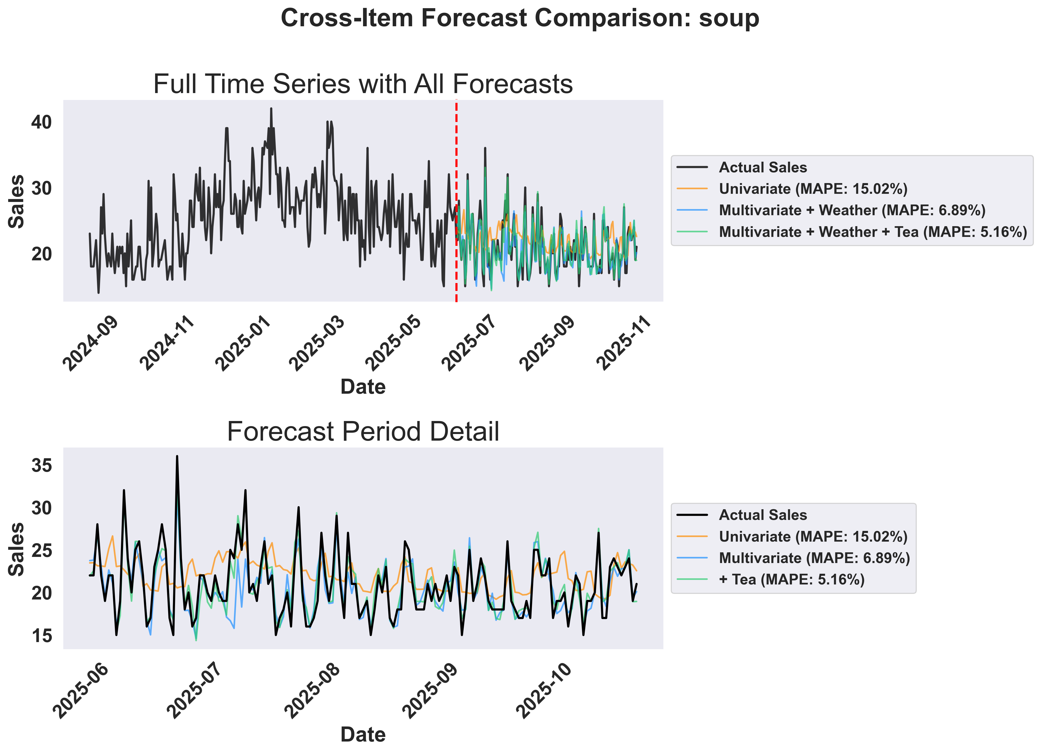 **Understanding the Analysis:**
* **Top panel**: Shows the full timeline with historical data and all three forecast approaches. The vertical line marks the train/test split.
* **Bottom panel**: Zoomed view of the forecast period showing how each approach performs. Notice the progressive improvement from univariate to multivariate to cross-item forecasting.
### Visualizing Cross-Item Prediction Accuracy
Create a comprehensive 2x2 grid showing which items are most helpful for predicting each target item:
```python theme={null}
def plot_cross_item_mape_comparison(cross_item_results: Dict[str, Dict[str, float]]) -> None:
"""
Create a 2x2 grid of bar charts showing MAPE values for cross-item predictions.
Each subplot shows one target item with bars for each predictor item.
"""
# Create 2x2 subplot grid
fig, axes = plt.subplots(2, 2, figsize=(16, 12))
axes = axes.flatten() # Flatten to 1D array for easier indexing
# Define colors for predictor items matching the main color scheme
predictor_colors = {
"soup": "#FF8C00", # Orange
"tea": "#1E90FF", # Blue
"ice_cream": "#2ECC71", # Green
"bread": "#A23B72", # Purple
}
# Get all predictor items (should be consistent across targets)
all_predictors = set()
for predictions in cross_item_results.values():
all_predictors.update(predictions.keys())
all_predictors = sorted(list(all_predictors))
# Create a subplot for each target item
for idx, (target_item, predictions) in enumerate(
cross_item_results.items()
):
ax = axes[idx]
# Prepare data for this target - sort by MAPE (smallest first)
predictor_data = []
for predictor in all_predictors:
if predictor in predictions:
predictor_data.append(
{
"name": format_item_name(predictor),
"mape": predictions[predictor],
"color": predictor_colors[predictor],
}
)
# Sort by MAPE (smallest first)
predictor_data.sort(key=lambda x: x["mape"])
predictor_names = [item["name"] for item in predictor_data]
mape_values = [item["mape"] for item in predictor_data]
colors = [item["color"] for item in predictor_data]
# Create bars
bars = ax.bar(predictor_names, mape_values, color=colors, alpha=0.8)
# Add value labels on top of bars
for bar, value in zip(bars, mape_values):
height = bar.get_height()
ax.text(
bar.get_x() + bar.get_width() / 2.0,
height + 0.1,
f"{value:.1f}%",
ha="center",
va="bottom",
fontweight="bold",
)
# Set y-axis to start from 0
ax.set_ylim(0, max(mape_values) * 1.2)
# Use swarm-visualizer set_axis_infos for consistent styling
set_axis_infos(
ax=ax,
xlabel="Predictor Item",
ylabel="MAPE (%)",
title_str=f"MAPE for forecasting {format_item_name(target_item)}\n(Lower MAPE = Better)",
grid=True,
)
# Rotate x-axis labels if needed
plt.setp(ax.get_xticklabels(), rotation=45, ha="right")
# Overall title
fig.suptitle(
"Cross-Item Prediction Accuracy by Target Item",
fontsize=24,
fontweight="bold",
y=0.99,
)
plt.tight_layout()
plt.subplots_adjust(
top=0.85
) # Add more space between main title and subplot titles
# Save the plot
os.makedirs("inventory_forecasting_plots", exist_ok=True)
filepath = os.path.abspath(
"inventory_forecasting_plots/cross_item_mape_comparison.png"
)
plt.savefig(filepath, dpi=300, bbox_inches="tight")
plt.close()
print(f"✓ Saved cross-item MAPE comparison: {filepath}")
# Print summary statistics
print("\n" + "=" * 60)
print("CROSS-ITEM PREDICTION SUMMARY")
print("=" * 60)
for target_item, predictions in cross_item_results.items():
sorted_predictors = sorted(predictions.items(), key=lambda x: x[1])
print(f"\n{target_item.upper()} - Best to Worst Predictors:")
for predictor, mape in sorted_predictors:
print(f" {format_item_name(predictor):12s}: {mape:6.2f}% MAPE")
# Overall best predictors
print("\nOVERALL BEST PREDICTORS:")
for target_item, predictions in cross_item_results.items():
best_predictor, best_mape = min(predictions.items(), key=lambda x: x[1])
print(
f" {format_item_name(target_item):12s} → best predicted by {format_item_name(best_predictor):12s} ({best_mape:.2f}% MAPE)"
)
# Create cross-item MAPE comparison chart
plot_cross_item_mape_comparison(cross_item_results)
```
### Example Output: Cross-Item MAPE Comparison
**Understanding the Analysis:**
* **Top panel**: Shows the full timeline with historical data and all three forecast approaches. The vertical line marks the train/test split.
* **Bottom panel**: Zoomed view of the forecast period showing how each approach performs. Notice the progressive improvement from univariate to multivariate to cross-item forecasting.
### Visualizing Cross-Item Prediction Accuracy
Create a comprehensive 2x2 grid showing which items are most helpful for predicting each target item:
```python theme={null}
def plot_cross_item_mape_comparison(cross_item_results: Dict[str, Dict[str, float]]) -> None:
"""
Create a 2x2 grid of bar charts showing MAPE values for cross-item predictions.
Each subplot shows one target item with bars for each predictor item.
"""
# Create 2x2 subplot grid
fig, axes = plt.subplots(2, 2, figsize=(16, 12))
axes = axes.flatten() # Flatten to 1D array for easier indexing
# Define colors for predictor items matching the main color scheme
predictor_colors = {
"soup": "#FF8C00", # Orange
"tea": "#1E90FF", # Blue
"ice_cream": "#2ECC71", # Green
"bread": "#A23B72", # Purple
}
# Get all predictor items (should be consistent across targets)
all_predictors = set()
for predictions in cross_item_results.values():
all_predictors.update(predictions.keys())
all_predictors = sorted(list(all_predictors))
# Create a subplot for each target item
for idx, (target_item, predictions) in enumerate(
cross_item_results.items()
):
ax = axes[idx]
# Prepare data for this target - sort by MAPE (smallest first)
predictor_data = []
for predictor in all_predictors:
if predictor in predictions:
predictor_data.append(
{
"name": format_item_name(predictor),
"mape": predictions[predictor],
"color": predictor_colors[predictor],
}
)
# Sort by MAPE (smallest first)
predictor_data.sort(key=lambda x: x["mape"])
predictor_names = [item["name"] for item in predictor_data]
mape_values = [item["mape"] for item in predictor_data]
colors = [item["color"] for item in predictor_data]
# Create bars
bars = ax.bar(predictor_names, mape_values, color=colors, alpha=0.8)
# Add value labels on top of bars
for bar, value in zip(bars, mape_values):
height = bar.get_height()
ax.text(
bar.get_x() + bar.get_width() / 2.0,
height + 0.1,
f"{value:.1f}%",
ha="center",
va="bottom",
fontweight="bold",
)
# Set y-axis to start from 0
ax.set_ylim(0, max(mape_values) * 1.2)
# Use swarm-visualizer set_axis_infos for consistent styling
set_axis_infos(
ax=ax,
xlabel="Predictor Item",
ylabel="MAPE (%)",
title_str=f"MAPE for forecasting {format_item_name(target_item)}\n(Lower MAPE = Better)",
grid=True,
)
# Rotate x-axis labels if needed
plt.setp(ax.get_xticklabels(), rotation=45, ha="right")
# Overall title
fig.suptitle(
"Cross-Item Prediction Accuracy by Target Item",
fontsize=24,
fontweight="bold",
y=0.99,
)
plt.tight_layout()
plt.subplots_adjust(
top=0.85
) # Add more space between main title and subplot titles
# Save the plot
os.makedirs("inventory_forecasting_plots", exist_ok=True)
filepath = os.path.abspath(
"inventory_forecasting_plots/cross_item_mape_comparison.png"
)
plt.savefig(filepath, dpi=300, bbox_inches="tight")
plt.close()
print(f"✓ Saved cross-item MAPE comparison: {filepath}")
# Print summary statistics
print("\n" + "=" * 60)
print("CROSS-ITEM PREDICTION SUMMARY")
print("=" * 60)
for target_item, predictions in cross_item_results.items():
sorted_predictors = sorted(predictions.items(), key=lambda x: x[1])
print(f"\n{target_item.upper()} - Best to Worst Predictors:")
for predictor, mape in sorted_predictors:
print(f" {format_item_name(predictor):12s}: {mape:6.2f}% MAPE")
# Overall best predictors
print("\nOVERALL BEST PREDICTORS:")
for target_item, predictions in cross_item_results.items():
best_predictor, best_mape = min(predictions.items(), key=lambda x: x[1])
print(
f" {format_item_name(target_item):12s} → best predicted by {format_item_name(best_predictor):12s} ({best_mape:.2f}% MAPE)"
)
# Create cross-item MAPE comparison chart
plot_cross_item_mape_comparison(cross_item_results)
```
### Example Output: Cross-Item MAPE Comparison
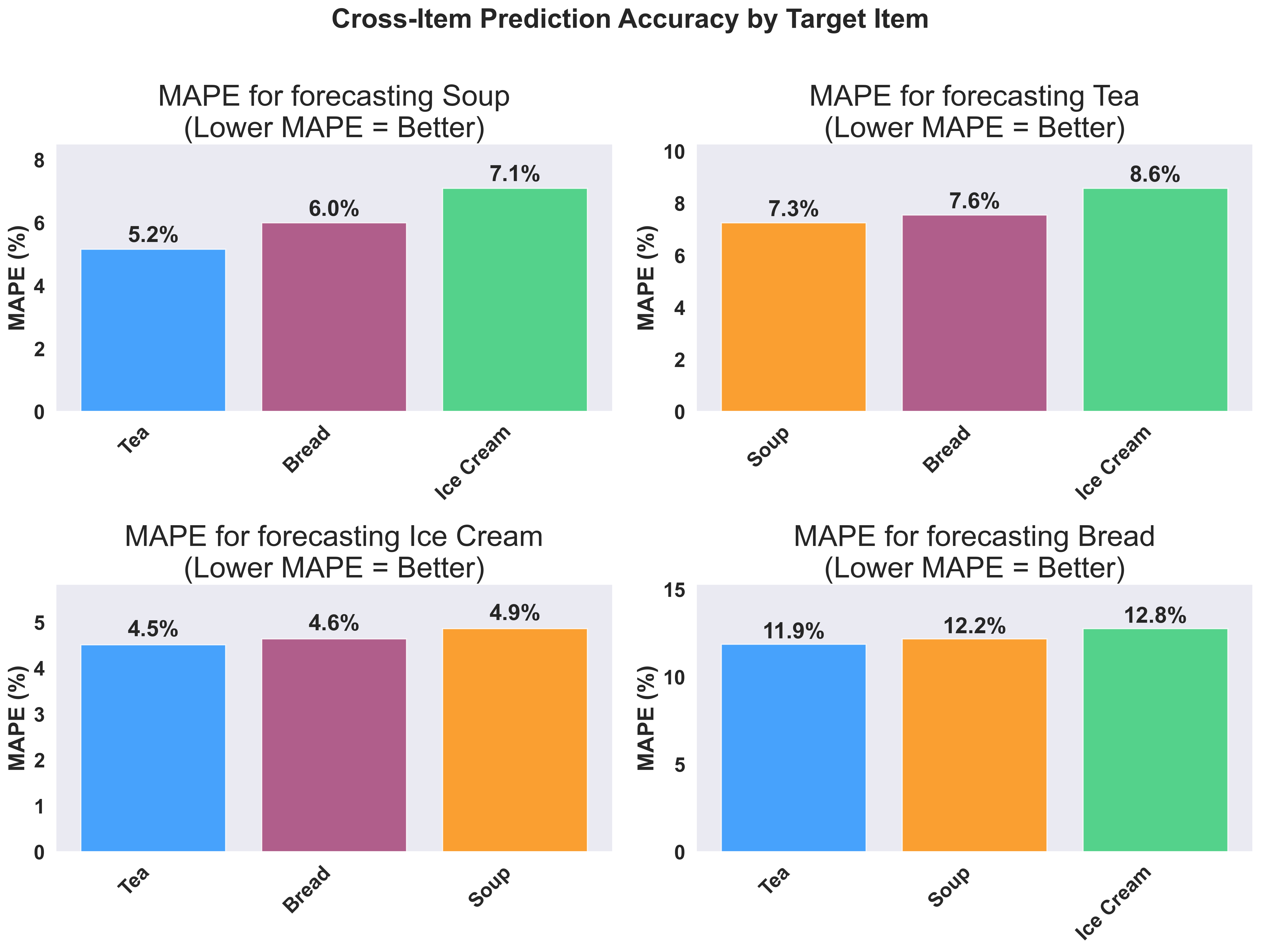 This visualization clearly shows which items are most helpful for predicting each target item:
* **Hot beverages show strong correlations** - Tea and Soup are highly correlated
**Variable Improvement Across Products**: Notice that soup and tea show much larger improvements from cross-item forecasting compared to their baseline univariate/multivariate forecasts. This is because hot beverages and comfort foods have strong weather-driven correlations. In contrast, products like bread may show less dramatic improvement since bread sales are more stable and less influenced by weather patterns. Focus your cross-item forecasting efforts on products that show strong seasonal or weather-related correlations.
**Business Applications**:
* **Inventory Optimization**: If tea and soup are highly correlated, use tea sales trends to improve soup inventory forecasts
* **Shelf Placement**: Position correlated products near each other to increase cross-sales
* **Demand Forecasting**: When you see unusual tea sales, prepare for corresponding soup demand changes
This visualization clearly shows which items are most helpful for predicting each target item:
* **Hot beverages show strong correlations** - Tea and Soup are highly correlated
**Variable Improvement Across Products**: Notice that soup and tea show much larger improvements from cross-item forecasting compared to their baseline univariate/multivariate forecasts. This is because hot beverages and comfort foods have strong weather-driven correlations. In contrast, products like bread may show less dramatic improvement since bread sales are more stable and less influenced by weather patterns. Focus your cross-item forecasting efforts on products that show strong seasonal or weather-related correlations.
**Business Applications**:
* **Inventory Optimization**: If tea and soup are highly correlated, use tea sales trends to improve soup inventory forecasts
* **Shelf Placement**: Position correlated products near each other to increase cross-sales
* **Demand Forecasting**: When you see unusual tea sales, prepare for corresponding soup demand changes