> ## Documentation Index
> Fetch the complete documentation index at: https://docs.synthefy.com/llms.txt
> Use this file to discover all available pages before exploring further.
# Economic Indicator Backtesting
> Learn how to forecast economic indicators using Synthefy's multi-variate forecasting with macroeconomic data from FRED and Haver.
## What is economic indicator backtesting? How does it help?
**Problem**: Financial analysts and economists need to forecast key economic indicators like CPI, unemployment, and market indices. Univariate models can miss important relationships between economic variables, leading to less accurate predictions. Further, analysts need a way to perform what-if scenario analysis by testing different assumptions about future economic conditions.
**Our approach**: We show how to use Synthefy's multi-variate forecasting API to leverage relationships between economic indicators (GDP, Federal Funds Rate, Unemployment, CPI, S\&P 500) to improve forecast accuracy through ***backtesting*** on historical data. We demonstrate three scenarios: univariate baseline, multivariate with macroeconomic indicators, and multivariate with "leaked" indicators (known future values) to enable powerful what-if forecasting.
**Outcome**: Multi-variate models show significant improvement over univariate forecasts, and we show that Synthefy's what-if forecasting is even more powerful, showing further improvements over the baseline univariate forecasting.
### 1. Setup and Data Loading
This example demonstrates forecasting CPI (Consumer Price Index) using macroeconomic indicators from FRED and Haver APIs.
First, let's set up our imports and API keys:
```python theme={null}
import asyncio
import os
import matplotlib.pyplot as plt
import numpy as np
import pandas as pd
from fredapi import Fred
from haver import Haver
from sklearn.metrics import (
mean_absolute_error,
mean_absolute_percentage_error,
mean_squared_error,
)
from swarm_visualizer.utility.general_utils import set_plot_properties
from synthefy.api_client import SynthefyAsyncAPIClient
from synthefy.data_models import ForecastV2Request
# Set plot properties
set_plot_properties(usetex=False)
# API Setup
FRED_API_KEY = os.getenv("FRED_API_KEY")
HAVER_API_KEY = os.getenv("HAVER_API_KEY")
SYNTHEFY_API_KEY = os.getenv("SYNTHEFY_API_KEY")
if not FRED_API_KEY or not HAVER_API_KEY or not SYNTHEFY_API_KEY:
raise ValueError(
"FRED_API_KEY, HAVER_API_KEY, and SYNTHEFY_API_KEY must be set"
)
# Forecasting configuration
TARGET_COLUMN = "CPIAUCSL_pct_change"
METADATA_COLUMNS = [
"FEDFUNDS_pct_change",
"GDPH_pct_change",
"UNRATE_pct_change",
"SPY_pct_change",
]
print(f"Forecasting for target column: {TARGET_COLUMN}")
FORECAST_WINDOW = 1 # Forecast 1 quarter ahead
NUM_BACKTEST_ROWS = 12 # Backtest last 12 quarters (3 years)
# Initialize Haver and FRED
haver = Haver(api_key=HAVER_API_KEY)
fred = Fred(api_key=FRED_API_KEY)
# Plot colors
COLORS = {
"univariate": "#2563eb",
"multivariate": "#16a34a",
"multivariate_leak": "#fea333",
"groundtruth": "black",
}
```
**API Keys Required**: You'll need API keys from [FRED](https://fred.stlouisfed.org/docs/api/api_key.html) and [Haver Analytics](https://www.haver.com/) to run this example.
### 2. Data Collection Functions
Let's create functions to fetch economic indicators from FRED and Haver:
```python theme={null}
def get_haver_series(haver_code, column_name):
"""
Retrieve data from Haver and calculate percent change.
Args:
haver_code: Haver code (e.g., "GDPHA@USECON")
column_name: Name for the value column
Returns:
pd.DataFrame: DataFrame with date, value, and percent change columns
"""
df = haver.read_df(haver_codes=[haver_code])
df = df[df.columns[df.columns.isin(["date", "value"])]]
df = df.dropna()
df = df.rename(columns={"value": column_name})
df["date"] = pd.to_datetime(df["date"])
pct_change_column = f"{column_name}_pct_change"
df[pct_change_column] = df[column_name].pct_change().dropna()
return df
def get_haver_gdp():
"""Retrieve Real GDP from Haver (GDPHA from USECON database)."""
return get_haver_series("GDPHA@USECON", "GDPH")
def get_federal_funds_rate():
"""Retrieve Federal Funds Effective Rate from FRED."""
df = (
fred.get_series("FEDFUNDS", observation_start="1990-01-01")
.reset_index()
.rename(columns={"index": "date", 0: "FEDFUNDS"})
)
df["date"] = pd.to_datetime(df["date"])
return df
def get_unemployment_rate():
"""Retrieve Unemployment Rate from FRED."""
df = (
fred.get_series("UNRATE", observation_start="1990-01-01")
.reset_index()
.rename(columns={"index": "date", 0: "UNRATE"})
)
df["date"] = pd.to_datetime(df["date"])
return df
def get_consumer_price_index():
"""Retrieve Consumer Price Index from FRED."""
df = (
fred.get_series("CPIAUCSL", observation_start="1990-01-01")
.reset_index()
.rename(columns={"index": "date", 0: "CPIAUCSL"})
)
df["date"] = pd.to_datetime(df["date"])
return df
def get_sp500():
"""Retrieve S&P 500 Index from Haver."""
return get_haver_series("SP500@USECON", "SPY")
```
### 3. Combine and Aggregate Data
Now let's combine all economic indicators and aggregate to quarterly frequency:
```python theme={null}
def create_combined_dataset():
"""
Combine economic indicators into a single dataset with percent changes,
aggregated to quarterly frequency.
Returns:
pd.DataFrame: Combined dataset with all indicators as percent changes (1990+), quarterly
"""
# Fetch all data sources
gdp_df = get_haver_gdp()
fed_funds = get_federal_funds_rate()
unemployment = get_unemployment_rate()
cpi = get_consumer_price_index()
sp500 = get_sp500()
# Merge monthly indicators
macro_df = (
fed_funds.merge(unemployment, on="date", how="outer")
.merge(cpi, on="date", how="outer")
.merge(sp500, on="date", how="outer")
)
macro_df["date"] = pd.to_datetime(macro_df["date"])
macro_df = macro_df.set_index("date")
# Join with GDP (yearly) and forward-fill to monthly frequency
gdp_df["date"] = pd.to_datetime(gdp_df["date"])
gdp_indexed = gdp_df.set_index("date")[["GDPH_pct_change"]]
combined_df = gdp_indexed.join(macro_df, how="outer")
combined_df["GDPH_pct_change"] = combined_df["GDPH_pct_change"].ffill()
# Calculate percent changes for monthly indicators
for col in ["FEDFUNDS", "UNRATE", "CPIAUCSL", "SPY"]:
combined_df[f"{col}_pct_change"] = combined_df[col].pct_change()
# Filter to 1990+ and keep only percent change columns
combined_df = combined_df[combined_df.index >= "1990-01-01"]
combined_df = combined_df.filter(like="_pct_change").ffill().dropna()
# Resample to quarterly frequency (taking the mean of each quarter)
combined_df = combined_df.resample("QE").mean()
return combined_df
# Load the data
df = create_combined_dataset()
print(f"Data shape: {df.shape}")
print(f"Date range: {df.index.min()} to {df.index.max()}")
print(df.head().to_markdown())
```
The combined dataset contains quarterly percent changes for all economic indicators:
| date | GDPH\_pct\_change | SPY\_pct\_change | FEDFUNDS\_pct\_change | UNRATE\_pct\_change | CPIAUCSL\_pct\_change |
| :------------------ | ----------------: | ---------------: | --------------------: | ------------------: | --------------------: |
| 1990-03-31 00:00:00 | 0.018857 | -0.00186627 | 0.00303472 | -0.0186932 | 0.00430453 |
| 1990-06-30 00:00:00 | 0.018857 | 0.0212617 | 0.000448915 | 0.000474834 | 0.00336038 |
| 1990-09-30 00:00:00 | 0.018857 | -0.0429016 | -0.00357724 | 0.0430479 | 0.00662899 |
| 1990-12-31 00:00:00 | 0.018857 | 0.0143365 | -0.0373292 | 0.0223255 | 0.00426035 |
| 1991-03-31 00:00:00 | -0.00108403 | 0.0435705 | -0.0570111 | 0.0258087 | 0.00148939 |
**Quarterly Aggregation**: We aggregate monthly data to quarterly frequency using `.resample("QE").mean()` to align with GDP reporting cycles and reduce noise. Each row represents one quarter with percent changes for all economic indicators.
### 4. Visualize Historical Data
Let's visualize the historical CPI percent change over time:
```python theme={null}
def plot_raw_time_series(df, output_dir="usecases/economic_backtesting"):
"""
Plot raw time series data for the target variable.
Args:
df: DataFrame with date index and target column
output_dir: Directory to save the plot
"""
os.makedirs(output_dir, exist_ok=True)
fig, ax = plt.subplots(figsize=(14, 6))
# Plot the target column
ax.plot(
df.index,
df["CPIAUCSL_pct_change"],
color="black",
linewidth=2,
label="CPI % Change",
zorder=2,
)
# Set labels and title
ax.set_xlabel("Date")
ax.set_ylabel("CPI % Change")
ax.set_title("Historical CPI Percent Change (1990-Present, Quarterly)")
# Add grid and legend
ax.grid(True, linestyle="--", alpha=0.3)
ax.legend(loc="upper left", frameon=True)
# Format x-axis
plt.xticks(rotation=45, ha="right")
plt.tight_layout()
# Save plot
plot_path = os.path.join(output_dir, "raw_time_series.png")
plt.savefig(plot_path, dpi=300, bbox_inches="tight")
print(f"Raw time series plot saved to: {plot_path}")
plt.close()
# Plot the raw data
plot_raw_time_series(df)
```
### Example Output: Historical CPI Data
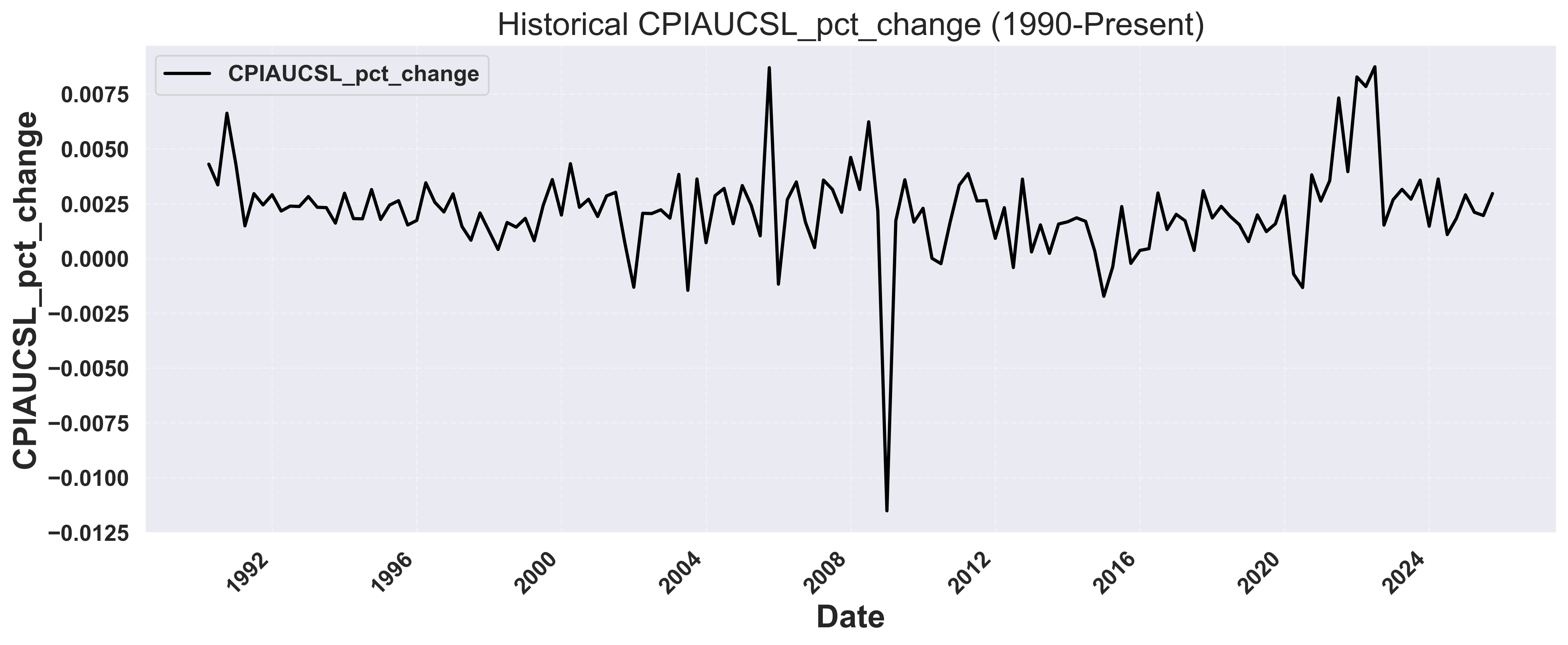 The plot shows the quarterly percent change in CPI from 1990 to present, revealing economic cycles and inflation trends.
### 5. Run Backtesting Scenarios
Now let's run three forecasting scenarios to compare performance:
1. **Univariate**: Forecast using only CPI history
2. **Multivariate (No Leak)**: Add other economic indicators as context
3. **Multivariate (With Future Leak)**: Include future variables (e.g., Fed Funds Rate)
```python theme={null}
# Configuration
TARGET_COLUMN = "CPIAUCSL_pct_change"
METADATA_COLUMNS = [
"FEDFUNDS_pct_change",
"GDPH_pct_change",
"UNRATE_pct_change",
"SPY_pct_change",
]
FORECAST_WINDOW = 1 # Forecast 1 quarter ahead
NUM_BACKTEST_ROWS = 12 # Backtest last 12 quarters (3 years)
def calculate_metrics(actual, predicted):
"""Calculate forecast accuracy metrics using scikit-learn."""
mae = mean_absolute_error(actual, predicted)
rmse = np.sqrt(mean_squared_error(actual, predicted))
mape = mean_absolute_percentage_error(actual, predicted) * 100
return {"MAE": mae, "RMSE": rmse, "MAPE": mape}
def extract_actuals_and_predictions(response, request, df_with_date):
"""Extract actual and predicted values from forecast response."""
all_actuals = []
all_predictions = []
for forecast_row, sample in zip(response.forecasts, request.samples):
if forecast_row[0].values:
target_dates = pd.to_datetime(forecast_row[0].timestamps)
predictions = forecast_row[0].values
actuals = []
for date in target_dates:
actual_val = df_with_date[df_with_date["date"] == date][
TARGET_COLUMN
].values
if len(actual_val) > 0:
actuals.append(actual_val[0])
if len(actuals) == len(predictions):
all_actuals.extend(actuals)
all_predictions.extend(predictions)
return all_actuals, all_predictions
async def run_backtest(df, metadata_cols=None, leak_cols=None):
"""
Generic backtesting function for target column forecasting.
Args:
df: Combined economic dataset
metadata_cols: List of metadata columns to use (None for univariate)
leak_cols: List of columns to leak (None for no leak)
Returns:
tuple: (metrics, response)
"""
# Prepare data
if metadata_cols is None:
# Univariate: only target column
data_df = df.reset_index()[["date", TARGET_COLUMN]].copy()
metadata_cols = []
else:
# Multivariate: target column + other indicators
data_df = df.reset_index().copy()
# Create backtesting request
request = ForecastV2Request.from_dfs_pre_split(
dfs=[data_df],
timestamp_col="date",
target_cols=[TARGET_COLUMN],
model="Migas-1.0",
num_target_rows=NUM_BACKTEST_ROWS,
forecast_window=FORECAST_WINDOW,
stride=FORECAST_WINDOW,
metadata_cols=metadata_cols,
leak_cols=leak_cols or [],
)
# Make forecast
async with SynthefyAsyncAPIClient() as client:
response = await client.forecast(request)
# Calculate metrics
all_actuals, all_predictions = extract_actuals_and_predictions(
response, request, data_df
)
metrics = calculate_metrics(all_actuals, all_predictions)
return metrics, response
async def run_all_backtests():
"""Run all three backtesting scenarios and compare results."""
df = create_combined_dataset()
# Run three scenarios in parallel
results = await asyncio.gather(
run_backtest(df, metadata_cols=None, leak_cols=None),
run_backtest(df, metadata_cols=METADATA_COLUMNS, leak_cols=None),
run_backtest(df, metadata_cols=METADATA_COLUMNS, leak_cols=METADATA_COLUMNS),
)
metrics1, response1 = results[0]
metrics2, response2 = results[1]
metrics3, response3 = results[2]
return df, (metrics1, metrics2, metrics3), (response1, response2, response3)
# Run backtests
df, metrics_list, responses = asyncio.run(run_all_backtests())
metrics1, metrics2, metrics3 = metrics_list
```
### 6. Compare Results
Let's print the comparison of all three scenarios:
```python theme={null}
def print_comparison_summary(metrics1, metrics2, metrics3):
"""Print formatted comparison table of all three scenarios."""
print(f"\n{'Scenario':<45} {'MAE':>10} {'RMSE':>10} {'MAPE':>10}")
print("-" * 80)
scenarios = [
("1. Univariate (target only)", metrics1),
("2. Multivariate (No Leak)", metrics2),
("3. Multivariate (With Leak)", metrics3),
]
for name, m in scenarios:
print(
f"{name:<45} {m['MAE']:>10.6f} {m['RMSE']:>10.6f} {m['MAPE']:>9.2f}%"
)
print_comparison_summary(metrics1, metrics2, metrics3)
```
Example output:
```
Scenario MAE RMSE MAPE
--------------------------------------------------------------------------------
1. Univariate (target only) 0.000893 0.001020 42.39%
2. Multivariate (No Leak) 0.000812 0.000941 38.56%
3. Multivariate (With Leak) 0.000671 0.000825 34.74%
```
### 7. Visualize Forecast Comparison
Create a comprehensive visualization showing all forecast scenarios:
```python theme={null}
def plot_forecast_comparison(df, responses, metrics_list, output_dir="economic_backtesting"):
"""
Plot comparison of all three forecasting scenarios.
Args:
df: Combined economic dataset with date index
responses: Tuple of (response1, response2, response3)
metrics_list: List of (metrics1, metrics2, metrics3)
output_dir: Directory to save the plot
"""
os.makedirs(output_dir, exist_ok=True)
response1, response2, response3 = responses
metrics1, metrics2, metrics3 = metrics_list
# Prepare data
data_df = df.reset_index()[["date", TARGET_COLUMN]].copy()
# Find the earliest forecast date to determine train/test split
earliest_forecast_date = None
for forecast_row in response1.forecasts:
if forecast_row[0].values:
dates = pd.to_datetime(forecast_row[0].timestamps)
if earliest_forecast_date is None or dates.min() < earliest_forecast_date:
earliest_forecast_date = dates.min()
# Calculate cutoff to show last 50% of historical data before forecasts
historical_before_forecast = data_df[data_df["date"] < earliest_forecast_date]
cutoff_idx = int(len(historical_before_forecast) * 0.5) # Show last 50% of history
cutoff_date = historical_before_forecast.iloc[cutoff_idx]["date"]
# Filter to show last 50% of historical data + all forecasts
data_df_filtered = data_df[data_df["date"] >= cutoff_date].copy()
fig, ax = plt.subplots(figsize=(14, 6))
# Plot ground truth (last 50% of history)
ax.plot(
data_df_filtered["date"],
data_df_filtered[TARGET_COLUMN],
color=COLORS["groundtruth"],
linewidth=2,
label="Actual",
zorder=4,
alpha=0.8,
)
# Extract and plot forecasts for each scenario
scenarios = [
(response1, metrics1, "univariate", "Univariate"),
(response2, metrics2, "multivariate", "Multivariate (No Leak)"),
(response3, metrics3, "multivariate_leak", "Multivariate (With Leak)"),
]
for response, metrics, color_key, label in scenarios:
# Collect all forecast points across all windows
all_forecast_dates = []
all_forecast_values = []
for forecast_row in response.forecasts:
if forecast_row[0].values:
dates = pd.to_datetime(forecast_row[0].timestamps)
predictions = forecast_row[0].values
all_forecast_dates.extend(dates)
all_forecast_values.extend(predictions)
# Combine all forecasts into a single DataFrame
if all_forecast_dates:
combined_forecast_df = pd.DataFrame(
{"date": all_forecast_dates, "forecast": all_forecast_values}
)
# Remove duplicates by taking the mean if same date appears multiple times
combined_forecast_df = (
combined_forecast_df.groupby("date").mean().reset_index()
)
combined_forecast_df = combined_forecast_df.sort_values("date")
# Plot as a single continuous line
ax.plot(
combined_forecast_df["date"],
combined_forecast_df["forecast"],
color=COLORS[color_key],
linewidth=2,
alpha=0.7,
label=f"{label} (MAPE: {metrics['MAPE']:.2f}%)",
zorder=3,
)
# Add vertical line at the train/test split (where forecasts begin)
ax.axvline(
x=earliest_forecast_date,
color="red",
linestyle="--",
linewidth=2,
alpha=0.7,
label="Train/Test Split",
zorder=2,
)
# Set labels and title
ax.set_xlabel("Date")
ax.set_ylabel(f"{TARGET_COLUMN}")
ax.set_title("Forecast Comparison: All Scenarios")
# Add grid and legend
ax.grid(True, linestyle="--", alpha=0.3)
# Place legend inside plot area at lower left with 2 rows
ax.legend(loc="lower left", frameon=True, ncol=3)
# Format x-axis
plt.xticks(rotation=45, ha="right")
plt.tight_layout()
# Save plot
plot_path = os.path.join(output_dir, "forecast_comparison.png")
plt.savefig(plot_path, dpi=300, bbox_inches="tight")
print(f"Forecast comparison plot saved to: {plot_path}")
plt.close()
# Generate the plot
plot_forecast_comparison(df, responses, metrics_list)
```
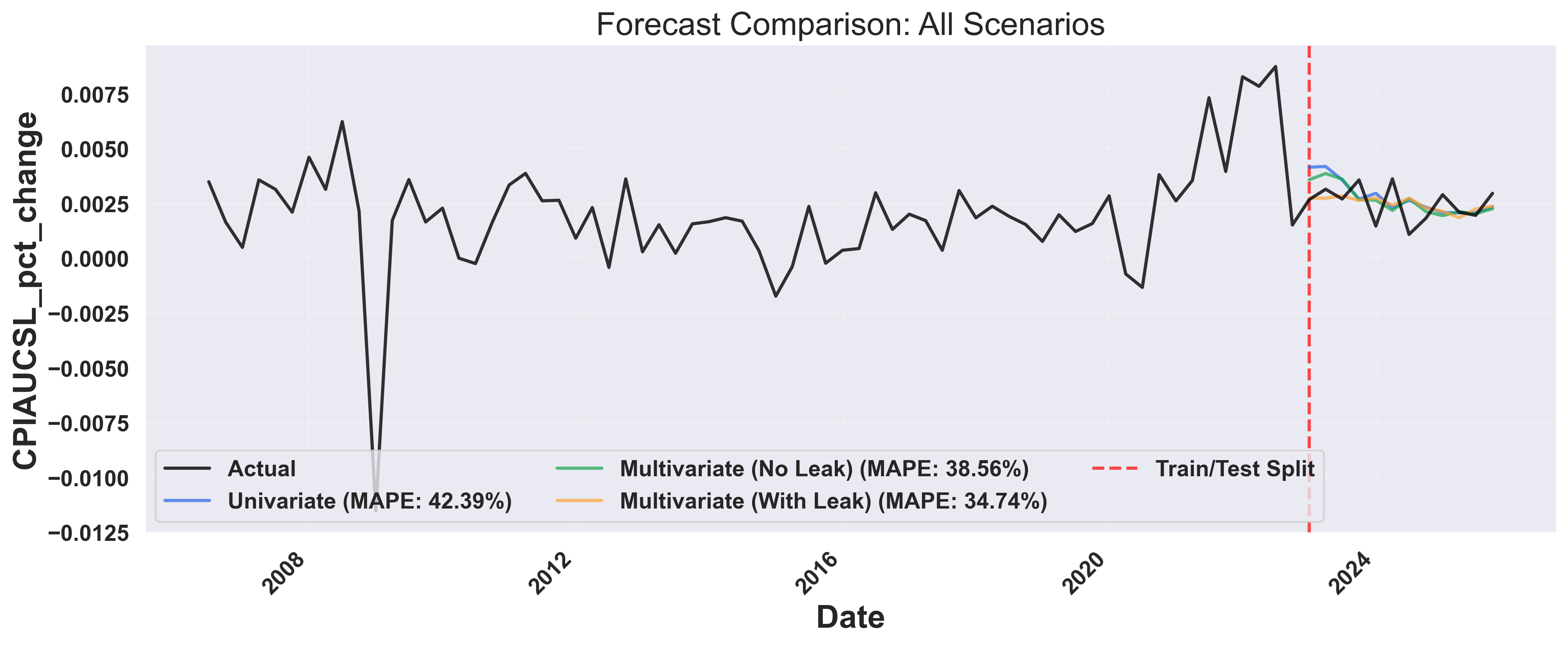
### Example Output: Forecast Comparison
The plot shows the quarterly percent change in CPI from 1990 to present, revealing economic cycles and inflation trends.
### 5. Run Backtesting Scenarios
Now let's run three forecasting scenarios to compare performance:
1. **Univariate**: Forecast using only CPI history
2. **Multivariate (No Leak)**: Add other economic indicators as context
3. **Multivariate (With Future Leak)**: Include future variables (e.g., Fed Funds Rate)
```python theme={null}
# Configuration
TARGET_COLUMN = "CPIAUCSL_pct_change"
METADATA_COLUMNS = [
"FEDFUNDS_pct_change",
"GDPH_pct_change",
"UNRATE_pct_change",
"SPY_pct_change",
]
FORECAST_WINDOW = 1 # Forecast 1 quarter ahead
NUM_BACKTEST_ROWS = 12 # Backtest last 12 quarters (3 years)
def calculate_metrics(actual, predicted):
"""Calculate forecast accuracy metrics using scikit-learn."""
mae = mean_absolute_error(actual, predicted)
rmse = np.sqrt(mean_squared_error(actual, predicted))
mape = mean_absolute_percentage_error(actual, predicted) * 100
return {"MAE": mae, "RMSE": rmse, "MAPE": mape}
def extract_actuals_and_predictions(response, request, df_with_date):
"""Extract actual and predicted values from forecast response."""
all_actuals = []
all_predictions = []
for forecast_row, sample in zip(response.forecasts, request.samples):
if forecast_row[0].values:
target_dates = pd.to_datetime(forecast_row[0].timestamps)
predictions = forecast_row[0].values
actuals = []
for date in target_dates:
actual_val = df_with_date[df_with_date["date"] == date][
TARGET_COLUMN
].values
if len(actual_val) > 0:
actuals.append(actual_val[0])
if len(actuals) == len(predictions):
all_actuals.extend(actuals)
all_predictions.extend(predictions)
return all_actuals, all_predictions
async def run_backtest(df, metadata_cols=None, leak_cols=None):
"""
Generic backtesting function for target column forecasting.
Args:
df: Combined economic dataset
metadata_cols: List of metadata columns to use (None for univariate)
leak_cols: List of columns to leak (None for no leak)
Returns:
tuple: (metrics, response)
"""
# Prepare data
if metadata_cols is None:
# Univariate: only target column
data_df = df.reset_index()[["date", TARGET_COLUMN]].copy()
metadata_cols = []
else:
# Multivariate: target column + other indicators
data_df = df.reset_index().copy()
# Create backtesting request
request = ForecastV2Request.from_dfs_pre_split(
dfs=[data_df],
timestamp_col="date",
target_cols=[TARGET_COLUMN],
model="Migas-1.0",
num_target_rows=NUM_BACKTEST_ROWS,
forecast_window=FORECAST_WINDOW,
stride=FORECAST_WINDOW,
metadata_cols=metadata_cols,
leak_cols=leak_cols or [],
)
# Make forecast
async with SynthefyAsyncAPIClient() as client:
response = await client.forecast(request)
# Calculate metrics
all_actuals, all_predictions = extract_actuals_and_predictions(
response, request, data_df
)
metrics = calculate_metrics(all_actuals, all_predictions)
return metrics, response
async def run_all_backtests():
"""Run all three backtesting scenarios and compare results."""
df = create_combined_dataset()
# Run three scenarios in parallel
results = await asyncio.gather(
run_backtest(df, metadata_cols=None, leak_cols=None),
run_backtest(df, metadata_cols=METADATA_COLUMNS, leak_cols=None),
run_backtest(df, metadata_cols=METADATA_COLUMNS, leak_cols=METADATA_COLUMNS),
)
metrics1, response1 = results[0]
metrics2, response2 = results[1]
metrics3, response3 = results[2]
return df, (metrics1, metrics2, metrics3), (response1, response2, response3)
# Run backtests
df, metrics_list, responses = asyncio.run(run_all_backtests())
metrics1, metrics2, metrics3 = metrics_list
```
### 6. Compare Results
Let's print the comparison of all three scenarios:
```python theme={null}
def print_comparison_summary(metrics1, metrics2, metrics3):
"""Print formatted comparison table of all three scenarios."""
print(f"\n{'Scenario':<45} {'MAE':>10} {'RMSE':>10} {'MAPE':>10}")
print("-" * 80)
scenarios = [
("1. Univariate (target only)", metrics1),
("2. Multivariate (No Leak)", metrics2),
("3. Multivariate (With Leak)", metrics3),
]
for name, m in scenarios:
print(
f"{name:<45} {m['MAE']:>10.6f} {m['RMSE']:>10.6f} {m['MAPE']:>9.2f}%"
)
print_comparison_summary(metrics1, metrics2, metrics3)
```
Example output:
```
Scenario MAE RMSE MAPE
--------------------------------------------------------------------------------
1. Univariate (target only) 0.000893 0.001020 42.39%
2. Multivariate (No Leak) 0.000812 0.000941 38.56%
3. Multivariate (With Leak) 0.000671 0.000825 34.74%
```
### 7. Visualize Forecast Comparison
Create a comprehensive visualization showing all forecast scenarios:
```python theme={null}
def plot_forecast_comparison(df, responses, metrics_list, output_dir="economic_backtesting"):
"""
Plot comparison of all three forecasting scenarios.
Args:
df: Combined economic dataset with date index
responses: Tuple of (response1, response2, response3)
metrics_list: List of (metrics1, metrics2, metrics3)
output_dir: Directory to save the plot
"""
os.makedirs(output_dir, exist_ok=True)
response1, response2, response3 = responses
metrics1, metrics2, metrics3 = metrics_list
# Prepare data
data_df = df.reset_index()[["date", TARGET_COLUMN]].copy()
# Find the earliest forecast date to determine train/test split
earliest_forecast_date = None
for forecast_row in response1.forecasts:
if forecast_row[0].values:
dates = pd.to_datetime(forecast_row[0].timestamps)
if earliest_forecast_date is None or dates.min() < earliest_forecast_date:
earliest_forecast_date = dates.min()
# Calculate cutoff to show last 50% of historical data before forecasts
historical_before_forecast = data_df[data_df["date"] < earliest_forecast_date]
cutoff_idx = int(len(historical_before_forecast) * 0.5) # Show last 50% of history
cutoff_date = historical_before_forecast.iloc[cutoff_idx]["date"]
# Filter to show last 50% of historical data + all forecasts
data_df_filtered = data_df[data_df["date"] >= cutoff_date].copy()
fig, ax = plt.subplots(figsize=(14, 6))
# Plot ground truth (last 50% of history)
ax.plot(
data_df_filtered["date"],
data_df_filtered[TARGET_COLUMN],
color=COLORS["groundtruth"],
linewidth=2,
label="Actual",
zorder=4,
alpha=0.8,
)
# Extract and plot forecasts for each scenario
scenarios = [
(response1, metrics1, "univariate", "Univariate"),
(response2, metrics2, "multivariate", "Multivariate (No Leak)"),
(response3, metrics3, "multivariate_leak", "Multivariate (With Leak)"),
]
for response, metrics, color_key, label in scenarios:
# Collect all forecast points across all windows
all_forecast_dates = []
all_forecast_values = []
for forecast_row in response.forecasts:
if forecast_row[0].values:
dates = pd.to_datetime(forecast_row[0].timestamps)
predictions = forecast_row[0].values
all_forecast_dates.extend(dates)
all_forecast_values.extend(predictions)
# Combine all forecasts into a single DataFrame
if all_forecast_dates:
combined_forecast_df = pd.DataFrame(
{"date": all_forecast_dates, "forecast": all_forecast_values}
)
# Remove duplicates by taking the mean if same date appears multiple times
combined_forecast_df = (
combined_forecast_df.groupby("date").mean().reset_index()
)
combined_forecast_df = combined_forecast_df.sort_values("date")
# Plot as a single continuous line
ax.plot(
combined_forecast_df["date"],
combined_forecast_df["forecast"],
color=COLORS[color_key],
linewidth=2,
alpha=0.7,
label=f"{label} (MAPE: {metrics['MAPE']:.2f}%)",
zorder=3,
)
# Add vertical line at the train/test split (where forecasts begin)
ax.axvline(
x=earliest_forecast_date,
color="red",
linestyle="--",
linewidth=2,
alpha=0.7,
label="Train/Test Split",
zorder=2,
)
# Set labels and title
ax.set_xlabel("Date")
ax.set_ylabel(f"{TARGET_COLUMN}")
ax.set_title("Forecast Comparison: All Scenarios")
# Add grid and legend
ax.grid(True, linestyle="--", alpha=0.3)
# Place legend inside plot area at lower left with 2 rows
ax.legend(loc="lower left", frameon=True, ncol=3)
# Format x-axis
plt.xticks(rotation=45, ha="right")
plt.tight_layout()
# Save plot
plot_path = os.path.join(output_dir, "forecast_comparison.png")
plt.savefig(plot_path, dpi=300, bbox_inches="tight")
print(f"Forecast comparison plot saved to: {plot_path}")
plt.close()
# Generate the plot
plot_forecast_comparison(df, responses, metrics_list)
```
### Example Output: Forecast Comparison
 ### 8. Metrics Comparison
Finally, let's create a bar chart comparing the performance metrics:
```python theme={null}
def plot_metrics_comparison(metrics_list, output_dir="usecases/economic_backtesting"):
"""
Plot bar chart comparing metrics across scenarios.
Args:
metrics_list: Tuple of (metrics1, metrics2, metrics3)
output_dir: Directory to save the plot
"""
os.makedirs(output_dir, exist_ok=True)
metrics1, metrics2, metrics3 = metrics_list
scenarios = [
"Univariate",
"Multivariate\n(No Leak)",
"Multivariate\n(With Leak)",
]
mae_values = [metrics1["MAE"], metrics2["MAE"], metrics3["MAE"]]
mape_values = [metrics1["MAPE"], metrics2["MAPE"], metrics3["MAPE"]]
fig, (ax1, ax2) = plt.subplots(1, 2, figsize=(14, 6))
x = np.arange(len(scenarios))
bar_colors = ["#2563eb", "#16a34a", "#fea333"]
# MAE plot
bars1 = ax1.bar(
x,
mae_values,
color=bar_colors,
alpha=0.8,
edgecolor="black",
linewidth=1,
)
for i, (bar, val) in enumerate(zip(bars1, mae_values)):
ax1.text(
bar.get_x() + bar.get_width() / 2,
bar.get_height() + max(mae_values) * 0.02,
f"{val:.4f}",
ha="center",
va="bottom",
fontsize=10,
)
ax1.set_xlabel("Scenarios")
ax1.set_ylabel("MAE (Mean Absolute Error)")
ax1.set_title("MAE Comparison")
ax1.set_xticks(x)
ax1.set_xticklabels(scenarios)
ax1.set_ylim(0, max(mae_values) * 1.15)
# MAPE plot
bars2 = ax2.bar(
x,
mape_values,
color=bar_colors,
alpha=0.8,
edgecolor="black",
linewidth=1,
)
for i, (bar, val) in enumerate(zip(bars2, mape_values)):
ax2.text(
bar.get_x() + bar.get_width() / 2,
bar.get_height() + max(mape_values) * 0.02,
f"{val:.2f}%",
ha="center",
va="bottom",
fontsize=10,
)
ax2.set_xlabel("Scenarios")
ax2.set_ylabel("MAPE (%)")
ax2.set_title("MAPE Comparison")
ax2.set_xticks(x)
ax2.set_xticklabels(scenarios)
ax2.set_ylim(0, max(mape_values) * 1.15)
plt.tight_layout()
# Save plot
plot_path = os.path.join(output_dir, "metrics_comparison.png")
plt.savefig(plot_path, dpi=300, bbox_inches="tight")
print(f"Metrics comparison plot saved to: {plot_path}")
plt.close()
# Generate the plot
plot_metrics_comparison(metrics_list)
```
### Example Output: Metrics Comparison
### 8. Metrics Comparison
Finally, let's create a bar chart comparing the performance metrics:
```python theme={null}
def plot_metrics_comparison(metrics_list, output_dir="usecases/economic_backtesting"):
"""
Plot bar chart comparing metrics across scenarios.
Args:
metrics_list: Tuple of (metrics1, metrics2, metrics3)
output_dir: Directory to save the plot
"""
os.makedirs(output_dir, exist_ok=True)
metrics1, metrics2, metrics3 = metrics_list
scenarios = [
"Univariate",
"Multivariate\n(No Leak)",
"Multivariate\n(With Leak)",
]
mae_values = [metrics1["MAE"], metrics2["MAE"], metrics3["MAE"]]
mape_values = [metrics1["MAPE"], metrics2["MAPE"], metrics3["MAPE"]]
fig, (ax1, ax2) = plt.subplots(1, 2, figsize=(14, 6))
x = np.arange(len(scenarios))
bar_colors = ["#2563eb", "#16a34a", "#fea333"]
# MAE plot
bars1 = ax1.bar(
x,
mae_values,
color=bar_colors,
alpha=0.8,
edgecolor="black",
linewidth=1,
)
for i, (bar, val) in enumerate(zip(bars1, mae_values)):
ax1.text(
bar.get_x() + bar.get_width() / 2,
bar.get_height() + max(mae_values) * 0.02,
f"{val:.4f}",
ha="center",
va="bottom",
fontsize=10,
)
ax1.set_xlabel("Scenarios")
ax1.set_ylabel("MAE (Mean Absolute Error)")
ax1.set_title("MAE Comparison")
ax1.set_xticks(x)
ax1.set_xticklabels(scenarios)
ax1.set_ylim(0, max(mae_values) * 1.15)
# MAPE plot
bars2 = ax2.bar(
x,
mape_values,
color=bar_colors,
alpha=0.8,
edgecolor="black",
linewidth=1,
)
for i, (bar, val) in enumerate(zip(bars2, mape_values)):
ax2.text(
bar.get_x() + bar.get_width() / 2,
bar.get_height() + max(mape_values) * 0.02,
f"{val:.2f}%",
ha="center",
va="bottom",
fontsize=10,
)
ax2.set_xlabel("Scenarios")
ax2.set_ylabel("MAPE (%)")
ax2.set_title("MAPE Comparison")
ax2.set_xticks(x)
ax2.set_xticklabels(scenarios)
ax2.set_ylim(0, max(mape_values) * 1.15)
plt.tight_layout()
# Save plot
plot_path = os.path.join(output_dir, "metrics_comparison.png")
plt.savefig(plot_path, dpi=300, bbox_inches="tight")
print(f"Metrics comparison plot saved to: {plot_path}")
plt.close()
# Generate the plot
plot_metrics_comparison(metrics_list)
```
### Example Output: Metrics Comparison
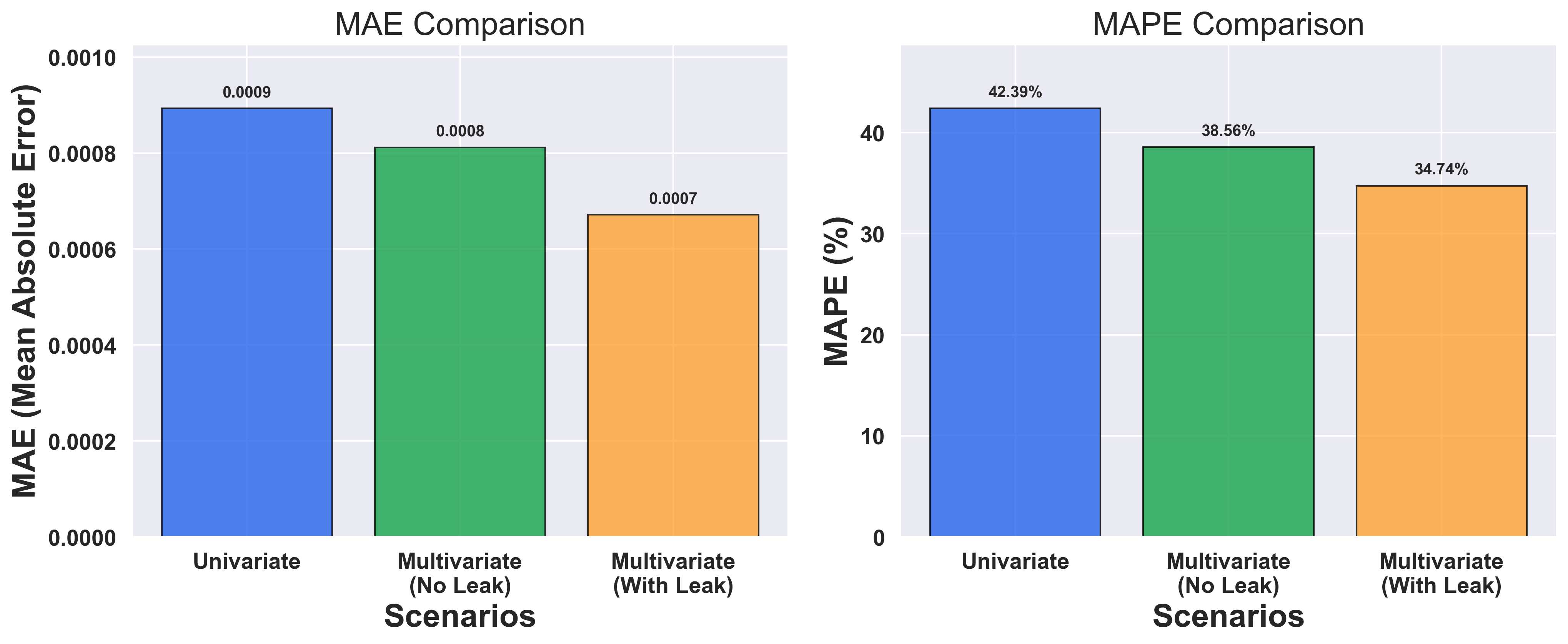 The bar charts clearly show the performance differences between the three approaches, with multivariate models leveraging economic relationships for better predictions.
## Key Insights
From this analysis, you can answer critical questions:
1. **How much does context help?** → Compare MAPE across scenarios to quantify improvement
2. **What If Forecasting** Variables known in advance (like Fed Funds Rate) can be included as leak columns
## Complete Code
Here's the full working example you can run:
```python theme={null}
import asyncio
import os
import matplotlib.pyplot as plt
import numpy as np
import pandas as pd
from fredapi import Fred
from haver import Haver
from sklearn.metrics import (
mean_absolute_error,
mean_absolute_percentage_error,
mean_squared_error,
)
df["date"] = pd.to_datetime(df["date"])
return df
def get_unemployment_rate():
"""Retrieve Unemployment Rate from FRED."""
df = (
fred.get_series("UNRATE", observation_start="1990-01-01")
.reset_index()
.rename(columns={"index": "date", 0: "UNRATE"})
)
df["date"] = pd.to_datetime(df["date"])
return df
def get_consumer_price_index():
"""Retrieve Consumer Price Index from FRED."""
df = (
fred.get_series("CPIAUCSL", observation_start="1990-01-01")
.reset_index()
.rename(columns={"index": "date", 0: "CPIAUCSL"})
)
df["date"] = pd.to_datetime(df["date"])
return df
def get_sp500():
"""Retrieve S&P 500 Index from Haver."""
return get_haver_series("SP500@USECON", "SPY")
def create_combined_dataset():
"""Combine economic indicators into a single quarterly dataset."""
# Fetch all data sources
gdp_df = get_haver_gdp()
fed_funds = get_federal_funds_rate()
unemployment = get_unemployment_rate()
cpi = get_consumer_price_index()
sp500 = get_sp500()
# Merge monthly indicators
macro_df = (
fed_funds.merge(unemployment, on="date", how="outer")
.merge(cpi, on="date", how="outer")
.merge(sp500, on="date", how="outer")
)
macro_df["date"] = pd.to_datetime(macro_df["date"])
macro_df = macro_df.set_index("date")
# Join with GDP and forward-fill
gdp_df["date"] = pd.to_datetime(gdp_df["date"])
gdp_indexed = gdp_df.set_index("date")[["GDPH_pct_change"]]
combined_df = gdp_indexed.join(macro_df, how="outer")
combined_df["GDPH_pct_change"] = combined_df["GDPH_pct_change"].ffill()
# Calculate percent changes
for col in ["FEDFUNDS", "UNRATE", "CPIAUCSL", "SPY"]:
combined_df[f"{col}_pct_change"] = combined_df[col].pct_change()
# Filter and resample to quarterly
combined_df = combined_df[combined_df.index >= "1990-01-01"]
combined_df = combined_df.filter(like="_pct_change").ffill().dropna()
combined_df = combined_df.resample("QE").mean()
return combined_df
def plot_raw_time_series(df, output_dir="economic_backtesting"):
"""Plot raw time series data."""
os.makedirs(output_dir, exist_ok=True)
fig, ax = plt.subplots(figsize=(14, 6))
ax.plot(
df.index,
df[TARGET_COLUMN],
color=COLORS["groundtruth"],
linewidth=2,
label=f"{TARGET_COLUMN}",
zorder=2,
)
ax.set_xlabel("Date")
ax.set_ylabel(f"{TARGET_COLUMN}")
ax.set_title(f"Historical {TARGET_COLUMN} (1990-Present)")
ax.grid(True, linestyle="--", alpha=0.3)
ax.legend(loc="upper left", frameon=True)
plt.xticks(rotation=45, ha="right")
plt.tight_layout()
plot_path = os.path.join(output_dir, "raw_time_series.png")
plt.savefig(plot_path, dpi=300, bbox_inches="tight")
print(f"Raw time series plot saved to: {plot_path}")
plt.close()
def calculate_metrics(actual, predicted):
"""Calculate forecast accuracy metrics."""
mae = mean_absolute_error(actual, predicted)
rmse = np.sqrt(mean_squared_error(actual, predicted))
mape = mean_absolute_percentage_error(actual, predicted) * 100
return {"MAE": mae, "RMSE": rmse, "MAPE": mape}
def extract_actuals_and_predictions(response, request, df_with_date):
"""Extract actual and predicted values from forecast response."""
all_actuals = []
all_predictions = []
for forecast_row, sample in zip(response.forecasts, request.samples):
if forecast_row[0].values:
target_dates = pd.to_datetime(forecast_row[0].timestamps)
predictions = forecast_row[0].values
actuals = []
for date in target_dates:
actual_val = df_with_date[df_with_date["date"] == date][
TARGET_COLUMN
].values
if len(actual_val) > 0:
actuals.append(actual_val[0])
if len(actuals) == len(predictions):
all_actuals.extend(actuals)
all_predictions.extend(predictions)
return all_actuals, all_predictions
def plot_forecast_comparison(
df, responses, metrics_list, output_dir="economic_backtesting"
):
"""Plot comparison of all three forecasting scenarios."""
os.makedirs(output_dir, exist_ok=True)
response1, response2, response3 = responses
metrics1, metrics2, metrics3 = metrics_list
data_df = df.reset_index()[["date", TARGET_COLUMN]].copy()
# Find the earliest forecast date to determine train/test split
earliest_forecast_date = None
for forecast_row in response1.forecasts:
if forecast_row[0].values:
dates = pd.to_datetime(forecast_row[0].timestamps)
if earliest_forecast_date is None or dates.min() < earliest_forecast_date:
earliest_forecast_date = dates.min()
# Calculate cutoff to show last 50% of historical data before forecasts
historical_before_forecast = data_df[data_df["date"] < earliest_forecast_date]
cutoff_idx = int(len(historical_before_forecast) * 0.5)
cutoff_date = historical_before_forecast.iloc[cutoff_idx]["date"]
# Filter to show last 50% of historical data + all forecasts
data_df_filtered = data_df[data_df["date"] >= cutoff_date].copy()
fig, ax = plt.subplots(figsize=(14, 6))
# Plot ground truth
ax.plot(
data_df_filtered["date"],
data_df_filtered[TARGET_COLUMN],
color=COLORS["groundtruth"],
linewidth=2,
label="Actual",
zorder=4,
alpha=0.8,
)
# Plot forecasts for each scenario
scenarios = [
(response1, metrics1, "univariate", "Univariate"),
(response2, metrics2, "multivariate", "Multivariate (No Leak)"),
(response3, metrics3, "multivariate_leak", "Multivariate (With Leak)"),
]
FORECAST_WINDOW = 1 # Forecast 1 quarter ahead
NUM_BACKTEST_ROWS = 12 # Backtest last 12 quarters (3 years)
# Initialize Haver and FRED
haver = Haver(api_key=HAVER_API_KEY)
fred = Fred(api_key=FRED_API_KEY)
# Plot colors
COLORS = {
"univariate": "#2563eb",
"multivariate": "#16a34a",
"multivariate_leak": "#fea333",
"groundtruth": "black",
}
def get_haver_series(haver_code, column_name):
"""Retrieve data from Haver and calculate percent change."""
df = haver.read_df(haver_codes=[haver_code])
df = df[df.columns[df.columns.isin(["date", "value"])]]
df = df.dropna()
df = df.rename(columns={"value": column_name})
df["date"] = pd.to_datetime(df["date"])
pct_change_column = f"{column_name}_pct_change"
df[pct_change_column] = df[column_name].pct_change().dropna()
return df
def get_haver_gdp():
"""Retrieve Real GDP from Haver."""
return get_haver_series("GDPHA@USECON", "GDPH")
def get_federal_funds_rate():
"""Retrieve Federal Funds Effective Rate from FRED."""
df = (
fred.get_series("FEDFUNDS", observation_start="1990-01-01")
.reset_index()
.rename(columns={"index": "date", 0: "FEDFUNDS"})
)
df["date"] = pd.to_datetime(df["date"])
return df
def get_unemployment_rate():
"""Retrieve Unemployment Rate from FRED."""
df = (
fred.get_series("UNRATE", observation_start="1990-01-01")
.reset_index()
.rename(columns={"index": "date", 0: "UNRATE"})
)
df["date"] = pd.to_datetime(df["date"])
return df
def get_consumer_price_index():
"""Retrieve Consumer Price Index from FRED."""
df = (
fred.get_series("CPIAUCSL", observation_start="1990-01-01")
.reset_index()
.rename(columns={"index": "date", 0: "CPIAUCSL"})
)
df["date"] = pd.to_datetime(df["date"])
return df
def get_sp500():
"""Retrieve S&P 500 Index from Haver."""
return get_haver_series("SP500@USECON", "SPY")
def create_combined_dataset():
"""Combine economic indicators into a single quarterly dataset."""
# Fetch all data sources
gdp_df = get_haver_gdp()
fed_funds = get_federal_funds_rate()
unemployment = get_unemployment_rate()
cpi = get_consumer_price_index()
sp500 = get_sp500()
# Merge monthly indicators
macro_df = (
fed_funds.merge(unemployment, on="date", how="outer")
.merge(cpi, on="date", how="outer")
.merge(sp500, on="date", how="outer")
)
macro_df["date"] = pd.to_datetime(macro_df["date"])
macro_df = macro_df.set_index("date")
# Join with GDP and forward-fill
gdp_df["date"] = pd.to_datetime(gdp_df["date"])
gdp_indexed = gdp_df.set_index("date")[["GDPH_pct_change"]]
combined_df = gdp_indexed.join(macro_df, how="outer")
combined_df["GDPH_pct_change"] = combined_df["GDPH_pct_change"].ffill()
# Calculate percent changes
for col in ["FEDFUNDS", "UNRATE", "CPIAUCSL", "SPY"]:
combined_df[f"{col}_pct_change"] = combined_df[col].pct_change()
# Filter and resample to quarterly
combined_df = combined_df[combined_df.index >= "1990-01-01"]
combined_df = combined_df.filter(like="_pct_change").ffill().dropna()
combined_df = combined_df.resample("QE").mean()
return combined_df
def plot_raw_time_series(df, output_dir="economic_backtesting"):
"""Plot raw time series data."""
os.makedirs(output_dir, exist_ok=True)
fig, ax = plt.subplots(figsize=(14, 6))
ax.plot(
df.index,
df[TARGET_COLUMN],
color=COLORS["groundtruth"],
linewidth=2,
label=f"{TARGET_COLUMN}",
zorder=2,
)
ax.set_xlabel("Date")
ax.set_ylabel(f"{TARGET_COLUMN}")
ax.set_title(f"Historical {TARGET_COLUMN} (1990-Present)")
ax.grid(True, linestyle="--", alpha=0.3)
ax.legend(loc="upper left", frameon=True)
plt.xticks(rotation=45, ha="right")
plt.tight_layout()
plot_path = os.path.join(output_dir, "raw_time_series.png")
plt.savefig(plot_path, dpi=300, bbox_inches="tight")
print(f"Raw time series plot saved to: {plot_path}")
plt.close()
def calculate_metrics(actual, predicted):
"""Calculate forecast accuracy metrics."""
mae = mean_absolute_error(actual, predicted)
rmse = np.sqrt(mean_squared_error(actual, predicted))
mape = mean_absolute_percentage_error(actual, predicted) * 100
return {"MAE": mae, "RMSE": rmse, "MAPE": mape}
def extract_actuals_and_predictions(response, request, df_with_date):
"""Extract actual and predicted values from forecast response."""
all_actuals = []
all_predictions = []
for forecast_row, sample in zip(response.forecasts, request.samples):
if forecast_row[0].values:
target_dates = pd.to_datetime(forecast_row[0].timestamps)
predictions = forecast_row[0].values
all_forecast_dates.extend(dates)
all_forecast_values.extend(predictions)
if all_forecast_dates:
combined_forecast_df = pd.DataFrame(
{"date": all_forecast_dates, "forecast": all_forecast_values}
)
combined_forecast_df = (
combined_forecast_df.groupby("date").mean().reset_index()
)
combined_forecast_df = combined_forecast_df.sort_values("date")
ax.plot(
combined_forecast_df["date"],
combined_forecast_df["forecast"],
color=COLORS[color_key],
linewidth=2,
alpha=0.7,
label=f"{label} (MAPE: {metrics['MAPE']:.2f}%)",
zorder=3,
)
# Add vertical line at the train/test split
ax.axvline(
x=earliest_forecast_date,
color="red",
linestyle="--",
linewidth=2,
alpha=0.7,
label="Train/Test Split",
zorder=2,
)
ax.set_xlabel("Date")
ax.set_ylabel(f"{TARGET_COLUMN}")
ax.set_title("Forecast Comparison: All Scenarios")
ax.grid(True, linestyle="--", alpha=0.3)
ax.legend(loc="lower left", frameon=True, ncol=3)
plt.xticks(rotation=45, ha="right")
plt.tight_layout()
plot_path = os.path.join(output_dir, "forecast_comparison.png")
plt.savefig(plot_path, dpi=300, bbox_inches="tight")
print(f"Forecast comparison plot saved to: {plot_path}")
plt.close()
def plot_metrics_comparison(
metrics_list, output_dir="economic_backtesting"
):
"""Plot bar chart comparing metrics across scenarios."""
os.makedirs(output_dir, exist_ok=True)
metrics1, metrics2, metrics3 = metrics_list
scenarios = [
"Univariate",
"Multivariate\n(No Leak)",
"Multivariate\n(With Leak)",
]
mae_values = [metrics1["MAE"], metrics2["MAE"], metrics3["MAE"]]
mape_values = [metrics1["MAPE"], metrics2["MAPE"], metrics3["MAPE"]]
fig, (ax1, ax2) = plt.subplots(1, 2, figsize=(14, 6))
x = np.arange(len(scenarios))
bar_colors = [
COLORS["univariate"],
COLORS["multivariate"],
COLORS["multivariate_leak"],
]
# MAE plot
bars1 = ax1.bar(
x, mae_values, color=bar_colors, alpha=0.8, edgecolor="black", linewidth=1
)
for i, (bar, val) in enumerate(zip(bars1, mae_values)):
ax1.text(
bar.get_x() + bar.get_width() / 2,
bar.get_height() + max(mae_values) * 0.02,
f"{val:.4f}",
ha="center",
va="bottom",
fontsize=10,
)
ax1.set_xlabel("Scenarios")
ax1.set_ylabel("MAE (Mean Absolute Error)")
ax1.set_title("MAE Comparison")
ax1.set_xticks(x)
ax1.set_xticklabels(scenarios)
ax1.set_ylim(0, max(mae_values) * 1.15)
# MAPE plot
bars2 = ax2.bar(
x, mape_values, color=bar_colors, alpha=0.8, edgecolor="black", linewidth=1
)
for i, (bar, val) in enumerate(zip(bars2, mape_values)):
ax2.text(
bar.get_x() + bar.get_width() / 2,
bar.get_height() + max(mape_values) * 0.02,
f"{val:.2f}%",
ha="center",
va="bottom",
fontsize=10,
)
ax2.set_xlabel("Scenarios")
ax2.set_ylabel("MAPE (%)")
ax2.set_title("MAPE Comparison")
ax2.set_xticks(x)
ax2.set_xticklabels(scenarios)
ax2.set_ylim(0, max(mape_values) * 1.15)
plt.tight_layout()
plot_path = os.path.join(output_dir, "metrics_comparison.png")
plt.savefig(plot_path, dpi=300, bbox_inches="tight")
print(f"Metrics comparison plot saved to: {plot_path}")
plt.close()
async def run_backtest(df, metadata_cols=None, leak_cols=None):
"""Generic backtesting function for target column forecasting."""
if metadata_cols is None:
data_df = df.reset_index()[["date", TARGET_COLUMN]].copy()
# Show only last 10% of data
total_rows = len(data_df)
cutoff_idx = int(total_rows * 0.9)
cutoff_date = data_df.iloc[cutoff_idx]["date"]
data_df_filtered = data_df[data_df["date"] >= cutoff_date].copy()
fig, ax = plt.subplots(figsize=(14, 6))
# Plot ground truth
ax.plot(
data_df_filtered["date"],
data_df_filtered[TARGET_COLUMN],
color=COLORS["groundtruth"],
linewidth=2,
label="Actual",
zorder=4,
alpha=0.8,
)
# Plot forecasts for each scenario
scenarios = [
(response1, metrics1, "univariate", "Univariate"),
(response2, metrics2, "multivariate", "Multivariate (No Leak)"),
(response3, metrics3, "multivariate_leak", "Multivariate (With Leak)"),
]
for response, metrics, color_key, label in scenarios:
all_forecast_dates = []
all_forecast_values = []
for forecast_row in response.forecasts:
if forecast_row[0].values:
dates = pd.to_datetime(forecast_row[0].timestamps)
predictions = forecast_row[0].values
all_forecast_dates.extend(dates)
all_forecast_values.extend(predictions)
if all_forecast_dates:
combined_forecast_df = pd.DataFrame(
{"date": all_forecast_dates, "forecast": all_forecast_values}
)
combined_forecast_df = (
combined_forecast_df.groupby("date").mean().reset_index()
)
combined_forecast_df = combined_forecast_df.sort_values("date")
ax.plot(
combined_forecast_df["date"],
combined_forecast_df["forecast"],
color=COLORS[color_key],
linewidth=2,
alpha=0.7,
label=f"{label} (MAPE: {metrics['MAPE']:.2f}%)",
zorder=3,
)
ax.set_xlabel("Date")
ax.set_ylabel(f"{TARGET_COLUMN}")
ax.set_title(
"Forecast Comparison: All Scenarios (Last 10% of History + Forecasts)"
)
ax.grid(True, linestyle="--", alpha=0.3)
ax.legend(loc="upper left", frameon=True)
plt.xticks(rotation=45, ha="right")
plt.tight_layout()
plot_path = os.path.join(output_dir, "forecast_comparison.png")
plt.savefig(plot_path, dpi=300, bbox_inches="tight")
print(f"Forecast comparison plot saved to: {plot_path}")
plt.close()
def plot_metrics_comparison(
metrics_list, output_dir="economic_backtesting"
):
"""Plot bar chart comparing metrics across scenarios."""
os.makedirs(output_dir, exist_ok=True)
metrics1, metrics2, metrics3 = metrics_list
scenarios = [
"Univariate",
"Multivariate\n(No Leak)",
"Multivariate\n(With Leak)",
]
mae_values = [metrics1["MAE"], metrics2["MAE"], metrics3["MAE"]]
mape_values = [metrics1["MAPE"], metrics2["MAPE"], metrics3["MAPE"]]
fig, (ax1, ax2) = plt.subplots(1, 2, figsize=(14, 6))
x = np.arange(len(scenarios))
bar_colors = [
COLORS["univariate"],
COLORS["multivariate"],
COLORS["multivariate_leak"],
]
# MAE plot
bars1 = ax1.bar(
x, mae_values, color=bar_colors, alpha=0.8, edgecolor="black", linewidth=1
)
for i, (bar, val) in enumerate(zip(bars1, mae_values)):
ax1.text(
bar.get_x() + bar.get_width() / 2,
bar.get_height() + max(mae_values) * 0.02,
f"{val:.4f}",
ha="center",
va="bottom",
fontsize=10,
)
ax1.set_xlabel("Scenarios")
ax1.set_ylabel("MAE (Mean Absolute Error)")
ax1.set_title("MAE Comparison")
ax1.set_xticks(x)
ax1.set_xticklabels(scenarios)
ax1.set_ylim(0, max(mae_values) * 1.15)
# MAPE plot
bars2 = ax2.bar(
x, mape_values, color=bar_colors, alpha=0.8, edgecolor="black", linewidth=1
)
for i, (bar, val) in enumerate(zip(bars2, mape_values)):
ax2.text(
bar.get_x() + bar.get_width() / 2,
bar.get_height() + max(mape_values) * 0.02,
f"{val:.2f}%",
ha="center",
va="bottom",
fontsize=10,
)
ax2.set_xlabel("Scenarios")
ax2.set_ylabel("MAPE (%)")
ax2.set_title("MAPE Comparison")
ax2.set_xticks(x)
ax2.set_xticklabels(scenarios)
ax2.set_ylim(0, max(mape_values) * 1.15)
plt.tight_layout()
plot_path = os.path.join(output_dir, "metrics_comparison.png")
plt.savefig(plot_path, dpi=300, bbox_inches="tight")
print(f"Metrics comparison plot saved to: {plot_path}")
plt.close()
async def run_backtest(df, metadata_cols=None, leak_cols=None):
"""Generic backtesting function for target column forecasting."""
if metadata_cols is None:
data_df = df.reset_index()[["date", TARGET_COLUMN]].copy()
metadata_cols = []
else:
data_df = df.reset_index().copy()
request = ForecastV2Request.from_dfs_pre_split(
dfs=[data_df],
timestamp_col="date",
target_cols=[TARGET_COLUMN],
model="Migas-1.0",
num_target_rows=NUM_BACKTEST_ROWS,
forecast_window=FORECAST_WINDOW,
stride=FORECAST_WINDOW,
metadata_cols=metadata_cols,
leak_cols=leak_cols or [],
)
async with SynthefyAsyncAPIClient() as client:
response = await client.forecast(request)
all_actuals, all_predictions = extract_actuals_and_predictions(
response, request, data_df
)
metrics = calculate_metrics(all_actuals, all_predictions)
return metrics, response
def print_comparison_summary(metrics1, metrics2, metrics3):
"""Print formatted comparison table."""
print(f"\n{'Scenario':<45} {'MAE':>10} {'RMSE':>10} {'MAPE':>10}")
print("-" * 80)
scenarios = [
("1. Univariate (target only)", metrics1),
("2. Multivariate (No Leak)", metrics2),
("3. Multivariate (With Leak)", metrics3),
]
for name, m in scenarios:
print(
f"{name:<45} {m['MAE']:>10.6f} {m['RMSE']:>10.6f} {m['MAPE']:>9.2f}%"
)
async def run_all_backtests():
"""Run all three backtesting scenarios and compare results."""
df = create_combined_dataset()
plot_raw_time_series(df)
results = await asyncio.gather(
run_backtest(df, metadata_cols=None, leak_cols=None),
run_backtest(df, metadata_cols=METADATA_COLUMNS, leak_cols=None),
run_backtest(
df, metadata_cols=METADATA_COLUMNS, leak_cols=METADATA_COLUMNS
),
)
metrics1, response1 = results[0]
metrics2, response2 = results[1]
metrics3, response3 = results[2]
print_comparison_summary(metrics1, metrics2, metrics3)
plot_forecast_comparison(
df,
(response1, response2, response3),
(metrics1, metrics2, metrics3),
)
plot_metrics_comparison((metrics1, metrics2, metrics3))
def main():
"""Main function to run backtesting analysis."""
return asyncio.run(run_all_backtests())
if __name__ == "__main__":
results = main()
```
## Next Steps
1. **Try different target variables**: Forecast unemployment, S\&P 500, or other economic indicators
2. **Adjust forecast horizon**: Change `NUM_BACKTEST_ROWS` to change the backtesting period
3. **Add more economic data**: Include additional indicators from FRED or Haver, or your own
The bar charts clearly show the performance differences between the three approaches, with multivariate models leveraging economic relationships for better predictions.
## Key Insights
From this analysis, you can answer critical questions:
1. **How much does context help?** → Compare MAPE across scenarios to quantify improvement
2. **What If Forecasting** Variables known in advance (like Fed Funds Rate) can be included as leak columns
## Complete Code
Here's the full working example you can run:
```python theme={null}
import asyncio
import os
import matplotlib.pyplot as plt
import numpy as np
import pandas as pd
from fredapi import Fred
from haver import Haver
from sklearn.metrics import (
mean_absolute_error,
mean_absolute_percentage_error,
mean_squared_error,
)
df["date"] = pd.to_datetime(df["date"])
return df
def get_unemployment_rate():
"""Retrieve Unemployment Rate from FRED."""
df = (
fred.get_series("UNRATE", observation_start="1990-01-01")
.reset_index()
.rename(columns={"index": "date", 0: "UNRATE"})
)
df["date"] = pd.to_datetime(df["date"])
return df
def get_consumer_price_index():
"""Retrieve Consumer Price Index from FRED."""
df = (
fred.get_series("CPIAUCSL", observation_start="1990-01-01")
.reset_index()
.rename(columns={"index": "date", 0: "CPIAUCSL"})
)
df["date"] = pd.to_datetime(df["date"])
return df
def get_sp500():
"""Retrieve S&P 500 Index from Haver."""
return get_haver_series("SP500@USECON", "SPY")
def create_combined_dataset():
"""Combine economic indicators into a single quarterly dataset."""
# Fetch all data sources
gdp_df = get_haver_gdp()
fed_funds = get_federal_funds_rate()
unemployment = get_unemployment_rate()
cpi = get_consumer_price_index()
sp500 = get_sp500()
# Merge monthly indicators
macro_df = (
fed_funds.merge(unemployment, on="date", how="outer")
.merge(cpi, on="date", how="outer")
.merge(sp500, on="date", how="outer")
)
macro_df["date"] = pd.to_datetime(macro_df["date"])
macro_df = macro_df.set_index("date")
# Join with GDP and forward-fill
gdp_df["date"] = pd.to_datetime(gdp_df["date"])
gdp_indexed = gdp_df.set_index("date")[["GDPH_pct_change"]]
combined_df = gdp_indexed.join(macro_df, how="outer")
combined_df["GDPH_pct_change"] = combined_df["GDPH_pct_change"].ffill()
# Calculate percent changes
for col in ["FEDFUNDS", "UNRATE", "CPIAUCSL", "SPY"]:
combined_df[f"{col}_pct_change"] = combined_df[col].pct_change()
# Filter and resample to quarterly
combined_df = combined_df[combined_df.index >= "1990-01-01"]
combined_df = combined_df.filter(like="_pct_change").ffill().dropna()
combined_df = combined_df.resample("QE").mean()
return combined_df
def plot_raw_time_series(df, output_dir="economic_backtesting"):
"""Plot raw time series data."""
os.makedirs(output_dir, exist_ok=True)
fig, ax = plt.subplots(figsize=(14, 6))
ax.plot(
df.index,
df[TARGET_COLUMN],
color=COLORS["groundtruth"],
linewidth=2,
label=f"{TARGET_COLUMN}",
zorder=2,
)
ax.set_xlabel("Date")
ax.set_ylabel(f"{TARGET_COLUMN}")
ax.set_title(f"Historical {TARGET_COLUMN} (1990-Present)")
ax.grid(True, linestyle="--", alpha=0.3)
ax.legend(loc="upper left", frameon=True)
plt.xticks(rotation=45, ha="right")
plt.tight_layout()
plot_path = os.path.join(output_dir, "raw_time_series.png")
plt.savefig(plot_path, dpi=300, bbox_inches="tight")
print(f"Raw time series plot saved to: {plot_path}")
plt.close()
def calculate_metrics(actual, predicted):
"""Calculate forecast accuracy metrics."""
mae = mean_absolute_error(actual, predicted)
rmse = np.sqrt(mean_squared_error(actual, predicted))
mape = mean_absolute_percentage_error(actual, predicted) * 100
return {"MAE": mae, "RMSE": rmse, "MAPE": mape}
def extract_actuals_and_predictions(response, request, df_with_date):
"""Extract actual and predicted values from forecast response."""
all_actuals = []
all_predictions = []
for forecast_row, sample in zip(response.forecasts, request.samples):
if forecast_row[0].values:
target_dates = pd.to_datetime(forecast_row[0].timestamps)
predictions = forecast_row[0].values
actuals = []
for date in target_dates:
actual_val = df_with_date[df_with_date["date"] == date][
TARGET_COLUMN
].values
if len(actual_val) > 0:
actuals.append(actual_val[0])
if len(actuals) == len(predictions):
all_actuals.extend(actuals)
all_predictions.extend(predictions)
return all_actuals, all_predictions
def plot_forecast_comparison(
df, responses, metrics_list, output_dir="economic_backtesting"
):
"""Plot comparison of all three forecasting scenarios."""
os.makedirs(output_dir, exist_ok=True)
response1, response2, response3 = responses
metrics1, metrics2, metrics3 = metrics_list
data_df = df.reset_index()[["date", TARGET_COLUMN]].copy()
# Find the earliest forecast date to determine train/test split
earliest_forecast_date = None
for forecast_row in response1.forecasts:
if forecast_row[0].values:
dates = pd.to_datetime(forecast_row[0].timestamps)
if earliest_forecast_date is None or dates.min() < earliest_forecast_date:
earliest_forecast_date = dates.min()
# Calculate cutoff to show last 50% of historical data before forecasts
historical_before_forecast = data_df[data_df["date"] < earliest_forecast_date]
cutoff_idx = int(len(historical_before_forecast) * 0.5)
cutoff_date = historical_before_forecast.iloc[cutoff_idx]["date"]
# Filter to show last 50% of historical data + all forecasts
data_df_filtered = data_df[data_df["date"] >= cutoff_date].copy()
fig, ax = plt.subplots(figsize=(14, 6))
# Plot ground truth
ax.plot(
data_df_filtered["date"],
data_df_filtered[TARGET_COLUMN],
color=COLORS["groundtruth"],
linewidth=2,
label="Actual",
zorder=4,
alpha=0.8,
)
# Plot forecasts for each scenario
scenarios = [
(response1, metrics1, "univariate", "Univariate"),
(response2, metrics2, "multivariate", "Multivariate (No Leak)"),
(response3, metrics3, "multivariate_leak", "Multivariate (With Leak)"),
]
FORECAST_WINDOW = 1 # Forecast 1 quarter ahead
NUM_BACKTEST_ROWS = 12 # Backtest last 12 quarters (3 years)
# Initialize Haver and FRED
haver = Haver(api_key=HAVER_API_KEY)
fred = Fred(api_key=FRED_API_KEY)
# Plot colors
COLORS = {
"univariate": "#2563eb",
"multivariate": "#16a34a",
"multivariate_leak": "#fea333",
"groundtruth": "black",
}
def get_haver_series(haver_code, column_name):
"""Retrieve data from Haver and calculate percent change."""
df = haver.read_df(haver_codes=[haver_code])
df = df[df.columns[df.columns.isin(["date", "value"])]]
df = df.dropna()
df = df.rename(columns={"value": column_name})
df["date"] = pd.to_datetime(df["date"])
pct_change_column = f"{column_name}_pct_change"
df[pct_change_column] = df[column_name].pct_change().dropna()
return df
def get_haver_gdp():
"""Retrieve Real GDP from Haver."""
return get_haver_series("GDPHA@USECON", "GDPH")
def get_federal_funds_rate():
"""Retrieve Federal Funds Effective Rate from FRED."""
df = (
fred.get_series("FEDFUNDS", observation_start="1990-01-01")
.reset_index()
.rename(columns={"index": "date", 0: "FEDFUNDS"})
)
df["date"] = pd.to_datetime(df["date"])
return df
def get_unemployment_rate():
"""Retrieve Unemployment Rate from FRED."""
df = (
fred.get_series("UNRATE", observation_start="1990-01-01")
.reset_index()
.rename(columns={"index": "date", 0: "UNRATE"})
)
df["date"] = pd.to_datetime(df["date"])
return df
def get_consumer_price_index():
"""Retrieve Consumer Price Index from FRED."""
df = (
fred.get_series("CPIAUCSL", observation_start="1990-01-01")
.reset_index()
.rename(columns={"index": "date", 0: "CPIAUCSL"})
)
df["date"] = pd.to_datetime(df["date"])
return df
def get_sp500():
"""Retrieve S&P 500 Index from Haver."""
return get_haver_series("SP500@USECON", "SPY")
def create_combined_dataset():
"""Combine economic indicators into a single quarterly dataset."""
# Fetch all data sources
gdp_df = get_haver_gdp()
fed_funds = get_federal_funds_rate()
unemployment = get_unemployment_rate()
cpi = get_consumer_price_index()
sp500 = get_sp500()
# Merge monthly indicators
macro_df = (
fed_funds.merge(unemployment, on="date", how="outer")
.merge(cpi, on="date", how="outer")
.merge(sp500, on="date", how="outer")
)
macro_df["date"] = pd.to_datetime(macro_df["date"])
macro_df = macro_df.set_index("date")
# Join with GDP and forward-fill
gdp_df["date"] = pd.to_datetime(gdp_df["date"])
gdp_indexed = gdp_df.set_index("date")[["GDPH_pct_change"]]
combined_df = gdp_indexed.join(macro_df, how="outer")
combined_df["GDPH_pct_change"] = combined_df["GDPH_pct_change"].ffill()
# Calculate percent changes
for col in ["FEDFUNDS", "UNRATE", "CPIAUCSL", "SPY"]:
combined_df[f"{col}_pct_change"] = combined_df[col].pct_change()
# Filter and resample to quarterly
combined_df = combined_df[combined_df.index >= "1990-01-01"]
combined_df = combined_df.filter(like="_pct_change").ffill().dropna()
combined_df = combined_df.resample("QE").mean()
return combined_df
def plot_raw_time_series(df, output_dir="economic_backtesting"):
"""Plot raw time series data."""
os.makedirs(output_dir, exist_ok=True)
fig, ax = plt.subplots(figsize=(14, 6))
ax.plot(
df.index,
df[TARGET_COLUMN],
color=COLORS["groundtruth"],
linewidth=2,
label=f"{TARGET_COLUMN}",
zorder=2,
)
ax.set_xlabel("Date")
ax.set_ylabel(f"{TARGET_COLUMN}")
ax.set_title(f"Historical {TARGET_COLUMN} (1990-Present)")
ax.grid(True, linestyle="--", alpha=0.3)
ax.legend(loc="upper left", frameon=True)
plt.xticks(rotation=45, ha="right")
plt.tight_layout()
plot_path = os.path.join(output_dir, "raw_time_series.png")
plt.savefig(plot_path, dpi=300, bbox_inches="tight")
print(f"Raw time series plot saved to: {plot_path}")
plt.close()
def calculate_metrics(actual, predicted):
"""Calculate forecast accuracy metrics."""
mae = mean_absolute_error(actual, predicted)
rmse = np.sqrt(mean_squared_error(actual, predicted))
mape = mean_absolute_percentage_error(actual, predicted) * 100
return {"MAE": mae, "RMSE": rmse, "MAPE": mape}
def extract_actuals_and_predictions(response, request, df_with_date):
"""Extract actual and predicted values from forecast response."""
all_actuals = []
all_predictions = []
for forecast_row, sample in zip(response.forecasts, request.samples):
if forecast_row[0].values:
target_dates = pd.to_datetime(forecast_row[0].timestamps)
predictions = forecast_row[0].values
all_forecast_dates.extend(dates)
all_forecast_values.extend(predictions)
if all_forecast_dates:
combined_forecast_df = pd.DataFrame(
{"date": all_forecast_dates, "forecast": all_forecast_values}
)
combined_forecast_df = (
combined_forecast_df.groupby("date").mean().reset_index()
)
combined_forecast_df = combined_forecast_df.sort_values("date")
ax.plot(
combined_forecast_df["date"],
combined_forecast_df["forecast"],
color=COLORS[color_key],
linewidth=2,
alpha=0.7,
label=f"{label} (MAPE: {metrics['MAPE']:.2f}%)",
zorder=3,
)
# Add vertical line at the train/test split
ax.axvline(
x=earliest_forecast_date,
color="red",
linestyle="--",
linewidth=2,
alpha=0.7,
label="Train/Test Split",
zorder=2,
)
ax.set_xlabel("Date")
ax.set_ylabel(f"{TARGET_COLUMN}")
ax.set_title("Forecast Comparison: All Scenarios")
ax.grid(True, linestyle="--", alpha=0.3)
ax.legend(loc="lower left", frameon=True, ncol=3)
plt.xticks(rotation=45, ha="right")
plt.tight_layout()
plot_path = os.path.join(output_dir, "forecast_comparison.png")
plt.savefig(plot_path, dpi=300, bbox_inches="tight")
print(f"Forecast comparison plot saved to: {plot_path}")
plt.close()
def plot_metrics_comparison(
metrics_list, output_dir="economic_backtesting"
):
"""Plot bar chart comparing metrics across scenarios."""
os.makedirs(output_dir, exist_ok=True)
metrics1, metrics2, metrics3 = metrics_list
scenarios = [
"Univariate",
"Multivariate\n(No Leak)",
"Multivariate\n(With Leak)",
]
mae_values = [metrics1["MAE"], metrics2["MAE"], metrics3["MAE"]]
mape_values = [metrics1["MAPE"], metrics2["MAPE"], metrics3["MAPE"]]
fig, (ax1, ax2) = plt.subplots(1, 2, figsize=(14, 6))
x = np.arange(len(scenarios))
bar_colors = [
COLORS["univariate"],
COLORS["multivariate"],
COLORS["multivariate_leak"],
]
# MAE plot
bars1 = ax1.bar(
x, mae_values, color=bar_colors, alpha=0.8, edgecolor="black", linewidth=1
)
for i, (bar, val) in enumerate(zip(bars1, mae_values)):
ax1.text(
bar.get_x() + bar.get_width() / 2,
bar.get_height() + max(mae_values) * 0.02,
f"{val:.4f}",
ha="center",
va="bottom",
fontsize=10,
)
ax1.set_xlabel("Scenarios")
ax1.set_ylabel("MAE (Mean Absolute Error)")
ax1.set_title("MAE Comparison")
ax1.set_xticks(x)
ax1.set_xticklabels(scenarios)
ax1.set_ylim(0, max(mae_values) * 1.15)
# MAPE plot
bars2 = ax2.bar(
x, mape_values, color=bar_colors, alpha=0.8, edgecolor="black", linewidth=1
)
for i, (bar, val) in enumerate(zip(bars2, mape_values)):
ax2.text(
bar.get_x() + bar.get_width() / 2,
bar.get_height() + max(mape_values) * 0.02,
f"{val:.2f}%",
ha="center",
va="bottom",
fontsize=10,
)
ax2.set_xlabel("Scenarios")
ax2.set_ylabel("MAPE (%)")
ax2.set_title("MAPE Comparison")
ax2.set_xticks(x)
ax2.set_xticklabels(scenarios)
ax2.set_ylim(0, max(mape_values) * 1.15)
plt.tight_layout()
plot_path = os.path.join(output_dir, "metrics_comparison.png")
plt.savefig(plot_path, dpi=300, bbox_inches="tight")
print(f"Metrics comparison plot saved to: {plot_path}")
plt.close()
async def run_backtest(df, metadata_cols=None, leak_cols=None):
"""Generic backtesting function for target column forecasting."""
if metadata_cols is None:
data_df = df.reset_index()[["date", TARGET_COLUMN]].copy()
# Show only last 10% of data
total_rows = len(data_df)
cutoff_idx = int(total_rows * 0.9)
cutoff_date = data_df.iloc[cutoff_idx]["date"]
data_df_filtered = data_df[data_df["date"] >= cutoff_date].copy()
fig, ax = plt.subplots(figsize=(14, 6))
# Plot ground truth
ax.plot(
data_df_filtered["date"],
data_df_filtered[TARGET_COLUMN],
color=COLORS["groundtruth"],
linewidth=2,
label="Actual",
zorder=4,
alpha=0.8,
)
# Plot forecasts for each scenario
scenarios = [
(response1, metrics1, "univariate", "Univariate"),
(response2, metrics2, "multivariate", "Multivariate (No Leak)"),
(response3, metrics3, "multivariate_leak", "Multivariate (With Leak)"),
]
for response, metrics, color_key, label in scenarios:
all_forecast_dates = []
all_forecast_values = []
for forecast_row in response.forecasts:
if forecast_row[0].values:
dates = pd.to_datetime(forecast_row[0].timestamps)
predictions = forecast_row[0].values
all_forecast_dates.extend(dates)
all_forecast_values.extend(predictions)
if all_forecast_dates:
combined_forecast_df = pd.DataFrame(
{"date": all_forecast_dates, "forecast": all_forecast_values}
)
combined_forecast_df = (
combined_forecast_df.groupby("date").mean().reset_index()
)
combined_forecast_df = combined_forecast_df.sort_values("date")
ax.plot(
combined_forecast_df["date"],
combined_forecast_df["forecast"],
color=COLORS[color_key],
linewidth=2,
alpha=0.7,
label=f"{label} (MAPE: {metrics['MAPE']:.2f}%)",
zorder=3,
)
ax.set_xlabel("Date")
ax.set_ylabel(f"{TARGET_COLUMN}")
ax.set_title(
"Forecast Comparison: All Scenarios (Last 10% of History + Forecasts)"
)
ax.grid(True, linestyle="--", alpha=0.3)
ax.legend(loc="upper left", frameon=True)
plt.xticks(rotation=45, ha="right")
plt.tight_layout()
plot_path = os.path.join(output_dir, "forecast_comparison.png")
plt.savefig(plot_path, dpi=300, bbox_inches="tight")
print(f"Forecast comparison plot saved to: {plot_path}")
plt.close()
def plot_metrics_comparison(
metrics_list, output_dir="economic_backtesting"
):
"""Plot bar chart comparing metrics across scenarios."""
os.makedirs(output_dir, exist_ok=True)
metrics1, metrics2, metrics3 = metrics_list
scenarios = [
"Univariate",
"Multivariate\n(No Leak)",
"Multivariate\n(With Leak)",
]
mae_values = [metrics1["MAE"], metrics2["MAE"], metrics3["MAE"]]
mape_values = [metrics1["MAPE"], metrics2["MAPE"], metrics3["MAPE"]]
fig, (ax1, ax2) = plt.subplots(1, 2, figsize=(14, 6))
x = np.arange(len(scenarios))
bar_colors = [
COLORS["univariate"],
COLORS["multivariate"],
COLORS["multivariate_leak"],
]
# MAE plot
bars1 = ax1.bar(
x, mae_values, color=bar_colors, alpha=0.8, edgecolor="black", linewidth=1
)
for i, (bar, val) in enumerate(zip(bars1, mae_values)):
ax1.text(
bar.get_x() + bar.get_width() / 2,
bar.get_height() + max(mae_values) * 0.02,
f"{val:.4f}",
ha="center",
va="bottom",
fontsize=10,
)
ax1.set_xlabel("Scenarios")
ax1.set_ylabel("MAE (Mean Absolute Error)")
ax1.set_title("MAE Comparison")
ax1.set_xticks(x)
ax1.set_xticklabels(scenarios)
ax1.set_ylim(0, max(mae_values) * 1.15)
# MAPE plot
bars2 = ax2.bar(
x, mape_values, color=bar_colors, alpha=0.8, edgecolor="black", linewidth=1
)
for i, (bar, val) in enumerate(zip(bars2, mape_values)):
ax2.text(
bar.get_x() + bar.get_width() / 2,
bar.get_height() + max(mape_values) * 0.02,
f"{val:.2f}%",
ha="center",
va="bottom",
fontsize=10,
)
ax2.set_xlabel("Scenarios")
ax2.set_ylabel("MAPE (%)")
ax2.set_title("MAPE Comparison")
ax2.set_xticks(x)
ax2.set_xticklabels(scenarios)
ax2.set_ylim(0, max(mape_values) * 1.15)
plt.tight_layout()
plot_path = os.path.join(output_dir, "metrics_comparison.png")
plt.savefig(plot_path, dpi=300, bbox_inches="tight")
print(f"Metrics comparison plot saved to: {plot_path}")
plt.close()
async def run_backtest(df, metadata_cols=None, leak_cols=None):
"""Generic backtesting function for target column forecasting."""
if metadata_cols is None:
data_df = df.reset_index()[["date", TARGET_COLUMN]].copy()
metadata_cols = []
else:
data_df = df.reset_index().copy()
request = ForecastV2Request.from_dfs_pre_split(
dfs=[data_df],
timestamp_col="date",
target_cols=[TARGET_COLUMN],
model="Migas-1.0",
num_target_rows=NUM_BACKTEST_ROWS,
forecast_window=FORECAST_WINDOW,
stride=FORECAST_WINDOW,
metadata_cols=metadata_cols,
leak_cols=leak_cols or [],
)
async with SynthefyAsyncAPIClient() as client:
response = await client.forecast(request)
all_actuals, all_predictions = extract_actuals_and_predictions(
response, request, data_df
)
metrics = calculate_metrics(all_actuals, all_predictions)
return metrics, response
def print_comparison_summary(metrics1, metrics2, metrics3):
"""Print formatted comparison table."""
print(f"\n{'Scenario':<45} {'MAE':>10} {'RMSE':>10} {'MAPE':>10}")
print("-" * 80)
scenarios = [
("1. Univariate (target only)", metrics1),
("2. Multivariate (No Leak)", metrics2),
("3. Multivariate (With Leak)", metrics3),
]
for name, m in scenarios:
print(
f"{name:<45} {m['MAE']:>10.6f} {m['RMSE']:>10.6f} {m['MAPE']:>9.2f}%"
)
async def run_all_backtests():
"""Run all three backtesting scenarios and compare results."""
df = create_combined_dataset()
plot_raw_time_series(df)
results = await asyncio.gather(
run_backtest(df, metadata_cols=None, leak_cols=None),
run_backtest(df, metadata_cols=METADATA_COLUMNS, leak_cols=None),
run_backtest(
df, metadata_cols=METADATA_COLUMNS, leak_cols=METADATA_COLUMNS
),
)
metrics1, response1 = results[0]
metrics2, response2 = results[1]
metrics3, response3 = results[2]
print_comparison_summary(metrics1, metrics2, metrics3)
plot_forecast_comparison(
df,
(response1, response2, response3),
(metrics1, metrics2, metrics3),
)
plot_metrics_comparison((metrics1, metrics2, metrics3))
def main():
"""Main function to run backtesting analysis."""
return asyncio.run(run_all_backtests())
if __name__ == "__main__":
results = main()
```
## Next Steps
1. **Try different target variables**: Forecast unemployment, S\&P 500, or other economic indicators
2. **Adjust forecast horizon**: Change `NUM_BACKTEST_ROWS` to change the backtesting period
3. **Add more economic data**: Include additional indicators from FRED or Haver, or your own